
Elementor Widgets
Every part of Farin has a widget in Elementor: the home page slider and banners, header and footer pieces, product page, cart and store. You drag widgets onto the page and set them up like Elementor's own widgets. Elementor Pro isn't required.
Where is it? WordPress dashboard → Tabs → Edit with Elementor
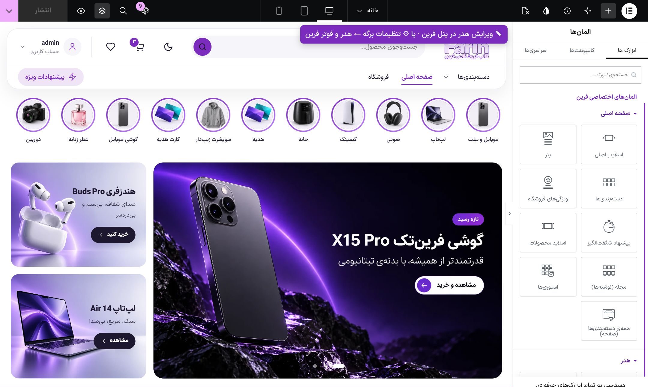
Finding Farin's widgets
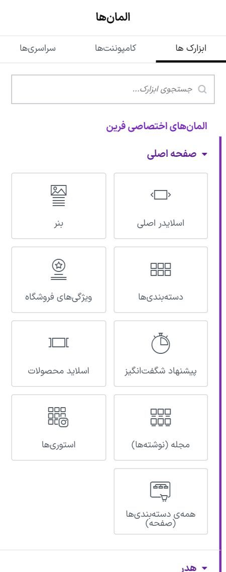
In Elementor's widgets panel, the “Farin custom elements” group sits above all the others, and each section has its own subgroup:
| Group | What widgets it has |
|---|---|
| Home page | Main slider, banner, categories, store features, amazing offer, product slider, magazine (posts), stories, all categories (page), image introduction, social networks gallery |
| Header | The complete Farin header and its pieces: logo, main menu, search, cart icon, wishlist, user account, category button, category bar, special offer, support phone |
| Footer | The complete Farin footer and its pieces: newsletter, logo and about, link columns, app download, contact, features, eNamad, payment gateway badges, bottom links, copyright |
| Product Page | The complete product page and its pieces: gallery, name and rating, price, selection and purchase, specifications, services, tabs, related products and other sections |
| Cart | The complete cart and its pieces: checkout steps, cart items, next purchase, free shipping bar, order summary, recommended products |
| Payment | The complete checkout page |
| Store | The complete shop page and its pieces: category banner, categories, filters, sorting, products, page numbers, category article |
| Contact and comments | Contact us form |
| General | Live search, eNamad, currency and gold rate bar, a single rate, blog posts, shop map |
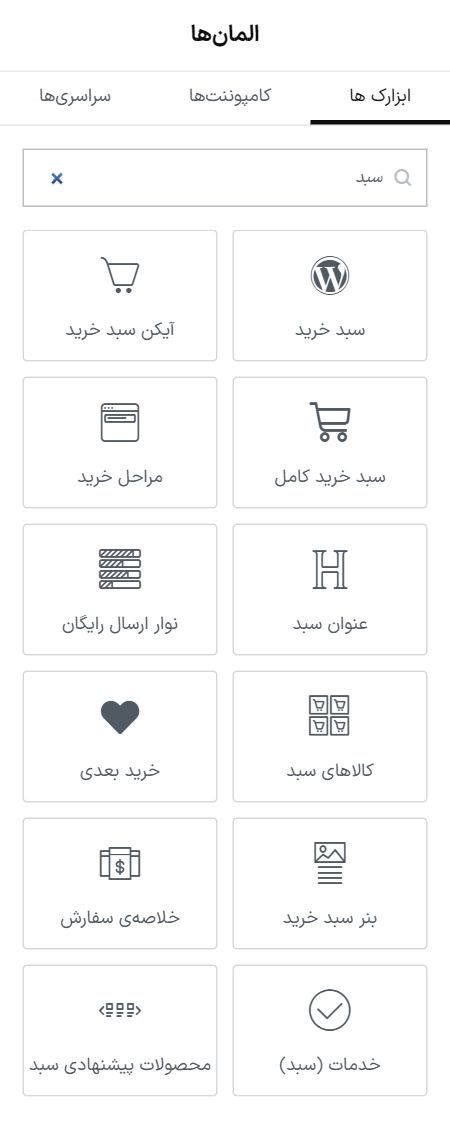
You can also type the widget's name in the “Search widget” box. For example, “cart” brings up all the cart pieces:
Building the home page
- Open the page. From “Pages”, open the page that is the home page with “Edit with Elementor”. Which page is the home page is set under “Settings → Reading”.
- Drag in a widget. From the “Home page” group, drag for example “Main slider” onto the page.
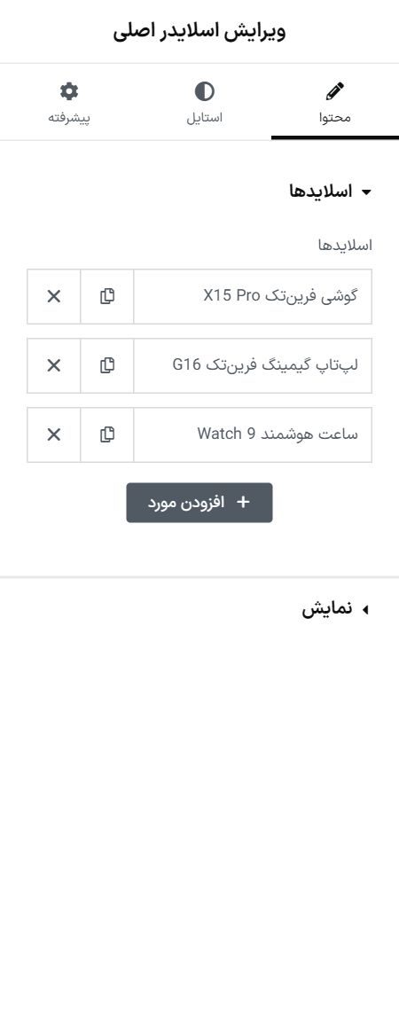
- Set it up. Click the widget; its settings open in the right-hand panel: slides, image, text and link for each.
- Press “Publish”. Until you publish, changes do not appear on the site.
| Place | Image size |
|---|---|
| Slider, default height 460 | 1920×640 |
| Slider, “Match image shape” | Any wide photo without cropping, such as 1920×800 or 1920×960 |
| Slider, “By aspect ratio” | Enter the image's own ratio; a 1920×960 image means 2 to 1. The slider scales with the page width and the image looks the same on every screen. |
| Full-width slider text | “Text position in width ← aligned with the site header and content”: on a wide screen the text stays on the same line as the logo. “Intro with image” has this option too. |
| Slider mobile image | 800×680, or 800×1000 for a taller slider |
| Small banner | 1400×440 |
| Wide banner | 1920×300 |
| Intro with image | 1200×800 |
| Social media gallery | 600×600 |
| Banner mobile image | 800×800 with a mobile height of 340; leave the area where the text sits empty |
The slider and banner have a separate mobile image, a separate height and a “Text position on mobile” setting, so on a phone the text does not land on the subject of the photo.
Each slide can have a second button too. Fill in the “Second button text” and its link to show an outline button next to the main button. Leave them empty and that slide has one button.
Homepage widget options
| Widget | Option |
|---|---|
| Main slider | “Arrow style” (a white circle or glass, for dark images), “Label above the title” (a colored label or just colored text), “Corners”, “Visible part of the image”, “Text position in width” and the “By aspect ratio” size. |
| Banner | For a banner where the text is part of the image: leave the title and button empty and write the same text in “Text on image”. |
| Categories | “Card size: Large, with a big image”. |
| Product slider | “Title position” (above the row, or beside it with the arrows below), “Card text” (right-aligned or centered), “Card image” (with spacing or full-bleed), “Line under the name” and “Wishlist heart on the image”. |
| Store features | “Icon style” (in a colored tile, or outline with no tile). A jewel icon has been added too. |
| Section titles | “Small line above the title” in widgets that have a section title. |
| Intro with image | An image beside text for About us or a collection: image position, curved or straight edge, corners, height and “Text position in width”. |
| Social media gallery | A title and button beside up to eight images that you choose yourself. Images are not pulled from Instagram. |
fhm-sheet. Its color comes from the shop page banner color and changes with the palette.Widgets and the Farin panel
The header, footer, product, cart, shop and checkout widgets are the same sections as the Farin panel, and their settings come from there:
- An empty field means “same as the panel”. Any box left empty in the widget's settings takes the Farin panel's value. What you type here applies only to this one widget.
- “Open this section in the Farin panel”. This link is at the top of every widget's settings and opens that section's tab in the panel.
- A widget with nothing to show. For example “Support phone” with no number. In the editor it shows a hint box, and nothing appears on the site.
Header and footer for each page
The site's header and footer come from the Farin panel, so they cannot be edited in the editor itself. Above the header in the editor a reminder “Edit header in the Farin panel” appears. For each page you can choose separately which header and footer it has:
- Open the page settings. In the Elementor editor, click the gear icon (page settings).
- Open the “Farin header and footer” section.
- Choose one option for the header and one for the footer.
| Option | What it does |
|---|---|
| Same as site (Farin panel) | The header or footer you built in the Farin panel. This is the default. |
| Hidden on this page | This page has no header or footer; for example for a campaign landing page. |
| An Elementor template | A saved Elementor template takes the place of the header or footer. Create the template from “Templates → Saved templates”; Farin's header and footer widgets can be used piece by piece inside it. |
Frequently Asked Questions
Do I need Elementor Pro?
No. All Farin widgets work without Elementor Pro. The “Upgrade” message at the bottom of the Elementor panel is Elementor's own advertising and has nothing to do with Farin.
Elementor's own widgets use a different font from the site.
Farin has registered its fonts in Elementor, in the “Farin fonts” group. In a widget's typography settings, choose one of them: “Farin Text” is the site's body font and “Farin Heading” is the heading font. Both follow the setting Font in the panel; when it changes there, it changes here too.
The widget is in the editor but does not show on the site.
Most often it has no data: for example “Blog posts” with no posts, or “Amazing offer” with no discounted products. If it does have data, clear the site cache.
Farin Theme · 1405