
Store
This section builds the look of the shop page. The page of each category, tag, and brand, and the product search results page, share this look. The default product order and “Showroom mode” for pausing sales are here too.
Where is it? Farin → Site content → Store and Products → Store
Preview and layout editing
The top of the page is a live preview of the shop page. Use the “Desktop” and “Mobile” buttons to see the page in both sizes. If the store has no products yet, the preview is shown with sample products; on the site, each category has its own products and filters.
The “Edit layout” button opens a window that shows the page sections in three rows: “Top of the page”, “Products” (with the “Side column” and “Products column”), and “Bottom of the page”. Drag sections and drop them wherever you like, or tap one and move it with the arrow keys. Tapping a section brings that section’s settings up beside the window. The description of each section is in Page sections .
Shop page style
| Option | What it does | Default |
|---|---|---|
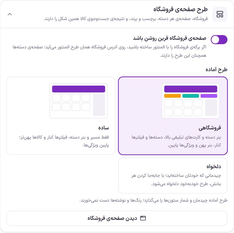
| Turn on the Farin shop page | When off, WooCommerce’s own shop page is shown. If you built the shop page with Elementor, that Elementor layout appears at the shop address and category pages still have the Farin look. | On |
| Ready-made layout | “Storefront”: category banner and promo cards on top, categories and filters at the side, category article and a wide banner below. “Simple”: only the breadcrumb and category banner on top, filters at the side. “Custom”: a layout you built yourself. A ready-made style changes only the layout and the number of columns; colors and texts stay. Any section you move in “Edit layout” turns the style into “Custom” automatically. | Storefront |
| View the shop page | Opens the shop page in a new tab. |
Farin shop page or Elementor template

If you want to build the shop page entirely in Elementor, create a template and select it here. The widgets in the “Farin Custom Elements · Shop” group, inside that template, show the products and filters of whichever page the buyer opened.
- Create the template. In Elementor, press “Templates → Add New” and create a “Page” type template.
- Arrange the widgets. Place the “Farin Custom Elements · Shop” widgets in the template and save.
- Select the template. Here, set “What to show” to “An Elementor template” and pick the template from the “Elementor template” list.
| Option | What it does | Default |
|---|---|---|
| What to show | “Farin shop page” or “An Elementor template”. | Farin shop page |
| Elementor template | A template from “Templates → Saved Templates” in Elementor. Until a template is selected, the Farin shop page remains. |
Page sections
These are the sections that move in “Edit layout”. Any section you don’t place in the layout does not appear on the page. The “Sort bar”, “Products”, and “Page numbers” fit only in the middle row (products), and the “Products” section always stays on the page.
| Section | What it shows |
|---|---|
| Breadcrumb | Home › Shop › Category. It is built from the product categories. |
| Category banner | The category (or shop) name and description, with an image or color. |
| Promo cards | Two or three colored cards with links. |
| Categories | The current category’s subcategories, with icon and count. When the “Category” filter is in the filters box, this box doesn’t appear so categories are not shown twice. |
| Category bar (horizontal) | Categories with images, side by side in one row that scrolls sideways. In the shop, the main categories; in each category, its subcategories. For the top of the page. |
| Filters | Price, brand, attributes (color, storage, warranty, and so on), stock, and discount. On mobile, the side column becomes a slide-out. |
| Sort bar | The number of products, order, grid or list view, and active filters. |
| Products | The product cards. |
| Page numbers | Going to the products on later pages. |
| Category article | The category description, when in Categories its position is “Article at the bottom of the page”. The long text is collapsed and opens with a button. |
| Wide banner | A banner with a heading, text, and a button. |
| Store features | A bar of fast delivery, guarantee, and the like. |
| Custom section 1 and 2 | Text, HTML or shortcode. |
Category banner settings
| Option | What it does | Default |
|---|---|---|
| Shop page heading | Up to 80 characters. Leave empty and the shop page’s name is used. Each category page has that category’s name. | Empty |
| Shop page text | Up to 240 characters. Each category page shows that category’s “description”. | Empty |
| Banner image | Suggested size 360 × 240. For categories, the category’s own “thumbnail image” is used; without an image, a simple design is drawn. | |
| Start color and end color | The banner’s two background colors, blending into each other. | #f4f1fa and #ebe4f6 |
| Product count on the banner | The number of products in the category or shop is written on the banner. | On |
Promo cards settings
Up to three cards. Each card has a “Color” (purple, red, orange, teal, blue, or dark), a “Title”, a “Short text”, and an “Address”. A card with no address is only text and goes nowhere. A row with no title is not saved. Arrange the cards with “Add row”, “Move up”, “Move down”, and “Delete”.
Categories settings
| Option | What it does | Default |
|---|---|---|
| Title | The box heading, up to 40 characters. | Categories |
| Product count per category | The number of its products appears beside each category name. | On |
Each category’s icon is the category’s “thumbnail image” in WooCommerce.
Filters settings
| Option | What it does | Default |
|---|---|---|
| Title | The filters box heading, up to 40 characters. | Filters |
| Apply button | The text of the button that applies the filters. | Apply filter |
| Clear filters button | The text of the button that removes all filters. | Clear all |
Which filters appear, in what order, and in what form is set in the Filters section. The “Go to filters” button takes you to that section.
Sort bar settings
| Option | What it does | Default |
|---|---|---|
| Grid and list buttons | The buyer can switch between grid and list views of products. Their choice stays in that browser. | On |
| Default display style | “Grid” or “List”, for when the buyer hasn’t chosen anything yet. | Grid |
Page numbers settings
This element has no separate setting. How to move on to further products is set in the box Moving on to next products . Don't remove this element from the layout, because the next products come from here.
Wide banner settings
| Option | What it does | Default |
|---|---|---|
| Title | Up to 80 characters. Leave empty and the banner does not appear. | Farin Sales Festival |
| Text | Up to 160 characters. | Sample text |
| Button text | Up to 40 characters. | View offers |
| Address | Where the button goes; an on-site address such as /shop/ or a full address. | Empty |
| Image | Suggested size 420 × 220. Without an image, a shopping bag with a percent sign is drawn. |
Store features settings
Up to six rows. Each row has an “Icon” (truck, shield, return, headset, gift, card, clock, star, wallet, verified badge, or store), a “Title”, and a “Short text”.
Custom section 1 and 2
Each takes up to 4,000 characters of text, HTML, or shortcode and is saved with “Apply”. If your account is not allowed to write free HTML, unsafe tags are removed before saving.
Columns and product card
| Option | What it does | Default |
|---|---|---|
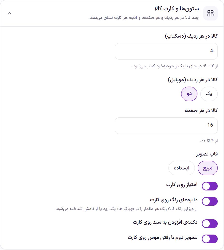
| Products per row (desktop) | From 2 to 6. In a narrower space it automatically becomes fewer. | 4 |
| Products per row (mobile) | “One” or “Two”. | Two |
| Products per page | From 4 to 60. | 16 |
| Image frame | “Square” or “Portrait” (taller than wide, better for clothing and books). | Square |
| Rating on the card | The product’s rating stars on the card. | On |
| Color circles on the card | The product’s available colors as circles. Read from the product’s color attribute; set each value’s color in Attributes ; otherwise it is recognized by its name (such as “Red”). | On |
| Add to cart button on the card | The buyer adds the product to the cart from the card itself. | On |
| Compare button on the card image | The buyer marks up to four products. A small bar appears at the bottom of the page that goes to the compare page. | On |
| Second image on hover | When the pointer goes over the card, the product gallery’s second image replaces the main one. | On |
Compare page
You don't build this page; the theme shows it itself. Selected products appear column by column side by side, with photo, price, cart button, rating, brand, stock and all their attributes. “Differences only” hides identical rows. The list stays in the buyer's browser and the page link can be sent to someone else. This page doesn't appear in search engines.
Moving on to next products
This setting is the same for the store page and the all-categories page. Set the number of products per page from “Products per page” in the box above.
| Option | What it does | Default |
|---|---|---|
| Display method | “Page by page”: the buyer clicks the page number. “Show more button”: clicking the button adds the next products below the list. “Infinite scroll”: scrolling down adds the next products automatically. Search engines see all pages in all three modes. | Page by page |
| Button text | Shown only in “Show more button” mode. Up to 40 characters. | Show more products |
Width and side column
| Option | What it does | Default |
|---|---|---|
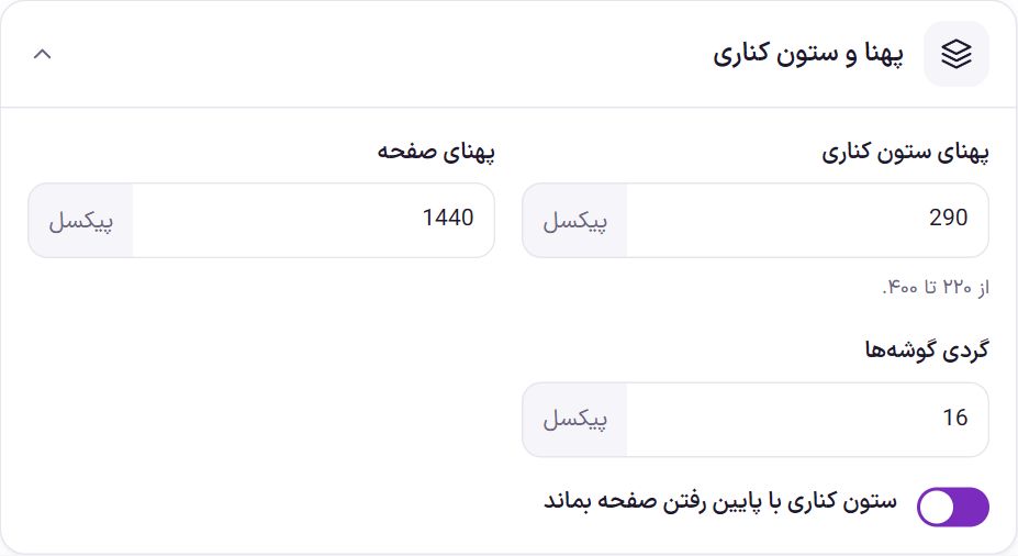
| Side column width | The width of the categories and filters column, from 220 to 400 pixels. | 290 |
| Page width | The maximum page content width, from 960 to 1920 pixels. | 1440 |
| Corner roundness | The corner roundness of cards and boxes, from 0 to 32 pixels. | 16 |
| Keep the side column in view while scrolling | As you scroll down the product list, the filters stay in view. | On |
Color scheme
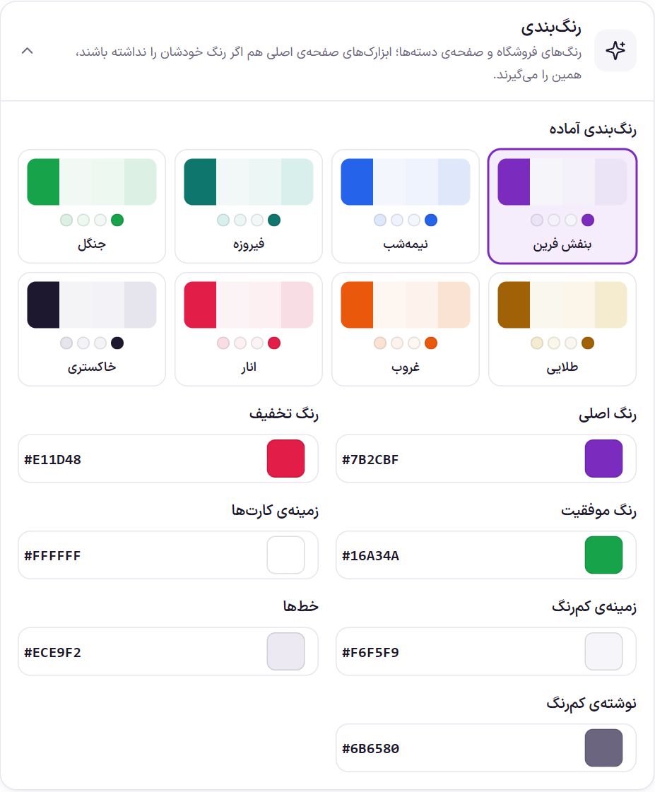
These colors are for the shop and category pages. The home page widgets also take these colors if they don’t have their own. Set each color with the picker or by typing its code (such as #7b2cbf).
| Option | What it does | Default |
|---|---|---|
| Ready-made color schemes | Farin purple, midnight, turquoise, forest, golden, sunset, pomegranate, and gray. | Farin Purple |
| Main color | Buttons, links, and selected options. | #7b2cbf |
| Discount color | The label and discount percentage. | #e11d48 |
| Success color | Success messages and indicators. | #16a34a |
| Card background | The product cards’ background color. | #ffffff |
| Light background | The background of boxes and less important places. | #f6f5f9 |
| Lines | The edge of cards and dividers. | #ece9f2 |
| Light text | Secondary text such as the product count. | #6b6580 |
Product order
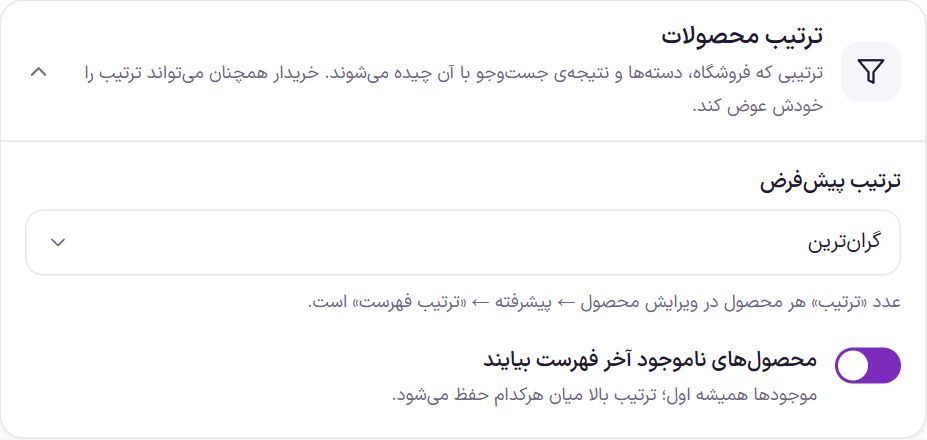
The order in which the shop, category pages, and search results are arranged. The buyer can still change the order from the sort bar.
| Option | What it does | Default |
|---|---|---|
| Default order | “Manual order (each product’s order number)”, “Newest”, “Best selling”, “Highest rated”, “Cheapest”, or “Most expensive”. In manual order, each product’s number is in Edit product → Advanced → “Menu order”; a lower number comes first. This is the same as WooCommerce’s own default order setting, and changing it here changes it there too. | Manual order |
| Out-of-stock products at the end of the list | In-stock products always come first and out-of-stock ones after them. The order above is preserved within each group. It works in the shop, category and tag pages, and product search results. | On |
Showroom mode
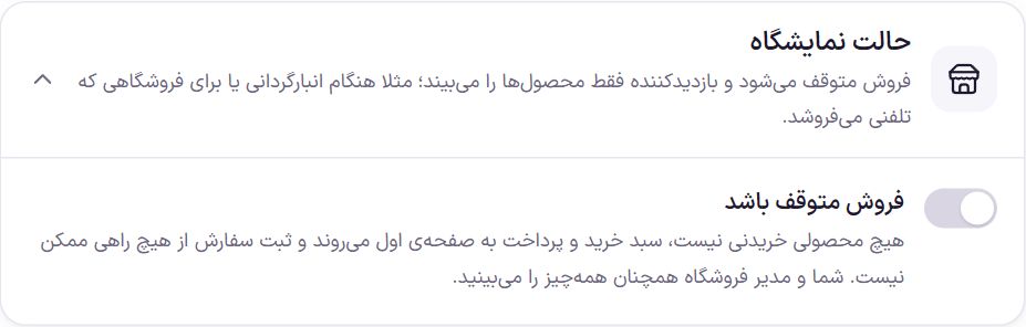
In showroom mode, sales are paused and the visitor only sees the products. It is useful for stocktaking time or a store that sells by phone.
| Option | What it does | Default |
|---|---|---|
| Pause sales | No product can be bought. The cart and checkout pages go to the home page, and placing an order is not possible by any route, even through the store API. | Off |
| Buy button placeholder text | Up to 80 characters. On cards it replaces the add to cart button, and on the product page it replaces the buy section. | Call to buy |
| Show prices | When off, prices are removed from pages, from the data Google reads from the product, and from the store API. | On |
| Also close login and account | The account page goes to the home page and sign-up is closed. The admin still reaches the dashboard from the WordPress login page. | On |
Frequently Asked Questions
How do I change one category’s page separately from the others?
The look of all categories comes from this section. Things that differ per category are read from the category itself: the name and description in the banner, the “thumbnail image” instead of the banner image, and the article at the bottom of the page. Write these in Categories or in editing that category in WooCommerce.
I changed the default order, but the list did not change for me.
If you previously chose another order from the sort bar, the page address keeps that order. Reopen the shop page from scratch, without the order suffix. If you have a caching plugin, clear the cache too.
Showroom mode is on, but I still see the checkout button.
That’s right. The admin and the shop manager are exempt from the closing of the cart and checkout so they can work. With a buyer account or in an incognito window, you see what a visitor sees.
I built the shop page with Elementor; what happens to this section’s settings?
At the shop address, your Elementor layout appears. Category pages, tags, and search results still have this section’s look. Product order and showroom mode work everywhere.
Farin Theme · 1405