
Mobile Settings
Most purchases are made on phones. This tab holds everything that appears only on phones and tablets in one place: the bottom bar of the screen, the phone header and footer, and the web app with which the buyer installs the store on their phone’s home screen like an app. Every change is saved instantly, and the desktop header and footer are untouched.
Where is it? Farin → Site content → Site Appearance → Mobile Settings
Mobile bottom bar
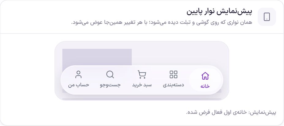
The bottom bar is the fixed bar at the bottom of the screen on phones and tablets: below 1024 pixels, where the header turns into a hamburger menu. It is not shown on desktop.
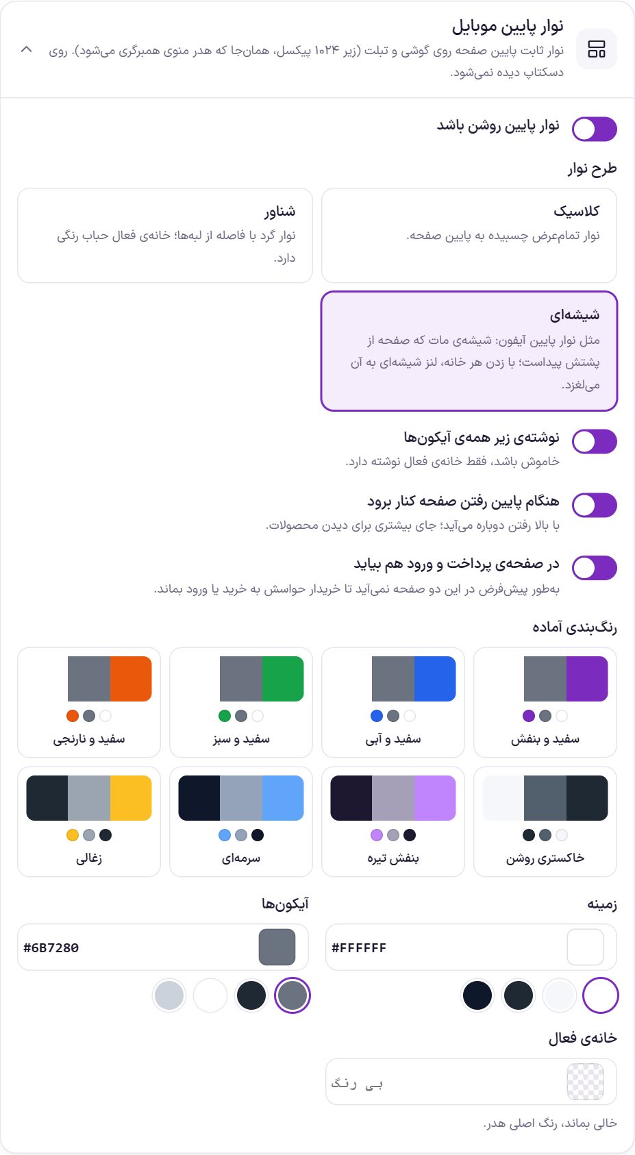
| Option | What it does | Default |
|---|---|---|
| Turn on the bottom bar | Shows the bar on phones and tablets. | On |
| Bar layout | “Classic”: a full-width bar attached to the bottom of the screen. “Floating”: a rounded bar set apart from the edges; the active item has a colored bubble. “Glass”: like the iPhone’s bottom bar, frosted glass with the page visible behind it; tapping an item slides a glass lens to it. | Classic |
| Label under all icons | When off, only the active item has a label. | On |
| Hide when scrolling down | It comes back when you scroll up; more room is left for viewing products. | Off |
| Also show on checkout and login pages | By default it is not shown on these two pages so the buyer stays focused on buying or logging in. | Off |
| Ready-made color schemes | Eight ready-made combinations, from “White and purple” to “Charcoal”, that set the three colors below together. | |
| Background | The bar’s background color. | #FFFFFF |
| Icons | The color of icons and labels. | #6B7280 |
| Active item | The color of the item the buyer is on. Leave empty to use the header’s main color. | Empty |
Glass effect
This box sets the look of the glass sections on mobile and tablet. “Frosted glass” is the default look. With “Liquid glass” the edge of each section bends like a lens and what's behind it looks slightly stretched.
After choosing “Liquid glass” you get a separate switch for each section: bottom bar, product gallery buttons, floating contact and AI buttons, product page buy bar, header and the slider's active dot.
Note: The bottom bar must have the “glass” layout, the gallery buttons must be glass and the header's glass option must be on. The edge bending shows only in Chrome and browsers in its family. On iPhone, Firefox and low-memory phones, the default look remains.
Bar items
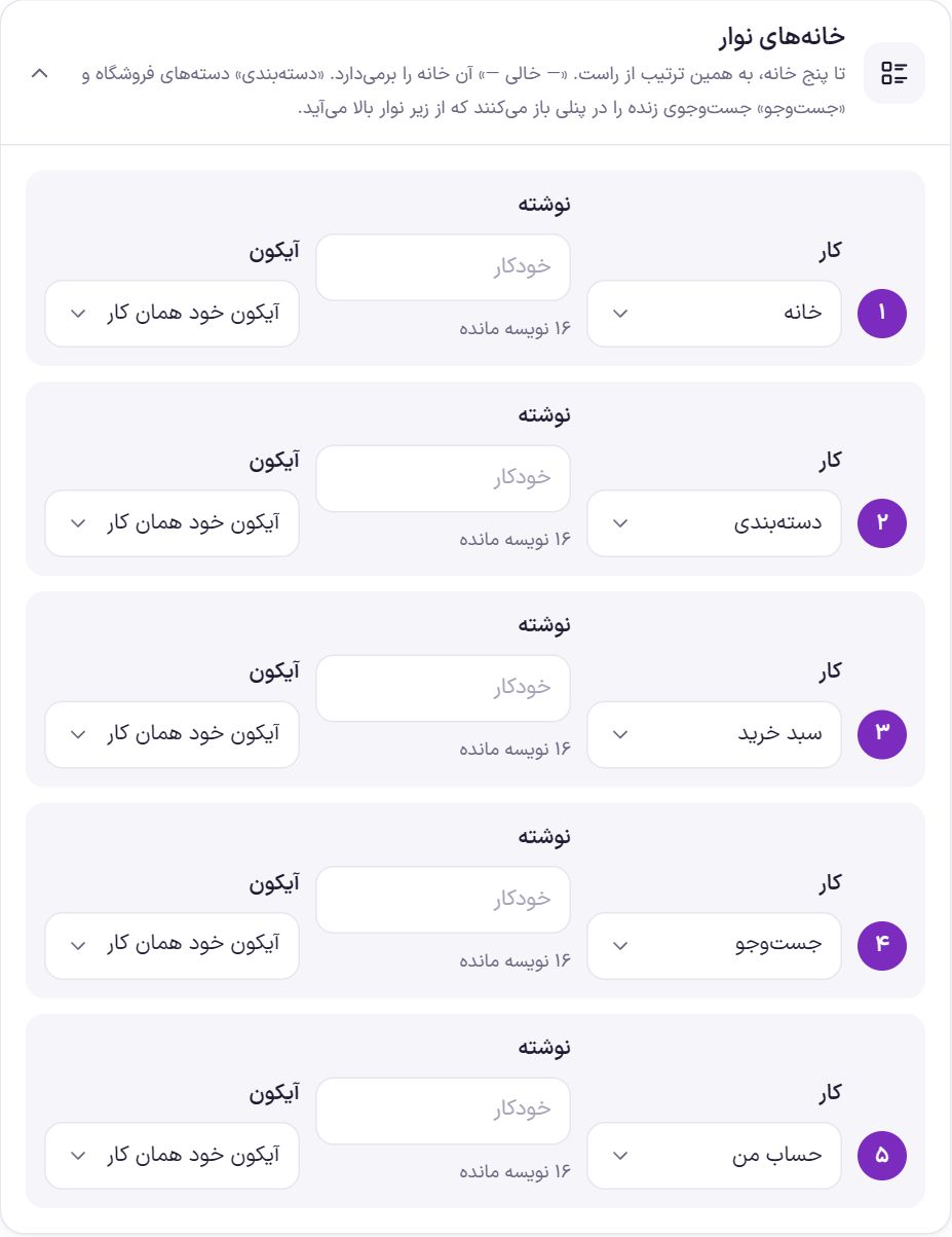
Each item has three parts:
| Option | What it does |
|---|---|
| Action | What tapping the item does: home, categories, search, cart, my account, wishlist, shop, blog, or a custom link. “— Empty —” removes the item. “Categories” and “Search” (live search) open in a panel that slides up from beneath the bar. |
| Text | Up to 16 characters. Leave empty and the action’s own name is used as the label. |
| Icon | “The action’s own icon” or one of the theme’s icons, such as the shopping bag or the heart. |
| Address | Only for “Custom link”. A page on the site such as /shop/ or a full address. |
Default layout: home, categories, cart, search, and my account.
Mobile and tablet header
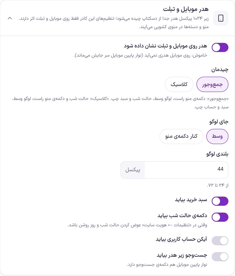
Below 1024 pixels, the header is laid out separately from desktop. The menu and categories appear in a slide-out menu. The desktop header is in Header .
| Option | What it does | Default |
|---|---|---|
| Show the header on mobile and tablet | When off, no header appears on mobile. The mobile bottom bar stays in place. | On |
| Layout | “Compact”: menu button on the right, logo in the middle, night mode and cart on the left. “Classic”: night mode and menu button on the right, logo in the middle, cart and account on the left. | Compact |
| Logo position | “Center” or “Beside the menu button”. | Center |
| Logo height | From 24 to 72 pixels. | 44 |
| Header height | Header height on mobile and tablet, from 48 to 120 pixels. If the logo is taller, the header grows to the logo's height. | 64 |
| Show the cart | The cart icon in the phone header. | On |
| Show the night mode button | When the Site Identity night/day mode switch is on. | On |
| Show the account icon | The login or account icon in the header. | Off |
| Show language switcher | In the slide-out menu, “فارسی / English”. When “Language switcher” is in the desktop header and the English version is on. | On |
| Show search under the header | A search box under the phone header. The mobile bottom bar also has a search button. | Off |
Mobile footer
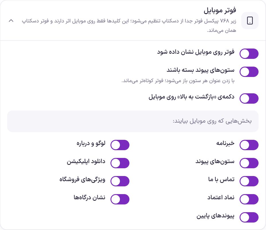
Below 768 pixels, the footer is set up separately from desktop. The texts and links are the same ones you wrote in Footer ; here you only say which sections to show on the phone.
| Option | What it does | Default |
|---|---|---|
| Show the footer on mobile | When off, no footer appears on phones. | On |
| Keep link columns collapsed | Tapping each column’s heading opens it; the footer stays shorter. | On |
| “Back to top” button on mobile | Also show the back-to-top button on phones. | On |
| Sections to show on mobile | One switch per section: newsletter, logo and about, link columns, app download, contact us, store features, trust badge, payment gateway badges, and bottom links. Turn any of them off and it is not shown on phones. | All on |
Web app
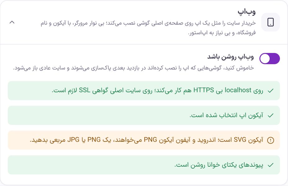
With the web app, the buyer installs the site on their phone’s home screen like an app: without the browser bar, with the store’s icon and name, and without needing an app store. “Turn on the web app” is on by default.
The status checklist checks four things:
- HTTPS. Phones will not install the app without an SSL certificate. On a test site
localhostit works without HTTPS too. - Icon. The app icon or the site favicon must be selected.
- Icon type. Android and iPhone need a PNG icon. If the icon is an SVG, provide a square PNG or JPG.
- Unique links. The web app also works with plain links, but readable links are better.
Name and icon
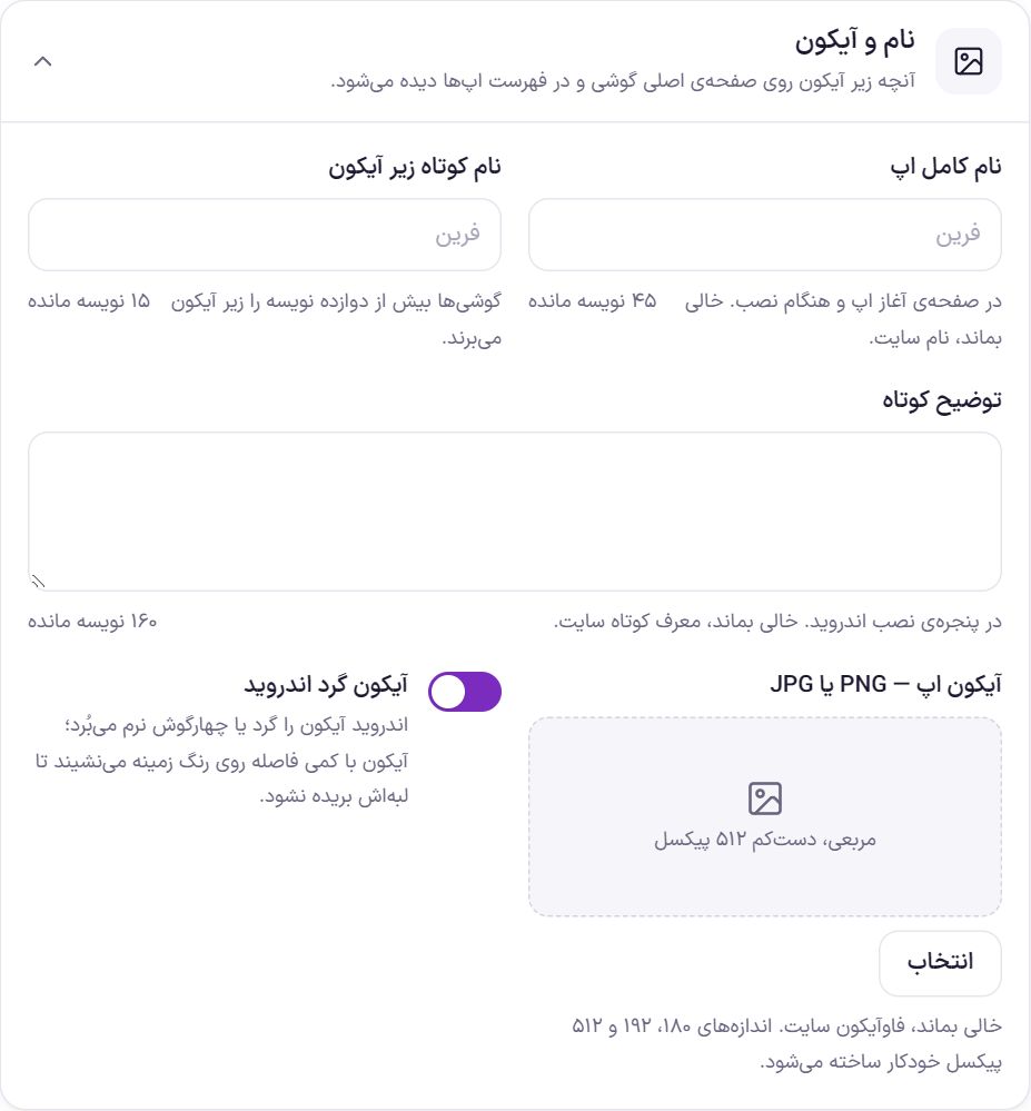
| Option | What it does | Default |
|---|---|---|
| Full app name | Up to 45 characters; shown on the app’s splash screen and during installation. | Site name |
| Short name under the icon | Up to 15 characters. Phones truncate anything beyond twelve characters under the icon. | Site name |
| Short description | Up to 160 characters; shown in the Android install window. | A short introduction to the site |
| App icon, PNG or JPG | A square image, at least 512 pixels. The 180, 192, and 512 pixel sizes are generated automatically. | Site favicon |
| Android round icon | Android crops the icon to a circle or a soft square. With this switch on, the icon sits on the background color with a little padding so its edges are not cut off. | On |
Color and display
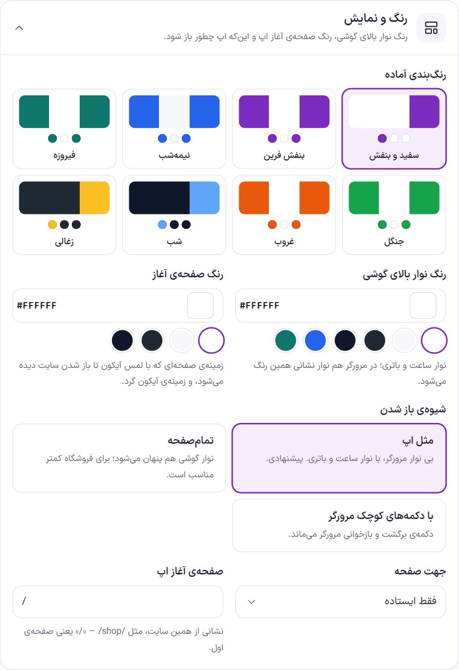
| Option | What it does | Default |
|---|---|---|
| Ready-made color schemes | Eight ready-made combinations that set the top bar color, the splash screen color, and the install message button color together. | White and purple |
| Phone top bar color | The clock and battery bar. In the browser, the address bar takes this color too. | #FFFFFF |
| Splash screen color | The background of the screen shown from tapping the icon until the site opens, and the background of the round icon. | #FFFFFF |
| How it opens | “Like an app”: no browser bar, with the clock and battery bar; recommended. “Full screen”: the phone bar is hidden too; less suitable for a store. “With small browser buttons”: the browser’s back and reload buttons remain. | Like an app |
| Screen orientation | Portrait only, portrait and landscape, or landscape only. | Portrait only |
| App start page | The page that opens when the icon is tapped; an address on this site such as /shop/. / means the home page. | / |
Shortcuts
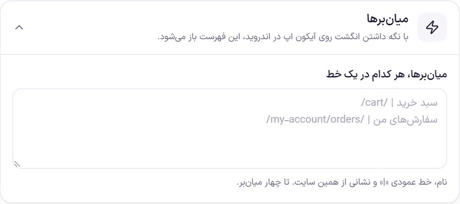
On Android, pressing and holding the app icon opens the shortcut list. Write each shortcut on one line: name, the vertical bar “|”, and an address on this site. Up to four shortcuts. For example:
Cart | /cart/My orders | /my-account/orders/
Offline mode
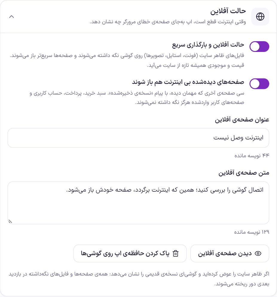
| Option | What it does | Default |
|---|---|---|
| Offline mode and fast loading | The site’s appearance files (fonts, styles, images) are kept on the phone and pages open faster. Prices and stock always come fresh from the site. | On |
| Pages already viewed open without internet too | The last thirty pages a guest viewed, with a “Saved version” message. The cart, checkout, account, and logged-in user pages are never stored. | On |
| Offline page title | Up to 60 characters. | No internet connection |
| Offline page text | Up to 200 characters. | Check your phone’s connection; as soon as the internet is back, the page opens by itself. |
“View offline page” shows that page in a new tab. “Clear the app cache on phones” is for when you have changed the site’s appearance and some phone still shows the old version: all stored pages and files are discarded on the next visit.
Install message
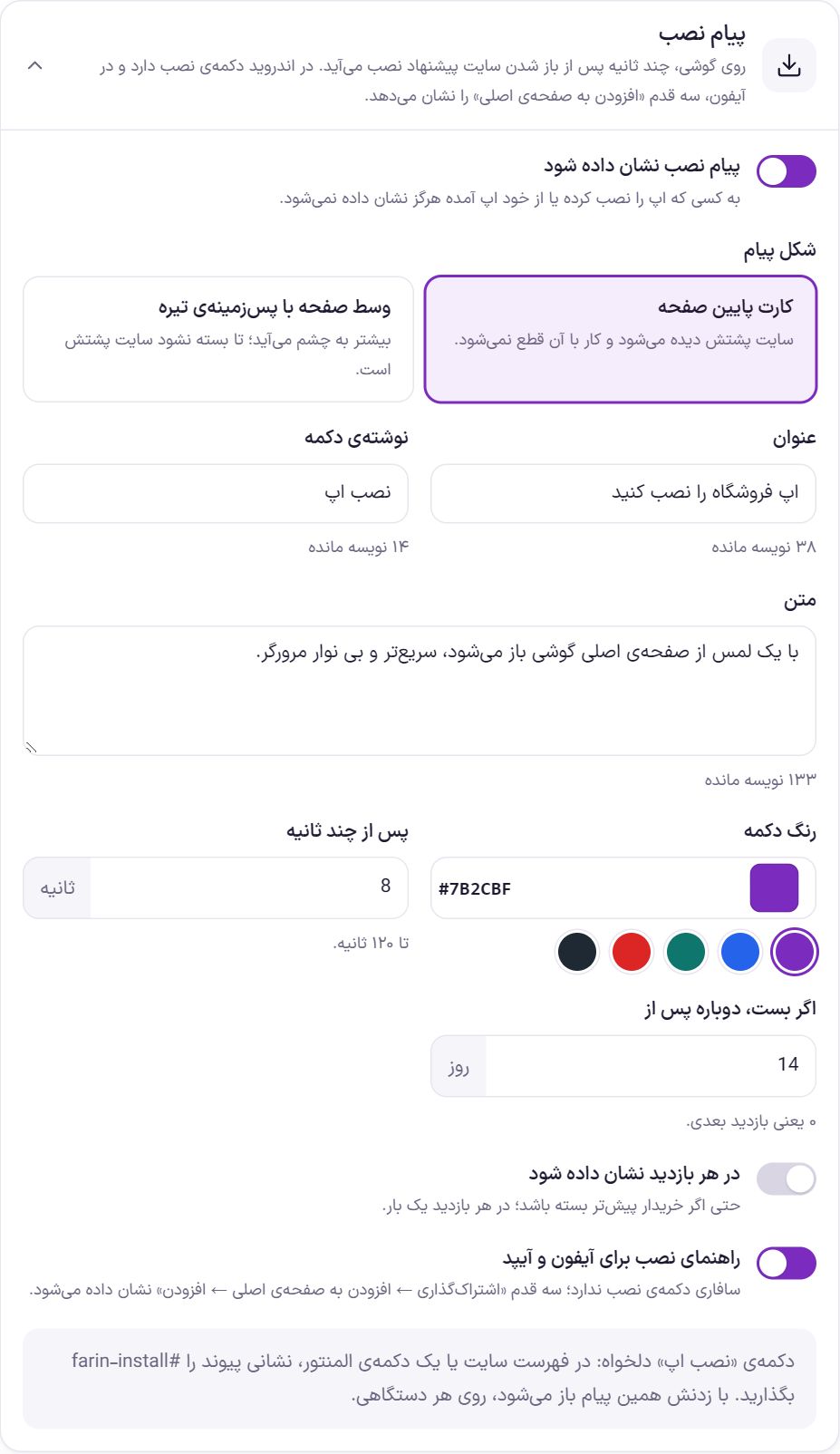
On a phone, an install prompt appears a few seconds after the site opens. On Android it has an install button, and on iPhone it shows the three “Add to Home Screen” steps. It is never shown to someone who has installed the app or came from the app itself.
| Option | What it does | Default |
|---|---|---|
| Show the install message | Turns the install prompt on or off. | On |
| Message style | “Card at the bottom of the screen”: the site stays visible behind it and use is not interrupted. “Centered with a dark backdrop”: more noticeable; the site stays behind it until it is closed. | Card at the bottom of the screen |
| Title | Up to 60 characters. | Install the store app |
| Button text | Up to 20 characters. | Install app |
| Text | Up to 200 characters. | It opens from the phone’s home screen with one tap, faster and without the browser bar. |
| Button color | The install button’s color. | #7B2CBF |
| After a few seconds | Appears this many seconds after the site opens; up to 120 seconds. | 8 seconds |
| If dismissed, show again after | If the buyer closes the message, show it again after this many days. 0 means the next visit. | 14 days |
| Show on every visit | Even if the buyer has dismissed it before; once per visit. | Off |
| Install guide for iPhone and iPad | Safari has no install button; the three steps “Share → Add to Home Screen → Add” are shown. | On |
#farin-install Tapping it opens this install message, on any device.Frequently Asked Questions
The buyer does not see the install message.
First look at the status checklist in the “Web app” box; most of the time the site is not on HTTPS or the icon is an SVG. If the buyer has closed the message, it does not appear until the days in “If dismissed, show again after” have passed. It is also not shown to someone who has installed the app.
With offline mode, will the buyer see old prices?
No. Only the site’s appearance files are stored on the phone, and prices and stock always come fresh from the site. A page opened without internet is shown with a “Saved version” message, and the cart and checkout are never stored.
I changed the site’s appearance but it still looks old on my phone.
In the “Offline mode” box, press “Clear the app cache on phones”. On the next visit, phones get the new version.
The bottom bar is not visible on a computer.
Correct. The bottom bar is visible only below 1024 pixels, meaning phones and tablets.
Farin Theme · 1405