
Header
The header is the bar at the top of all the store’s pages: logo, menu, search, cart and user account. In this tab you pick one of two ready-made layouts, change the place of each element with “Edit layout”, and adjust its color and frame. Every change is saved on the spot.
Where is it? Farin → Site content → Site Appearance → Header
Header layout
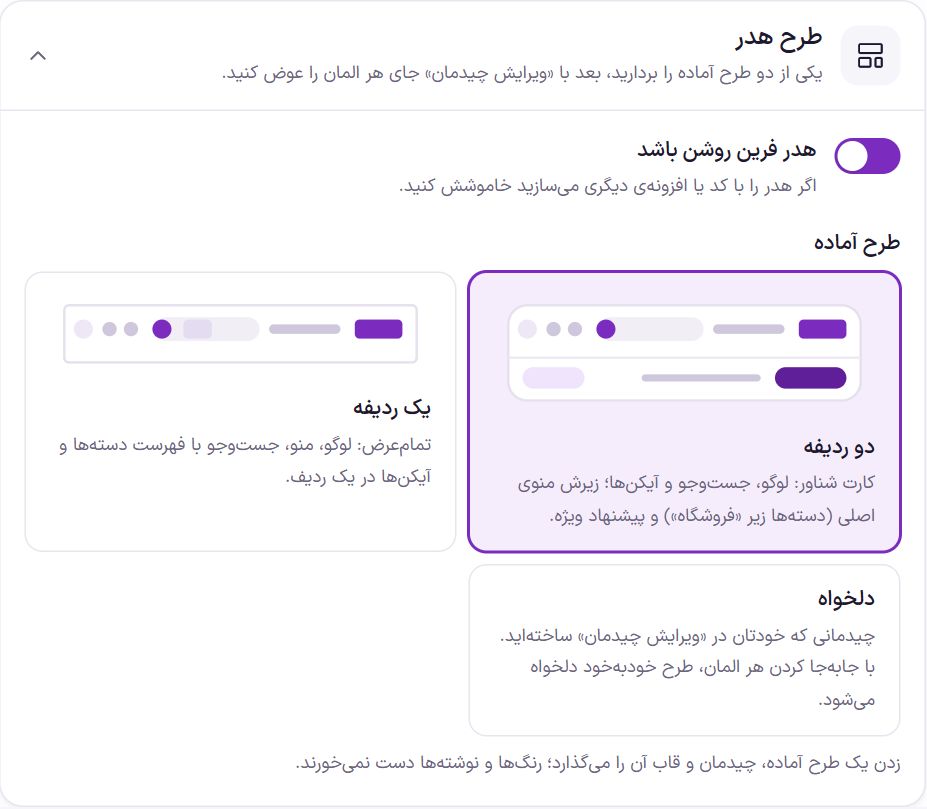
| Option | What it does | Default |
|---|---|---|
| Farin header enabled | Turn it off if you build the header with other code or a plugin. When off, the header is not printed on the site and the preview remains for viewing only. | On |
| Ready-made layout: Two rows | A floating card. In the main row the logo, search and the cart, wishlist and account icons; in the bottom row the main menu (categories under “Shop”) and the special offer button. | Selected |
| Ready-made layout: Store - Gold & Jewelry | A full-width dark row: logo and menu with a line under the active item, a calm search and icons. | - |
| Ready-made layout: One row | Full width. Logo, menu, search with a category list, and icons in one row. | |
| Custom | A layout you built yourself in “Edit layout”. Moving any element turns the layout into Custom automatically. |
Choosing a ready-made layout sets its arrangement and frame (width, corner roundness, shadow, line between rows, category list in search and the shape of the user account). Colors and texts you have written are not touched.
Edit layout
The “Edit layout” button at the top of the tab opens a window that shows the header in two rows: “Main row” and “Bottom row”, each with three sections: “Right”, “Center” and “Left”. Elements that are not in the header stay in the “Unused” row.
- Move an element. Drag it and drop it in any section. Or click one and move it with the arrow keys. You can also click any element on the preview.
- Change the header's own size. Click an empty spot of the header in the preview, or the “Header frame” button at the top of the window. The same “Width and frame” options (below) appear beside the window: full width or box, content width and row heights. Whatever you change here also changes in the “Width and frame” box.
- Give the exact place. When you click an element, its “Row” and “Section” and the two buttons “One forward” and “One back” appear beside the window.
- Change the element’s own settings. Most elements have their own settings in this same window (table below).
- To remove an element, move it to “Unused”. It is no longer shown on the site.
“Undo” takes back the last move and “Reset to defaults” restores the theme’s first layout.
| Element | Settings in the layout window |
|---|---|
| Logo | The logo image and size are in Site Identity . Without a logo, the site name is written. |
| Main menu | “Current page indicator”: an underline (default), a colored background or just color. The menu links are in the “Main menu and submenus” box in this same tab. |
| Search | “Show the ‘All categories’ list in the box”: the shopper can limit the search to one category and its subcategories. “Maximum box width” from 240 to 760 pixels (default 520). The text inside the box, suggestions and results come from Search tab. |
| Cart | No settings. The cart item count updates without reloading the page. When purchasing is turned off in the store (showcase mode), the cart is not shown. |
| Wishlist | “Wishlist page address”. If left empty, it goes to the user account. |
| User account | “Style”: icon and two lines (default), icon and one line, or icon only. “Text for guests” (default “Log in / Sign up”) and “Second line” (default “Your account”, only in the two-line style). A logged-in user sees their own name, and clicking opens their account menu. |
| Category button | The button that opens the store’s big category menu. “Button text” (default “Product categories”) and “Button style”: bold, light or plain. The big menu shows all categories with subcategories and an image for each main category. |
| Category bar | Several main categories side by side. “Where the links come from”: the main categories, or the “Header category bar” menu in Appearance ← Menus. “How many links” from 2 to 12 (default 7); if they don’t fit, the bar scrolls sideways. “Show each category’s small image” shows the image you set on the category itself in Products ← Categories. |
| Special offer | A link button with an icon. “Text” (default “Special offers”), “Address” (if left empty, it goes to the shop) and “Style”: light, bold or plain. |
| Support phone | “Text above the number” (default “Support”) and “Number”. Without a number, this element is not shown. |
| Language switcher | Opens this same page in another language. It has three forms: “فارسی / English”, “FA / EN” and “Globe icon”. Each language name is written in its own script and has no flag, because a language is not a country. It shows only when “English version” in Languages is on. On mobile it appears in the slide-out menu. |
| Custom section 1 and 2 | Text, HTML or shortcode, up to 4,000 characters, for example [farin_rate symbol="usd"]. It is saved with “Apply”. If left empty, it is not shown. |
Main menu and submenus
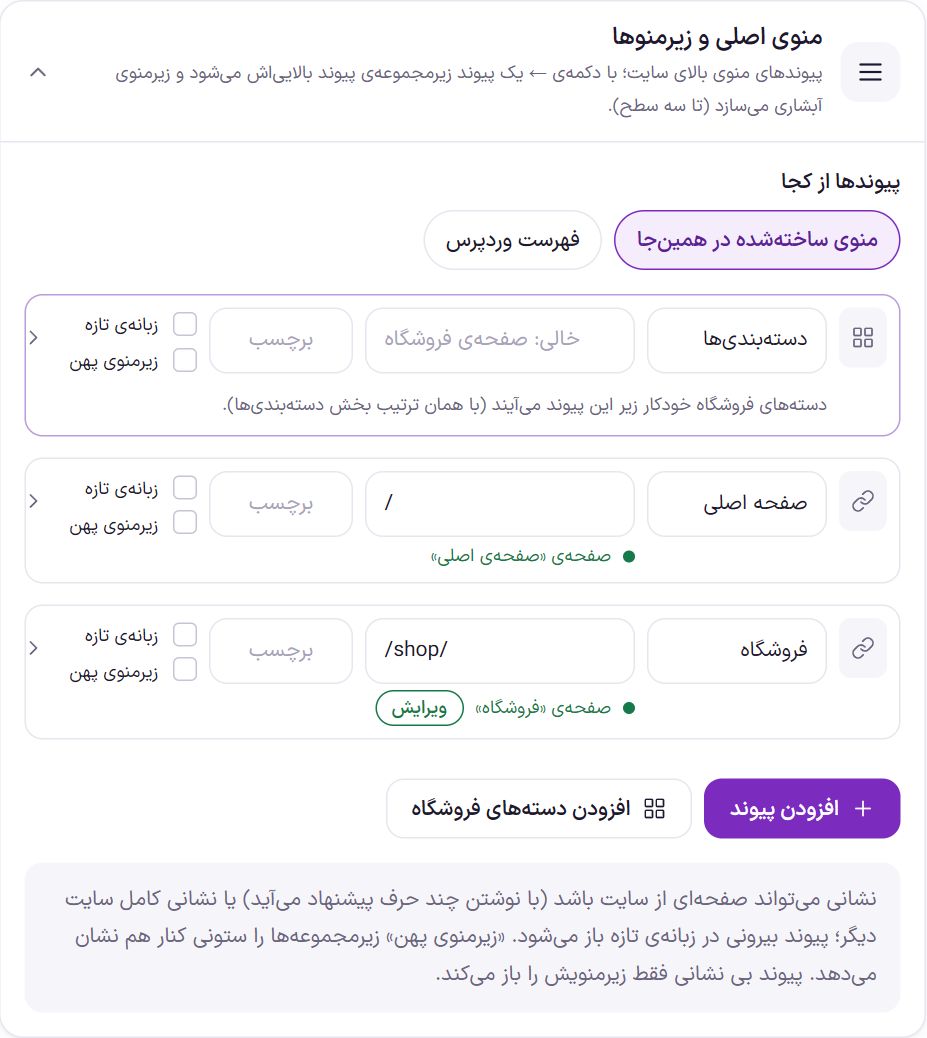
“Where the links come from” has two modes:
- Menu built here (default): you build the links in this box.
- WordPress menu: the links come from a menu you have assigned to “Header main menu” in Appearance ← Menus. Until a menu is assigned there, the menu built in Farin is shown. The “Go to Menus” button takes you to that page.
Each link has these parts:
| Section | What it does |
|---|---|
| Link text | What the shopper sees in the menu. |
| Address | A page on the site (suggestions appear as you type a few letters) or the full address of another site. An external link opens in a new tab. A link with no address only opens its submenu. |
| Label | A short text beside the link, such as “New”, up to 16 characters. |
| New tab | The link opens in a new browser tab. |
| Wide submenu | Child items are shown in side-by-side columns, not in a narrow list. |
The up and down arrows change the order of links. The ← button makes a link a child of the link above it and builds a cascading submenu, up to three levels. The → button moves it up one level.
“Add link” creates a simple link. “Add store categories” creates a row called “Categories” under which the store’s categories appear automatically, in the same order as the Categories. If this row’s address is left empty, it goes to the shop page. Whether these categories open as a mega menu or a regular cascading menu is set in the Categories section.
Farin header or Elementor template
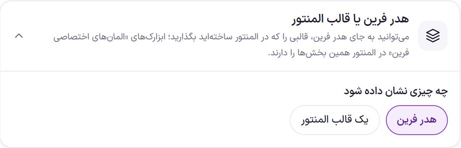
“What to show” has two modes: “Farin header” (default) or “An Elementor template”. In the second case, choose the template from the “Elementor template” list. This list is the templates in Templates ← Saved Templates in Elementor. Until a template is chosen, the Farin header stays.
If you don’t have a template yet, in Elementor create one with Templates ← Add New and arrange the “Farin Custom Elements” widgets in it. These widgets have the same header sections. More in Elementor Widgets.
Width and frame
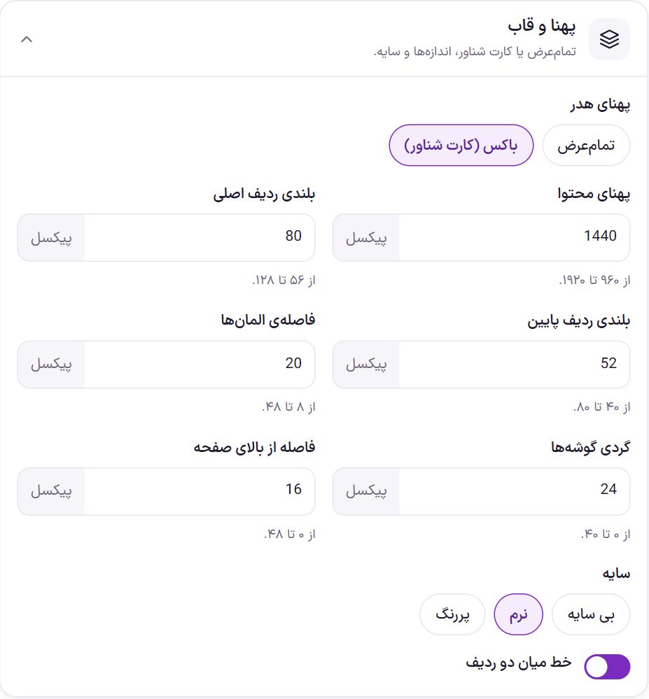
| Option | What it does | Default |
|---|---|---|
| Header width | “Full width” goes from edge to edge of the page. “Box (floating card)” is a card set apart from the edges. | Box |
| Content width | The maximum width of the layout inside the header, from 960 to 1920 pixels. | 1440 |
| Main row height | From 56 to 128 pixels. | 80 |
| Bottom row height | From 40 to 80 pixels. | 52 |
| Element spacing | The space between side-by-side elements, from 8 to 48 pixels. | 20 |
| Corner roundness | Box mode only. From 0 to 40 pixels. | 24 |
| Distance from the top of the page | Box mode only. The card’s distance from the top edge, from 0 to 48 pixels. | 16 |
| Shadow | None, soft or bold. | Soft |
| Line between the two rows | A thin line between the main row and the bottom row. | On |
Color scheme
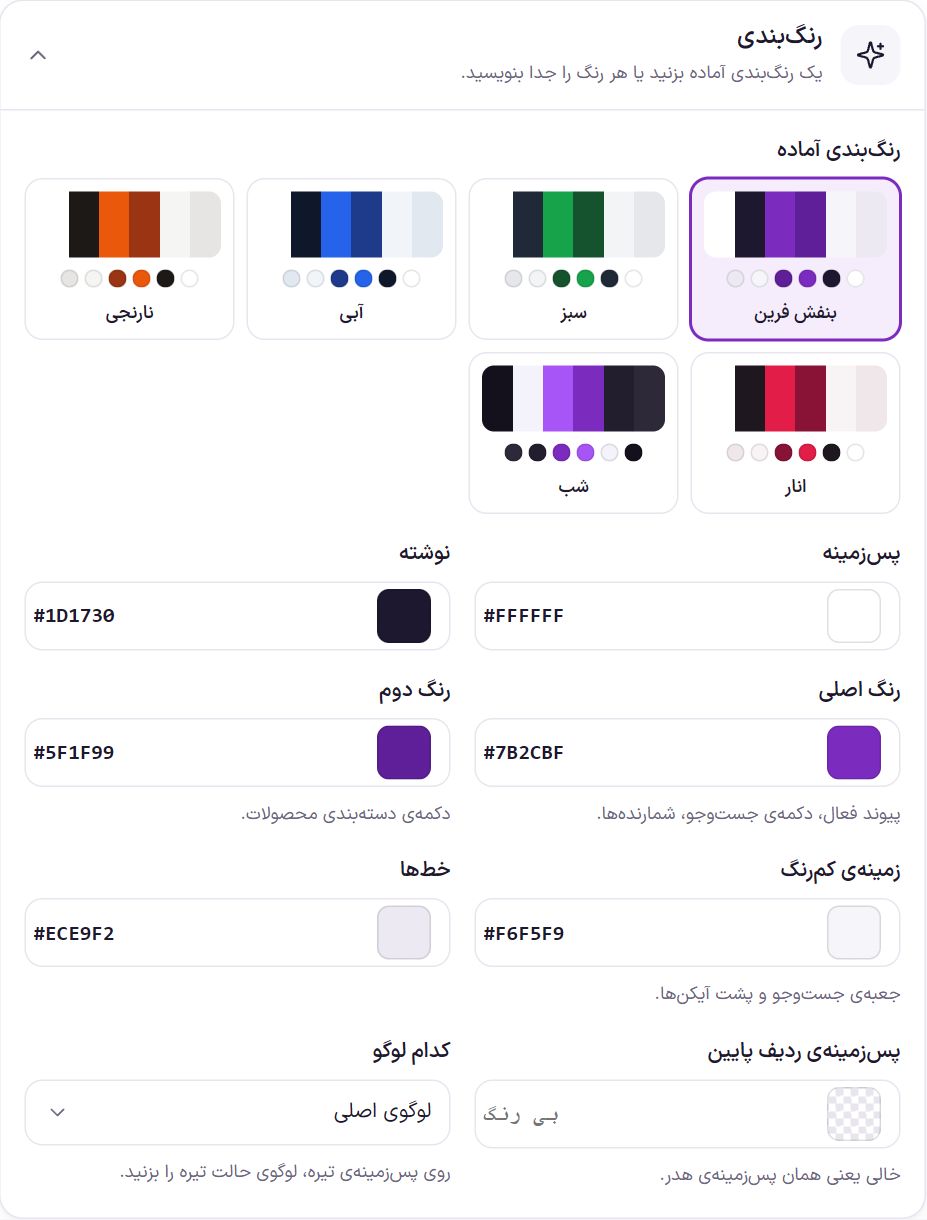
Ready-made color schemes: Farin Purple, Green, Blue, Orange, Pomegranate and Night (dark background). Clicking one changes the first six colors in the table below together. You can set each color with the color picker or by typing its code (such as #7B2CBF).
| Option | What it does | Default |
|---|---|---|
| Background | The header background color. | #FFFFFF |
| Text | The color of texts and icons. | #1D1730 |
| Main color | Active link, search button, counters. | #7B2CBF |
| Second color | The product categories button. | #5F1F99 |
| Light background | The search box and the background behind icons. | #F6F5F9 |
| Lines | Divider lines. | #ECE9F2 |
| Bottom row background | A separate color for the bottom row. Empty means the header’s own background. | Empty |
| Which logo | “Main logo” or “Dark mode logo”. On a dark background, choose the dark mode logo. Both logos are uploaded in Site Identity . | Main logo |
Background and pattern
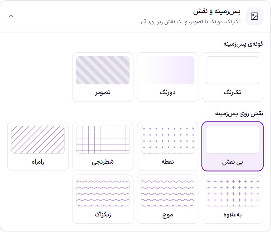
| Option | What it does | Default |
|---|---|---|
| Background type | Solid, two-tone or image. | Solid |
| Second background color | Two-tone mode only. The first color is the “Background” in the color scheme. | #F3E8FF |
| Angle | Two-tone mode only. The direction from the first color to the second, from 0 to 360 degrees. | 90 degrees |
| Background image | Image mode only. Suggested size 1920 × 160. | |
| How the image is laid out | “Fill the whole header” or “Repeat (tile)”. | Fill the whole header |
| Color overlay on the image | The background color sits over the image at this strength (percent) so the text stays readable. | 0% |
| Pattern over the background | None, dots, checkered, striped, plus, wave or zigzag. | None |
| Pattern color | When a pattern is chosen. | #7B2CBF |
| Pattern strength | From 2 to 40 percent. The pattern should be subtle so the texts stay readable. | 8% |
| Pattern size | From 8 to 64 pixels. | 20 |
Glass and sticky
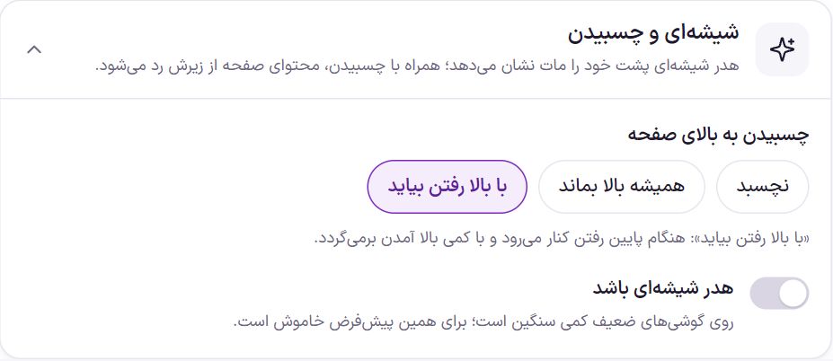
| Option | What it does | Default |
|---|---|---|
| Sticking to the top of the page | “Don’t stick”: the header scrolls up with the page. “Always stay on top”: the header is always visible at the top of the page. “Show on scroll up”: it slides away when scrolling down and returns with a slight scroll up. | Show on scroll up |
| Glass header | The content behind the header is seen blurred. Combined with sticking, the page content passes under it. It is a bit heavy on weaker phones. | Off |
| Blur amount | Glass header only. From 2 to 30 pixels. | 14 |
| Background strength | Glass header only. From 30 to 95 percent; the lower, the more transparent. | 72% |
Frequently Asked Questions
If I change the ready-made layout, will I lose my colors?
No. A ready-made layout sets only the arrangement and frame. Colors, texts and menu links stay as they are.
My changes aren’t visible on the phone.
The phone and tablet header (under 1024 pixels) is separate and is set in Mobile Settings .
How do submenus open on tablets?
A landscape iPad and large tablets show the desktop header but have no mouse. On them, the first touch on an item with a submenu (or on “Categories” and each category of the mega menu) opens the submenu and a second touch goes to its page. Touching anywhere else on the page closes the submenu. With a mouse it opens by hover as usual, and it can also be opened with the Tab key.
How do I remove search or the wishlist from the header?
Open “Edit layout” and drag that element to the “Unused” row.
I put the support phone in the header but it isn’t visible.
This element is not shown without a number. In the layout window, click it and write the “Number”.
Farin Theme · 1405