
Attributes and Brands
Attributes are things shared across products, such as color, storage or size. Store filters and the selection buttons on the product page are built from them. Brands are also managed here with their logo and color, and size charts are built for the product page's size guide.
Where is it? Farin → Attributes and Brands
Attributes
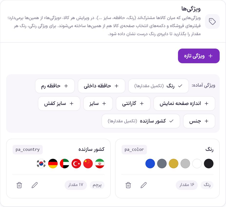
In each product’s edit screen, the “Attributes” section draws from this list. So create “Color” once here with its values and use it in all products. Each card shows the attribute’s Latin slug (such as pa_color), a few sample values, the option style and the number of values, and has edit and delete buttons.
Ready-made attributes
With one click, a complete attribute is created with its values: color (with a color for each value), internal storage, RAM, screen size, warranty, size, shoe size, material and country of manufacture (with each country’s flag). If the attribute already exists, a check mark and “(complete values)” appear beside its name. Clicking it only adds the missing values and does not touch your values.
Creating or editing an attribute
- Click “New attribute”. For an existing attribute, click the edit button on its card.
- Fill in “Attribute settings”. Give the name, Latin slug and option style, then click “Save attribute”.
- Add the values. In the “Values” section, create each value with “New value” and, for a color attribute, set its color.
| Option | What it does |
|---|---|
| Name | The attribute name the shopper sees, for example “Color”. |
| Latin slug | It appears in the address of filtered pages and cannot be changed after creation. Choose it carefully from the start, such as color. |
| Option style | “Text”, “Color”, “Image” or “Flag”. This same style is used in the filters and the selection buttons on the product page. |
| Name beside swatch | Only for color, image and flag. “With name”: each value's name beside its circle or flag. “Circle only”: the name shows on hover or long press. “Same as settings”: the one in Product page → Colors and swatches applies. This choice takes precedence over that setting. |
| Value order | “Manual (drag)”, “Alphabetical”, “Numeric” or “By creation order”. |
| Give each value its own page | Each value, such as “Red”, gets a page listing its own products. |
Each value has these options. Which ones you see depends on the “Option style”:
| Option | What it does |
|---|---|
| Name | The value name, such as “Black” or “128 GB”. |
| Slug | The Latin part of the address. If left empty, it is built from the name. |
| Color | The color of this value’s swatch. |
| Second color (two-tone) | Optional. The swatch is split half and half into two colors; for two-tone products such as “Black and white”. |
| Image | A small image that sits in the swatch instead of a color, such as a fabric pattern. |
| Flag | Choose the country from the flag list, searching by country name. If the value name is empty, the country name is used. |
Color and Black. English pages (/en/) show this in filters and product selection buttons, and an empty field means the Persian is used.Brands
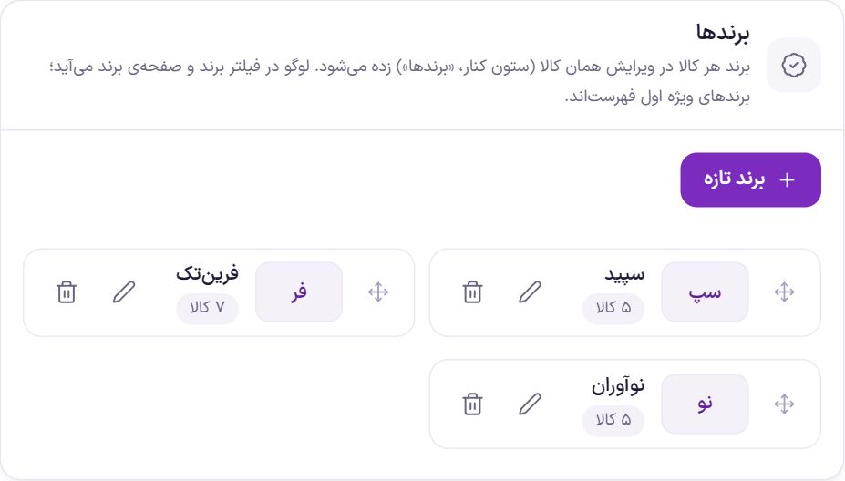
A product’s brand is set on that product’s edit page, in the side column under “Brands”. Here you create and arrange the brands themselves. Change the order by dragging the handle; featured brands are always at the top of the list. This section uses WooCommerce’s own brands; if WooCommerce is outdated, you will see a message to update it.
With “New brand” or the edit button, the brand window opens:
| Option | What it does |
|---|---|
| Name | The brand name. Required. |
| Latin name | Optional, such as Apple. |
| Slug (in the address) | Part of the brand page’s address. If left empty, it is built from the name. |
| Brand website | The brand’s official website address. |
| Logo | Suggested size 200 × 100, transparent PNG. It appears in the brand filter and on the brand page. |
| Brand color | Optional. When there is no logo, the brand’s circle in the filters is drawn in this color. |
| Featured brand (top of lists) | The brand comes first in lists, such as the brand filter. |
| Description | Like categories: “One line under the title (top of page)” or “Article at the bottom of the page (for SEO)” with an “Article title” and “Text”. |
If the site's English version is on, under “Name”, “Article title” and “Text” there is also an “English (optional)” field, and “Same Latin name” puts the brand's Latin name into the English name field in one click. An empty field means the English page shows the Persian.
Deleting a brand does not delete products; they just no longer have that brand. Before deleting, you see the number of these products.
Size chart
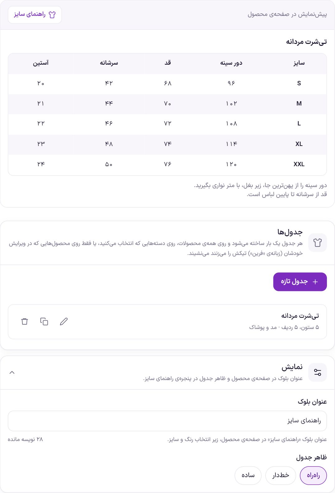
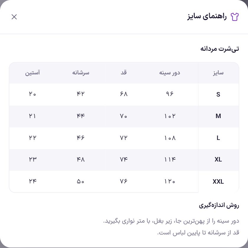
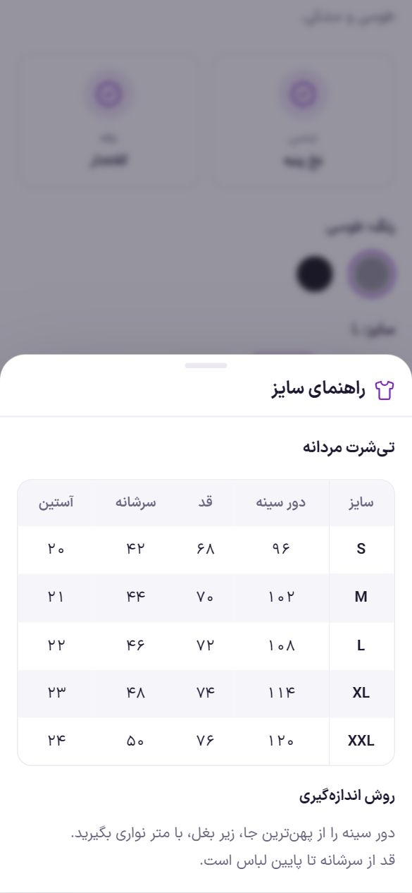
A size chart is built once and applies to any number of products: all products, products in several categories, or only the products you tick yourself. On the product page, the “Size guide” block appears under the color and size selection, and clicking it opens a window with the charts and the measuring method.
Creating a chart
- Click “New chart”. For an existing chart, click the pencil button beside it. The duplicate button makes a copy of the chart; it saves work for similar charts, such as men's and women's.
- Enter the chart name. For example “Men's T-shirt”. If a product has several charts, this name appears on each chart's tab in the window.
- Choose “Show on”. This sets which products the chart applies to automatically (see the table below).
- Fill in the chart cells. The first row is the header and the first column is the size. “Add row” and “Add column” enlarge the chart, and the cross beside each row or above each column removes it.
- Add a measuring method and an image if you like Then click “Save”. The chart appears in the list and is saved automatically.
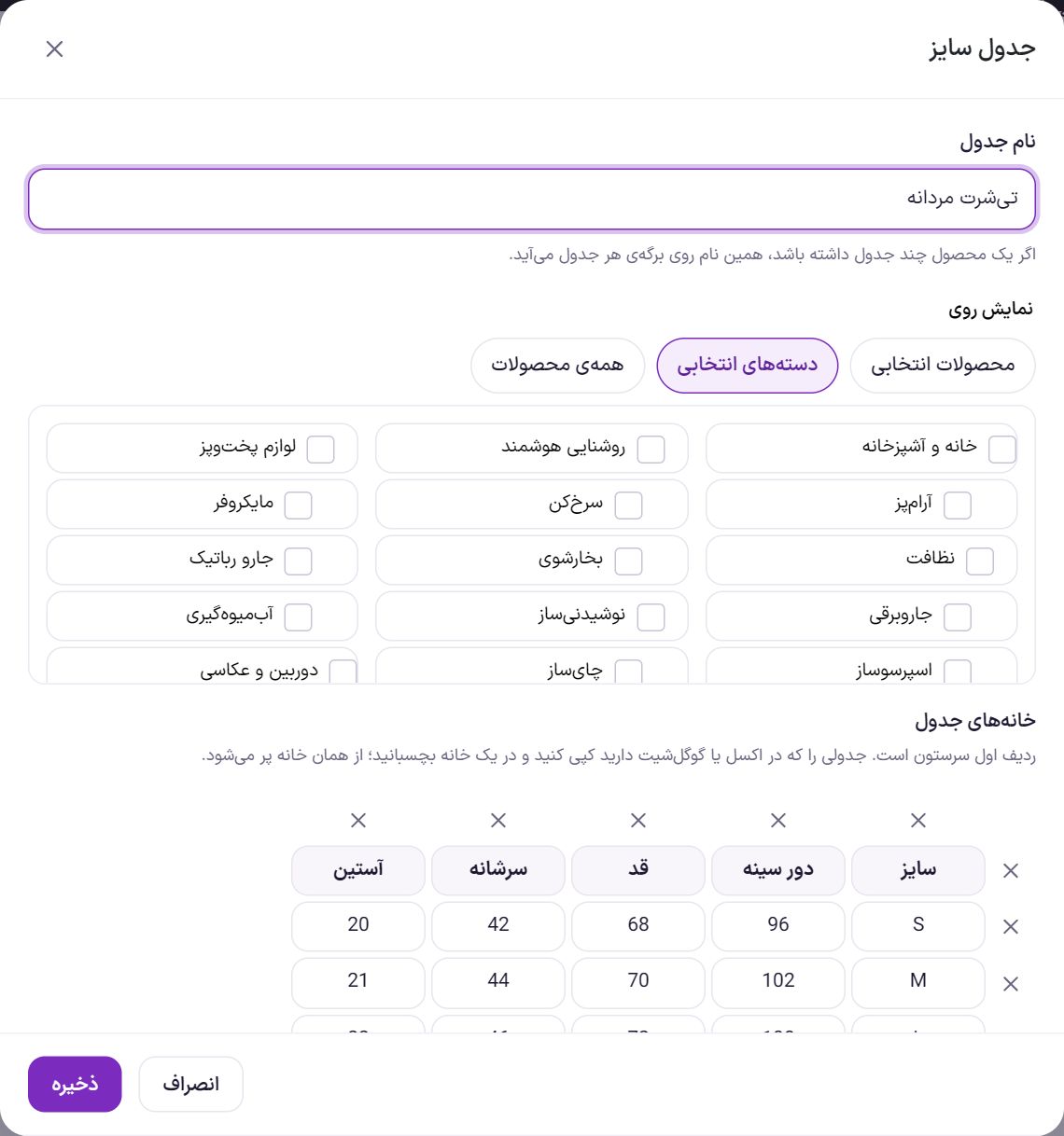
| Option | What it does |
|---|---|
| Chart name | Up to 60 characters. Required. |
| Show on: Selected products | The chart is not placed automatically. Tick it in each product's edit page (see below). |
| Show on: Selected categories | Appears on products in the ticked categories and all their subcategories. For example, ticking “Men's clothing” also covers “Men's T-shirts” products. |
| Show on: All products | Appears on every product in the store; for a store that only sells clothing. |
| Chart cells | Up to 30 rows and 12 columns, each cell up to 40 characters. Numbers are shown with Persian digits on the site, and “42.5” appears as “۴۲٫۵”. |
| Measuring method | Optional, appears below the chart. For example “Measure around the chest at the widest point, under the armpits, with a tape measure”. |
| Measuring image | Optional, suggested size 800 × 600; for example a body diagram showing where each measurement is taken. On desktop it sits beside the measuring method text. |
Display settings
| Option | What it does | Default |
|---|---|---|
| Block title | The block title on the product page and at the top of the window, up to 40 characters. | Size guide |
| Chart appearance | “Striped” (alternate rows colored), “Lined” (lines between rows) or “Plain”. Colors come from the product page color scheme and support night mode too. | Striped |
In each product's edit page
On the product edit page, in the “Product data” section, open the “Farin” tab. The “Size guide” section is at the bottom of it.
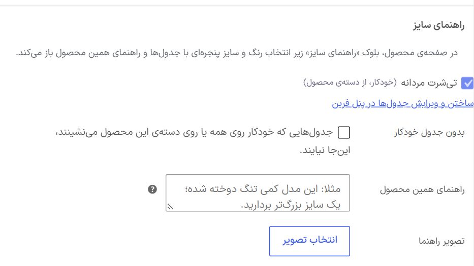
| Option | What it does |
|---|---|
| Charts | All size charts. Ticking a chart adds it to this product. Charts that apply automatically (from “All products” or from the product's category) are ticked and locked. |
| No automatic charts | Automatic charts do not apply to this product, and only the charts you tick yourself do; for a product that is in the clothing category but has its own separate chart. |
| This product's guide | A few lines specific to this product, shown in the window above the charts in a colored box. For example “This model runs large; take one size smaller”. |
| Guide image | An image specific to this product, shown beside those lines. |
If a product has no chart but has “This product's guide” or an image, the size guide block still appears for it.
On the product page
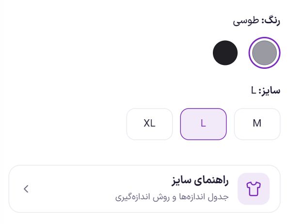
The block appears only on a product that has a chart or guide. You can change its position: in Product Page, place the “Size guide” element anywhere in the layout. In Elementor there is also a “Size guide” widget in the “Product page” group. Once the element is placed somewhere, it is no longer repeated under the options.
Frequently Asked Questions
In the color filter, only the color name appears instead of a color swatch.
Set that attribute’s “Option style” to “Color” and choose a color for each value. In Filters also set that filter’s style to “Color or image swatch”.
I want to change an attribute’s Latin slug.
The Latin slug cannot be changed after creation because it is used in the address of filtered pages. If you really need to, create a new attribute with the right slug and move the products to it.
I created the attribute; how do I assign it to a product?
Edit the product under “Products”. In the “Product data” section, on the “Attributes” tab, choose this attribute and select that product’s values.
Which ready-made charts are there?
Hoodies and sweatshirts, shoes and sneakers, rings, and chains and necklaces. They are not applied to any product until you select their categories. You can also change the button text; for example “Selection guide” for cosmetics.
I created a size chart but it isn't on the product page.
Check the chart's “Show on”. If it is “Selected products”, tick it in the product edit page (“Farin” tab → “Size guide”). If it is “Selected categories”, the product must be in one of those categories or their subcategories. “No automatic charts” must also not be on in that product's edit page.
Do size charts move to another site with “Backup and transfer”?
No. Each chart is tied to this site's categories and images and does not fit correctly on another site. Rebuild the chart there; if you have the chart in Excel, pasting builds it in a few seconds.
Farin Theme · 1405