
Product Page
This section builds the look of every product page: the place for the gallery, name, price, and buy button, store services, the description and reviews tabs, and related products. Changes apply to all products at once.
Where is it? Farin → Site content → Store and Products → Product Page
Preview and layout editing
The top of the page is a preview of the product page. The preview is shown with the store’s newest product; if there is no product yet, with a sample product. Use “Desktop” and “Mobile” to see both sizes.
The “Edit layout” button opens a window that shows the page in four rows:
- Top of the page: One wide column.
- Three main columns: “Right column”, “Middle column”, and “Left column”.
- Bottom of the page: Two columns, “Right” and “Left”.
- Footer of the page: One wide column.
Drag sections and drop them wherever you like, or tap one and move it with the arrow keys. You can also tap any section on the preview. Tapping a section brings that section’s settings up beside the window. The description of each section is in Page sections .
Product page style
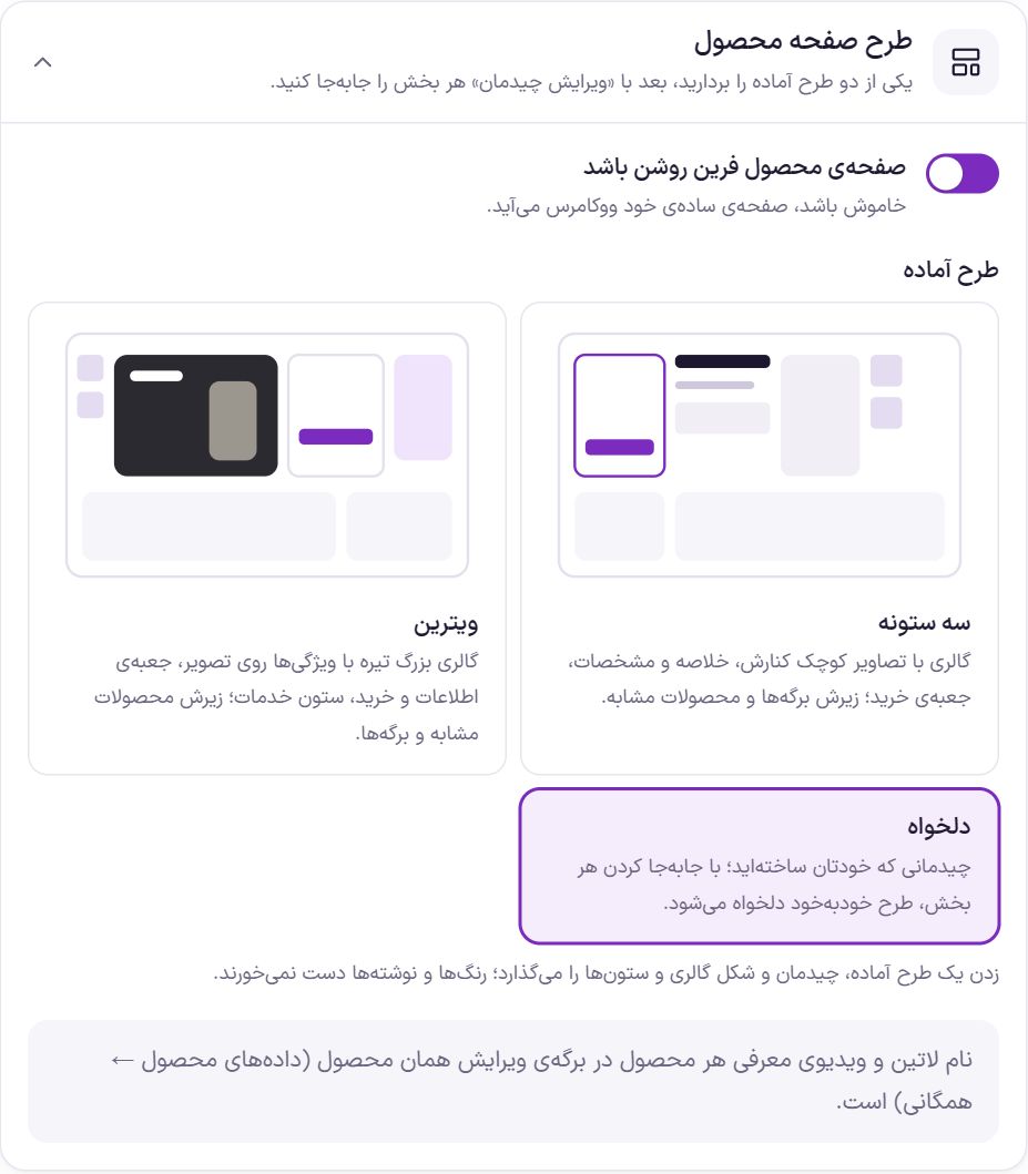
| Option | What it does | Default |
|---|---|---|
| Turn on the Farin product page | When off, WooCommerce’s own plain page appears. | On |
| Ready-made layout | “Three columns”: gallery with thumbnails beside it, summary and specifications, buy box; below it the tabs and related products. “Showcase”: a large dark gallery with features over the image, an info and buy box, a services column; below it related products and tabs. “Custom”: a layout you built yourself. Tapping a ready-made style sets the layout, gallery shape, and column widths; colors and texts are untouched. | Three columns |
The ready-made “Beauty” layout puts the photo and thumbnails on the right and the name, price and purchase on the left. Below it comes the services bar, and beside it a “Product specifications” card with tabs. In this layout the specifications have their own card and don't get a separate tab.
Fill in “Short line under name” also on the same product edit page, in the “Farin” section. This line appears in the product card under the name, like “Suitable for dry skin”. If left empty, the card keeps its previous form.
The “Gold & Jewelry” layout shows the photo full-frame and arranges the services in four columns under the buy button. On desktop, the photo's height matches the column beside it and the bottom of the photo aligns with the services row; so a photo with a square or slightly landscape frame works better. In the “Tabs” section settings you can set the title and the photo beside the description, and the “Frequently asked questions” tab. The photo beside the description is the last photo of each product's gallery. In the “Bottom-of-page banner” section, the “Newsletter signup form instead of button” switch brings in the newsletter form; the button text goes on the form's button and the link doesn't work. In this layout the banner photo is wide and covers the whole banner, so leave the text side on the right of the photo empty.
Farin product page or Elementor template
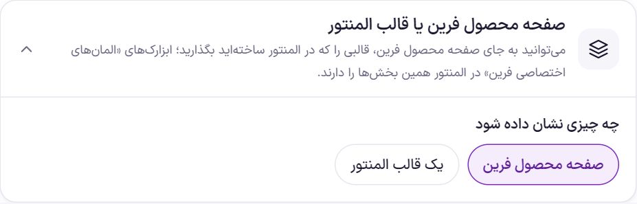
If you want to build the product page entirely in Elementor, create a template, place the “Farin Custom Elements” widgets in it, and select it here. These widgets contain the same sections as the product page and show the data of the product the buyer opened.
| Option | What it does | Default |
|---|---|---|
| What to show | “Farin product page” or “An Elementor template”. | Farin product page |
| Elementor template | Appears when “An Elementor template” is chosen. A template from “Templates → Saved Templates” in Elementor. Until a template is selected, the Farin product page remains. |
Width and columns
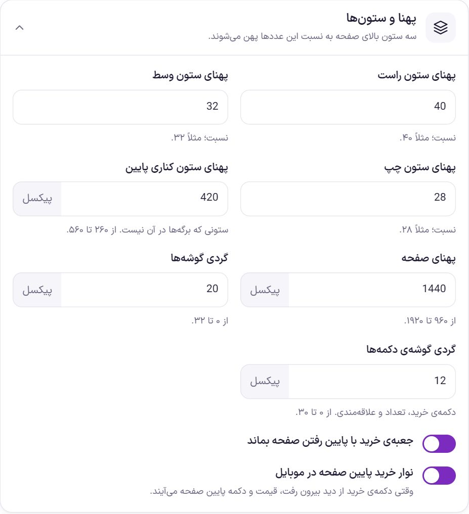
| Option | What it does | Default |
|---|---|---|
| Right column width | The width ratio of the right column in the three main columns. | 40 |
| Middle column width | The width ratio of the middle column. | 32 |
| Left column width | The width ratio of the left column. | 28 |
| Bottom side column width | In the bottom row of the page, the width of the column that does not hold the tabs; from 260 to 560 pixels. | 420 |
| Page width | The maximum content width, from 960 to 1920 pixels. | 1440 |
| Corner roundness | The corner roundness of cards and boxes, from 0 to 32 pixels. | 20 |
| Button corner roundness | The buy button, quantity, and wishlist; from 0 to 30 pixels. | 12 |
| Keep the buy box in view while scrolling | As the buyer scrolls down, the buy box stays in view. | On |
| Mobile bottom buy bar | On a phone, when the buy button scrolls out of view, the price and buy button appear in a bar at the bottom of the screen. | On |
The “Showcase” style sets the column ratios to 16, 30, and 54 so the gallery is larger.
Color scheme
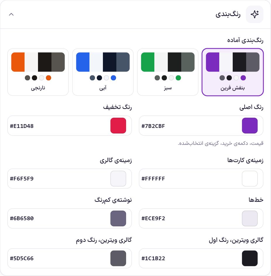
| Option | What it does | Default |
|---|---|---|
| Ready-made color schemes | Farin purple, green, blue and orange. | Farin Purple |
| Main color | Price, buy button, and the selected option. | #7b2cbf |
| Discount color | The discount percentage and label. | #e11d48 |
| Card background | The background color of the boxes. | #ffffff |
| Gallery background | The background behind the product image in the plain gallery. | #f6f5f9 |
| Lines | Edges and dividers. | #ece9f2 |
| Light text | Secondary texts. | #6b6580 |
| Showcase gallery, first color | The background color of the “Dark showcase” gallery. | #1c1b22 |
| Showcase gallery, second color | The second background color of the “Dark showcase” gallery. | #5d5c66 |
Colors and swatches
Options whose shape is a color, image or flag (such as “Color” or “Country of manufacture”) are shown in two ways:
- With name: Its name appears beside each circle or flag, like “Olive” or “Yellow”. The selected option gets a tick, and an option that's unavailable with the other selections turns dashed and faint but stays visible.
- Circle only: Just the circle or flag. Its name shows on hovering over it, or on a phone, by long-pressing; the selected option also appears beside the attribute title, like “Color: Olive”.
| Option | What it does | Default |
|---|---|---|
| Default everywhere | One of the two forms above, for every place where it isn't set separately. | Circle only |
| Product page | All product page layouts, the Elementor template and the “Select and buy” and “Full product page” widgets. In each Elementor widget you can also set “Name beside colors” separately. | Same as default |
| Quick select | The window that the product card's buy button opens for choosing color and variation. | Same as default |
| Product card | The colors on the card in the store and widgets. With name, they appear under the product name (three, plus the count of the rest). | Same as default |
| Filters | Color or image filter on the store page. | Same as default |
Each attribute can also have its own choice, for example color with name and country with flag only: in Attributes, set “Name beside swatch” for that attribute. The attribute's choice takes precedence over the setting here. In the English version of the site, each value's English name is shown.
Page sections
These are the sections you move in “Edit layout”. Any section you do not place in the layout does not appear on the page.
| Section | What it shows |
|---|---|
| Breadcrumb | Home › Category › Product. It comes from WooCommerce itself. |
| Image gallery | The main image, thumbnails, zoom, and the introduction video. |
| Name and rating | Brand, name, Latin name, tags, and rating. |
| Short description | The same “Product short description” in the product edit page. |
| Key features | The product’s first few features, with icons. |
| Specifications summary | The first few rows of specifications and the “View all” link. |
| Price | Price, price before discount, and discount percentage. When a color or variation is selected, that variation’s price is shown. |
| Colors and variations | Choosing color, storage, size, and the like, separate from the buy box. Colors become color circles and the rest buttons; when a variation is selected, that variation’s price, image, and installment amount appear. If this section is not in the layout, the options appear in “Options and buy”; if it is, they are not repeated there. |
| Options and buy | Quantity and the add to cart button. |
| Size guide | A block that opens this product's window of charts and size guide. The charts are built in Attributes and brands → Size chart . If it isn't in the layout, it appears under the color and size selection; a product with no chart doesn't have this block. |
| Buy in installments | Installment services, with the number and amount of installments computed from this product’s price. |
| Wishlist, compare and installments | Wishlist, compare, share and installment purchase buttons. |
| Store services | Delivery, guarantee, returns, and consultation. In a narrow column it is a list, and in a wide place (such as the “Footer of the page”) it becomes a horizontal row. |
| Seller | “Seller: store name” under the buy button. |
| Plugins | Anything plugins place beside the buy button, such as installments, comparison, or stock notices. |
| Tabs | Description, technical specifications, reviews, and tabs that plugins add. |
| Related products | Products from the same category and tags. |
| Product slider | A sliding row of products from the same category, best sellers first. |
| Elementor template | A template built in Elementor, inside every product page. |
| Custom section 1 and 2 | Text, HTML or shortcode. |
Image gallery settings
| Option | What it does | Default |
|---|---|---|
| Gallery style | “Simple and light” or “Dark showcase”. In the dark showcase, the Latin name and key features appear over the image. | Simple and light |
| Thumbnail position | “Right”, “Left”, “Bottom”, or “No thumbnails”. | Right |
| Enlarge on click | Clicking the image opens a larger version. | On |
| Image navigation arrows | “Glass”, “White”, “Dark”, or “No arrows”. The zoom button takes the same style. With “No arrows”, images change by swiping or tapping the thumbnails. | Glass |
| Show arrows only when the pointer is over the image | On a computer, the arrows stay hidden until the pointer is over the image. On mobile and tablet they are always visible. | Off |
| Arrow size | From 32 to 64 pixels. | 44 |
Name and rating settings
| Option | What it does | Default |
|---|---|---|
| Name style | “Name only” or “Large Latin name, Persian name below it”. | Name only |
| Brand above the name | The product’s brand from WooCommerce brands (Products → Brands). | On |
| Rating and review count | The stars and the number of reviews posted. | On |
| “New” label for how many days | A product gets the “New” label for this many days after publication. Zero means never. | 30 days |
Key features and specifications summary settings
| Option | What it does | Default |
|---|---|---|
| How many features | In “Key features”: the product’s first few features, from 0 to 8. Features such as camera, chip, screen, and battery have their own icon. | 4 |
| How many rows | In “Specifications summary”: from 0 to 12. All specifications are in the “Technical specifications” tab. | 5 |
Options and buy settings
| Option | What it does | Default |
|---|---|---|
| Quantity selector | The buyer chooses the quantity before adding to the cart. | On |
| Number sold | From WooCommerce’s own sales count. | On |
| Remaining stock | For products that have “Stock management”. | On |
| Show remaining only when fewer than | The remaining amount is shown only when stock is below this number. 0 means always. | 10 |
| Production and expiry date | The dates you wrote in Shamsi (Jalali) format in each product’s edit page, “Product data → General”. | On |
| Default variation of a variable product | “The one set on the product” (in the product edit page → Variations → “Form defaults”), “None; the buyer chooses”, or “The cheapest available variation”. The price written on the card and at the top of the page is this variation’s price; with no default variation, “From” the cheapest price is written. | The one set on the product |
| “Added to cart” message | After a product is added (from the product page or the shop cards), a small card with the product image appears at the bottom of the page and disappears by itself. The page does not change. | On |
| Stay for how many seconds | Applies when the message is on. From 2 to 10 seconds. | 4 |
| “View cart” button in the message | A button in the same message that goes to the cart. | On |
| Price beside the buy button | When the “Price” section is not placed separately in the layout, the price appears beside the button. | Off (on in the Showcase style) |
A variation option that is not available with the other choices is dimmed and disabled.
Installment purchase settings
| Option | What it does | Default |
|---|---|---|
| Title | The box heading, up to 60 characters. | Buy this product in installments |
| Installment services | Up to eight rows. Each row: “Logo” (SnappPay, TorobPay, DigiPay, Blu Bank, or no logo), “Service name”, “Number of installments”, “Down payment %”, “From price”, and “To price”. | Three sample rows |
| Note under the list | Up to 200 characters, under the list of services. | Sample text about the final terms |
Each installment amount = (product price minus down payment) divided by the number of installments, rounded up. For example, for a 12,000,000 Toman product with a 0 down payment and 4 installments, each installment is written as 3,000,000 Toman. An empty “From price” and “To price” means no limit; a product outside this range does not show that service.
Wishlist, compare and installment settings
| Option | What it does | Default |
|---|---|---|
| Wishlist button | The buyer adds the product to their wishlist. For a buyer who is not logged in, the list is kept in the same browser. | On |
| Compare button | Adds the product to the compare list; up to four products appear side by side. | On |
| Share button | On mobile, the phone's own share sheet opens. On desktop, Telegram, WhatsApp, X and copy link appear. | On |
| Installment button text | Up to 30 characters. | Buy in installments |
| Installment page address | The page that explains the installment terms. With no address, the installments button does not appear. | Empty |
Store services settings
| Option | What it does | Default |
|---|---|---|
| Services | Up to eight rows, each with an “Icon”, a “Title”, and a “Short text”. A row without a title is not saved. | Fast delivery, guaranteed authenticity, 7-day return guarantee, support |
| Consultation text | Up to 30 characters. | Purchase consultation |
| Consultation phone | The phone number for purchase consultation, beside the “Consultation text”. With no number, this row does not appear. | The phone number saved in Site Identity |
| Colored card when it is alone in a column | When services are the only section in a column, they are shown in a colored card. | Off (on in the Showcase style) |
Seller settings
| Option | What it does | Default |
|---|---|---|
| “Seller: store name” | The store name under the buy button. In a marketplace with the Dokan plugin, the name and link of that product’s seller appear. | On |
Tabs settings
| Option | What it does | Default |
|---|---|---|
| Description tab name | Up to 30 characters. | Description |
| Specifications tab name | Up to 30 characters. | Technical specifications |
| Reviews tab name | Up to 30 characters. | User reviews |
| Title above description | For example “About this product”. If left empty, no title appears. | Empty |
| Photo beside description | Places the last photo of each product's gallery beside the description, or the main photo if there is no gallery. | Off |
| Questions tab name | Up to 30 characters. | FAQ |
| FAQ | Questions and answers that appear on all products; up to twelve rows. If left empty, the tab doesn't appear. | Empty |
Tabs that plugins add appear in the same style. You can also build each product’s description in Elementor.
Related products and product slider settings
| Option | What it does | Default |
|---|---|---|
| Heading (related products) | Up to 40 characters. | Related products |
| How many products (related products) | From the same category and tags, from 0 to 12. | 3 |
| Heading (product slider) | Up to 40 characters. Leave empty and the slider does not appear. | Related products |
| How many products (product slider) | From the same category, best sellers first; if there are few, from the store’s best sellers. From 4 to 20. | 10 |
Elementor template and custom sections settings
In the “Elementor template” section, choose one of Elementor’s “Templates → Saved Templates” to show it in every product page, where you placed the section. If no template is saved yet, create one in Elementor first.
“Custom section 1” and “Custom section 2” each take up to 4,000 characters of text, HTML, or shortcode and are saved with “Apply”. An empty section is not shown. If your account is not allowed to write free HTML, unsafe tags are removed before saving.
Frequently Asked Questions
I want only one product to look different.
This section’s look is the same for all products. Things that differ per product are read from the product itself: images, short description, features, Latin name, video, and dates. For content special to one product, build its description in Elementor.
Why does a variable product’s card say “From …”?
When “Default variation of a variable product” is set to “None; the buyer chooses”, or the product has no default variation, the cheapest price is written with “From”. To show one specific price, remove “The cheapest available variation” or set “Form defaults” for the product.
The remaining count does not appear for some products.
This count appears only for a product with stock management turned on in Edit product → “Inventory”, and only when stock is below “Show remaining only when fewer than”.
Farin Theme · 1405