
Footer
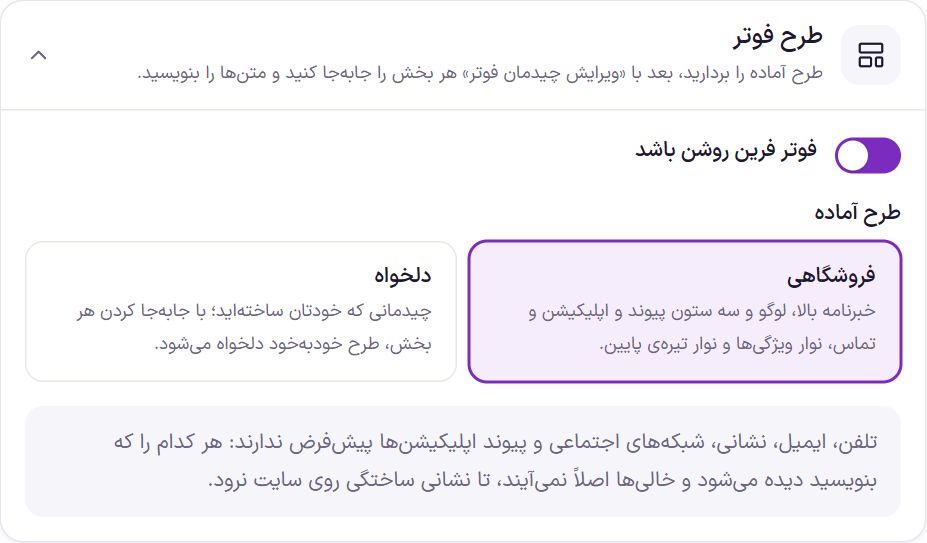
The footer is at the bottom of all the store’s pages: newsletter, logo and about, link columns, contact methods, trust badge and gateway badges. In this tab you pick a ready-made layout, move each section with “Edit footer layout”, and write the texts and colors. Every change is saved on the spot.
Where is it? Farin → Site content → Site Appearance → Footer
Footer layout
| Option | What it does | Default |
|---|---|---|
| Farin footer enabled | When off, the footer is not printed on the site and the preview remains for viewing only. | On |
| Ready-made layout: Store | Newsletter on top; logo, three link columns, app and contact in columns; a features bar with the trust badge; and a dark bottom bar with gateway badges, links and copyright. | Selected |
| Custom | A layout you built yourself. Moving any section turns the layout into Custom automatically. |
Edit footer layout
The “Edit footer layout” button above the tab opens a window with four rows. Click an empty spot of the footer in the preview, or the “Footer frame” button at the top of the window, and the footer's own width and height appear beside the window (the same “Width and size” box):
| Row | Place |
|---|---|
| Top of footer | Full width; in the Store layout, the newsletter. |
| Columns | Sections sit side by side from right to left. |
| Features bar | Two sections, right and left. |
| Bottom bar | Two sections, right and left. |
Drag sections and drop them in any row, or click one and move it with the arrow keys or the “One forward” and “One back” buttons. Move a section you don’t want to “Unused”. “Undo” takes back the last move and “Reset to defaults” restores the theme’s first layout. Clicking a section opens its own settings in this same window:
| Section | Settings |
|---|---|
| Newsletter | “Title”, “Text”, “Text inside the box” (default “Email or mobile number”), “Button text” (default “Subscribe”) and “Envelope and letter image beside the card” (on). The shopper gives an email or a mobile number. |
| Logo and about | “Slogan under the logo”, “About text” (up to 400 characters) and the addresses of your pages on social networks: Instagram, Telegram, WhatsApp, X, YouTube, LinkedIn, Aparat, Rubika, Eitaa and Bale. The footer logo is in Site Identity ; if you don’t set a separate one, the header logo is used. |
| Link column 1 to 4 | Each column’s title and links are written in the “Footer links” box (further down). |
| App download | “Title”, “Short text” and the app’s address on Google Play, App Store, Cafe Bazaar and Myket. Each button appears with its own address; with no address at all, this column does not appear. |
| Contact us | “Title”, “Phone” (separate several numbers with commas), “Response hours”, “Email” and “Address”. Each line appears only when filled in. |
| Store features | Up to six short cards, each with an icon, a title and a short text; such as “Fast shipping”. A card with no title is not saved. Four default cards: Return guarantee, Authenticity guarantee, Fast shipping and Support. |
| eNamad | “Show badge in footer” (next table) and “Footer badge code” (eNamad, PayPing or any other badge). Other badges, such as Samandehi and PayPing, are placed in eNamad and are shown on the all-badges page. |
| Gateway badges | Three switches: “Shetab”, “Shaparak” and “Active payment gateways” (the logo of every gateway turned on in Payment gateway , in the same order). All three are on by default. |
| Bottom links | They are written in the “Footer links” box. |
| Copyright text | Up to 300 characters. {site} becomes the site name and {year} becomes this year’s Jalali year. Simple links and bold text are allowed. |
| Custom section 1 and 2 | Text, HTML or shortcode, up to 4,000 characters. It is saved with “Apply”. If left empty, it is not shown. |
“Show badge in footer” has three methods (full explanation in eNamad):
| Method | What it does |
|---|---|
| Theme image, badge link | The theme image; clicking it opens the store's inquiry page and the provider site's image is not loaded. A code without a link (like PayPing) sends the click to the all-badges page. |
| Theme image, all-badges page | The theme image; clicking it opens the /enamad/ page, which shows all the badges side by side. |
| The badge code itself | The badge code (any badge) sits in the footer itself and the theme image steps aside. Until there is code, depending on the switch “Until there is a badge code, show the theme image”, it shows either the theme image or nothing. |
Put the eNamad code in exactly as the eNamad site gives it after you receive the badge, complete and unchanged.
Footer links

All the links of the columns and bottom bar are in this box. For each column:
| Option | What it does |
|---|---|
| Column title | Up to 30 characters. Defaults: “Customer service”, “Shopping guide”, “Quick access” and “Other links”. |
| Where the links come from | “List here”: you write the links in this box. “WordPress menu”: the links come from a menu assigned in Appearance ← Menus to “Footer column 1” (or 2nd, 3rd, 4th). “Store categories”: the main categories that have products, in the categories’ own order. |
| Links | Each row has a “Text” and an “Address”. The address can be a site path (/faq/) or a full one (https://…). A row with no address is not saved. |
| How many categories | Only in the store categories mode. From 2 to 12; default 6. |
Under each address you see which page it goes to. If a page with that address has not been created yet, you can create it right there. The “Create all missing pages” button at the top of the box creates pages in one go for all links that have none. These pages are empty and published, and their title is the link’s text; write their content afterward.
The “Store - Gold & Jewelry” layout is dark: logo with tagline, three link columns and a newsletter with social networks below it, and a copyright line at the bottom. The “Social networks under form” switch in the newsletter settings puts the icons under the form, and they are no longer repeated beside the logo.
The “Store - Beauty” layout has a light row: a stacked newsletter, a “Social networks” column, two link columns and the logo with tagline. The network URLs are entered in the “Logo and about” box, and when the networks column is in the layout, the icons are not repeated under the logo.
The default footer link pages, such as About us, Terms and Contact, are created automatically with ready-made text when the theme is installed. Align their text with your store using Elementor. A page you created yourself or deleted is not created again.
Link column 4 is not in the footer in the Store layout. To show it, drag it from “Unused” to the columns row in “Edit footer layout”.
Farin footer or Elementor template
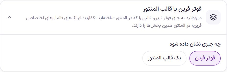
“What to show”: “Farin footer” (default) or “An Elementor template”. In the second case, choose the template from the “Elementor template” list; this list is the templates in Templates ← Saved Templates in Elementor. Until a template is chosen, the Farin footer stays. The “Farin Custom Elements” widgets have these same footer sections in Elementor; more in Elementor Widgets.
Footer colors
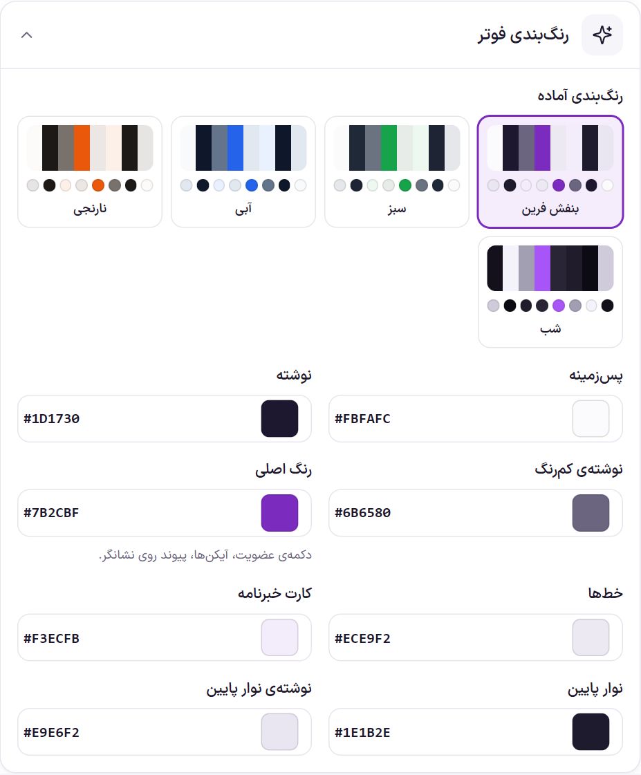
Ready-made schemes: Farin Purple, Green, Blue, Orange and Night (dark background).
| Option | What it does | Default |
|---|---|---|
| Background | The footer background. | #FBFAFC |
| Text | Headings and main text. | #1D1730 |
| Light text | Secondary texts. | #6B6580 |
| Main color | The subscribe button, icons and link hover. | #7B2CBF |
| Lines | Divider lines. | #ECE9F2 |
| Newsletter card | The newsletter card background. | #F3ECFB |
| Bottom bar | The background of the footer’s bottom bar. | #1E1B2E |
| Bottom bar text | The texts of that same bar. | #E9E6F2 |
Background, pattern and width
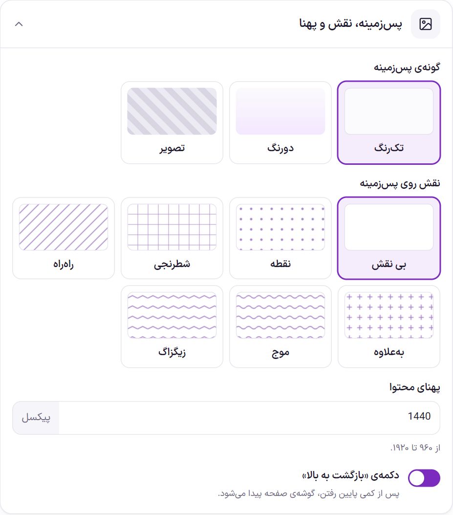
| Option | What it does | Default |
|---|---|---|
| Background type | Solid, two-tone or image. | Solid |
| Second background color | Only in two-tone mode. The first color is the “Background”. | #F3E8FF |
| Angle | Only in two-tone mode. The direction going from the first color to the second. | 180 degrees |
| Background image | Only in image mode. Suggested size 1920 × 600. | |
| Color overlay on the image | From 0 to 95 percent. The background color sits over the image so the texts stay readable. | 70% |
| Pattern over the background | None, dots, checkered, striped, plus, wave or zigzag. | None |
| Pattern color | When a pattern is chosen. | #7B2CBF |
| Pattern strength | From 2 to 40 percent. | 6% |
| Pattern size | From 8 to 64 pixels. | 22 |
| “Back to top” button | After scrolling down a little, it appears in the corner of the page. | On |
Width and size
| Option | What it does | Default |
|---|---|---|
| Footer width | “Full width” runs edge to edge of the page. “Box (card)” is a card at the content width with rounded corners, set away from the page edges. | Full width |
| Content width | The maximum width of the footer layout, from 960 to 1920 pixels. | 1440 |
| Top and bottom spacing of columns | This changes the height of the footer's main section, from 16 to 120 pixels. | 48 |
| Bottom bar height (copyright) | From 40 to 140 pixels. | 72 |
| Corner roundness | Box mode only. From 0 to 40 pixels; on mobile, at most 16. | 24 |
| Distance from page edges | Box mode only. From 0 to 48 pixels; on mobile, at most 8. | 16 |
Frequently Asked Questions
The phone number or Instagram is not visible in the footer.
These have no defaults and do not appear until you write them. In “Edit footer layout”, click the “Contact us” or “Logo and about” section and fill them in.
Where do I put the eNamad code?
In “Edit footer layout” click “Trust badge” and put the code in “Footer badge code”, or on the “Trust badge” tab; both are the same setting. Until there is code, the theme image is shown without a link (in method three, depending on its switch, the theme image or nothing).
Do I have to change the copyright year every year?
No. In the copyright text, instead of a number, write {year} ; it always becomes this year’s Jalali year.
Farin Theme · 1405