
Page builder editor and elements
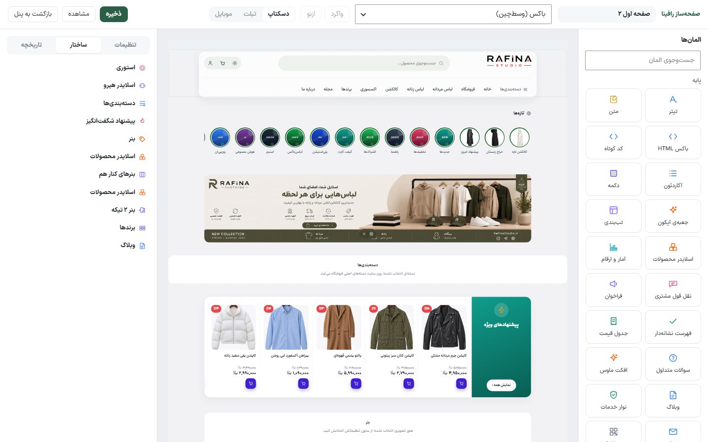
The page builder editor is where you arrange and configure a page’s sections by dragging and dropping. Everything you see on the canvas is the site page itself, so the result is exactly what customers will see.
Where is it? Rafina Panel → Site content → Page builder and layout → The “Edit” button on each page
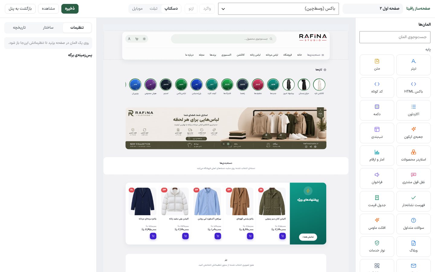
Editor top bar
| Option | What it does |
|---|---|
| Page title | The field next to “Rafina page builder”. Rename the page here; this name appears in the pages list. |
| Page width | Two options for the whole page: “Boxed (centered)” and “Full width”. Because all sections move together, a “Change the whole page width to …?” dialog appears first and it applies only with “Yes, change it”; “Cancel”, the Esc key or clicking outside changes nothing. |
| Undo / Redo | Reverts the last change or redoes it. |
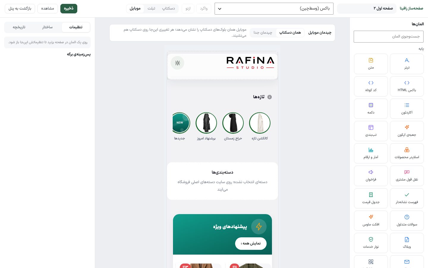
| Desktop / Tablet / Mobile | Changes the canvas size so you can see how the page looks on each device. If “App-style” mode is selected in “Mobile settings”, tablet and mobile are turned off, because phones show the app layout rather than this page. In tablet and mobile views, the “Mobile layout” bar appears above the canvas (see below). |
| Save | Saves every change instantly. If the page is not yet the default for its area, the “Display default” dialog asks whether to make it the default; it is not pre-ticked, and “Save only” saves the page without making it the default. |
| View | Opens the page on the live site in a new tab. |
| Back to panel | Returns to the page builder’s pages list. |
Mobile layout: same as desktop or separate
When you click “Tablet” or “Mobile”, the “Mobile layout” bar appears above the canvas with two options. Tablet also uses the mobile layout, because the site’s mobile breakpoint is 782 pixels.
| Option | What it does |
|---|---|
| Same as desktop | Default. Phones show the same desktop blocks, and any change you make in this view also applies to desktop. |
| Separate layout | A second list of blocks that appears only on phones and tablets. The first time, it is copied from the desktop layout so you don’t start from a blank page; after that, every change affects only mobile and desktop is left alone. All desktop elements are available here too. |
| Copy again from desktop | Separate mode only. Replaces the mobile layout with today’s desktop layout; it asks first and can be undone with “Undo”. |
Autosave
Three seconds after the last change, the page is saved automatically and “Saved at …” appears beside the buttons. Autosave never makes a page the default. If you close the tab with an unsaved change, that change is sent before it closes. The states you see beside the save button are: “Unsaved changes”, “Autosaving…”, “Saved” and “Not saved” (with the reason the server gave).
Canvas and elements column
The right “Elements” column shows all 58 elements in five groups: “Basic”, “Media”, “Store”, “Corporate” and “Layout”, with an “Search elements” box above it. To add one, drag the element and drop it where you want on the canvas, or click it to add it at the end of the page.
Below the canvas, “Zoom” shows the scale at which the page is shrunk to fit the middle column. “Loading page…” appears until the site page has loaded in the canvas; if it fails, an error message with a “Try again” button appears.
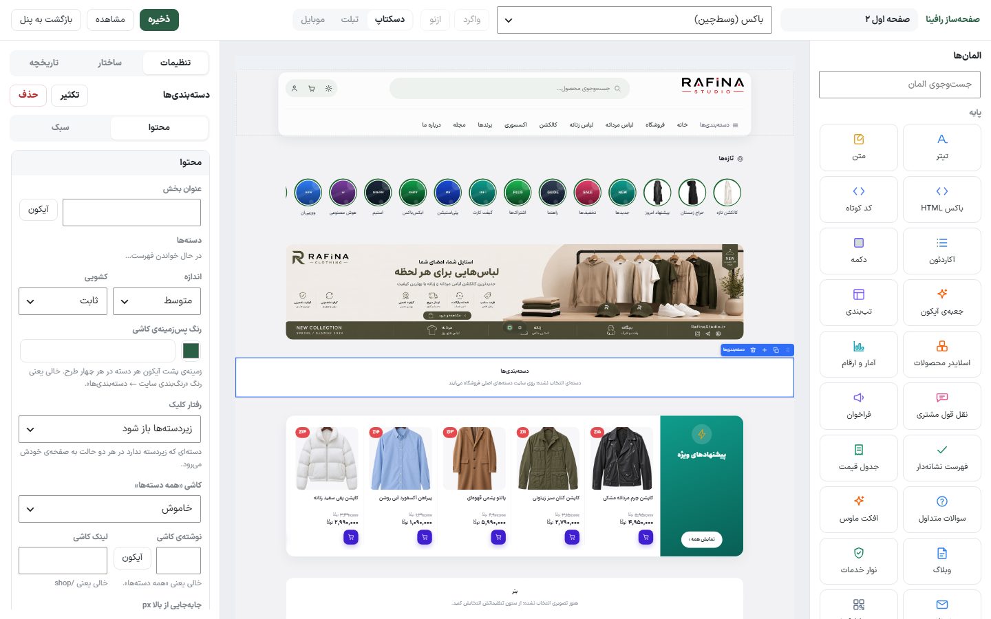
Working with each section on the canvas
- Select: Click a section; its settings open in the left column under “Settings”. Above them are the element name and two buttons, “Duplicate” and “Delete”.
- Toolbar above a section: The “Move” handle (drag to move the section up or down; near the top or bottom edge the page scrolls by itself, and Esc cancels the move), “Duplicate”, “Delete” and “Add row below”.
- Right-click on a section: The menu with “Edit”, “Move up one”, “Move down one”, “Duplicate” and “Delete”.
Settings column: Content and Style
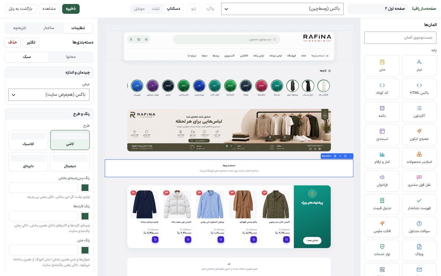
Each element’s settings are in two tabs. “Content” holds texts, images, products and links. “Style” has two groups: “Layout and size” (width, alignment, columns, spacing, height, rounding) and “Color and design” (designs as visual cards, and colors). Numeric options such as height and spacing have sliders. Every change is visible on the canvas immediately.
Structure and history
The “Structure” tab lists all the page’s sections in order (with each row’s boxes beneath it); clicking a row selects that section on the canvas, and you can drag rows in this list to reorder them. The “History” tab shows every action in this session from the “Initial state” onward (adding, deleting, duplicating, editing, moving an element, adding a row, adding an element to a box, editing a box, changing box widths), and clicking a step takes you back to that moment.
Mobile preview
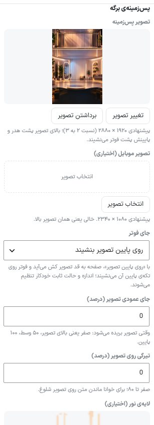
Page background
When no element is selected, the “Page background” box appears under the “Settings” tab. This background belongs to the whole page, not one section, and is also visible behind the header and footer. The other options appear only after you set a “Background image”.
| Option | What it does | Default |
|---|---|---|
| Background image | Recommended 1920 × 2880 pixels (2:3 ratio); the top of the image sits behind the header and the bottom behind the footer. | — |
| Mobile image (optional) | Recommended 1080 × 2340 pixels. Empty means the same image as above. | — |
| Footer position | “Move with content” or “Sit at the bottom of the image”. With “Sit at the bottom of the image”, the page stretches to the image’s height and the footer sits over the bottom part; the size and fixed mode are set automatically and those two options are hidden. | Move with content |
| Image size | “Cover the whole page”, “Page width, from the top” or “Show the whole image (centered)”. | Cover the whole page |
| Image vertical position (percent) | Only with “Cover the whole page”. When the image is cropped: 0 is the top of the image, 50 the middle, 100 the bottom. | 0 |
| Color around the image | Only with “Show the whole image”. The color on both sides of the image; empty means the site’s own background. | — |
| On scroll | “Move with the page” or “Stay fixed”. | Move with the page |
| Overlay darkness on image (percent) | 0 to 80; keeps text readable over a busy image. | 0 |
| Light layer (optional) | An image or SVG of lights, exactly the same aspect ratio as the background image with a black or transparent background; only its bright parts are drawn over the image. On mobile it is visible only if you haven’t set a separate mobile image. | — |
| Light intensity (percent) | 5 to 100. Only with a light layer. | 60 |
| Light motion | “Static” or “Fade softly in and out (breathing)”, once every seven seconds. It stays static for anyone who has asked for “reduced motion” on their system. | Static |
Keyboard shortcuts
| Key | What it does |
|---|---|
Ctrl + S | Save |
Ctrl + Z | Undo |
Ctrl + Shift + Z | Redo |
Ctrl + D | Duplicate the selected section or box |
Delete | Delete the selected section or box |
When you are typing inside a text field, these keys are disabled so a section is not deleted by accident.
Multi-column row and boxes
The “Multi-column row” element places several boxes side by side. The “Add row below” button in each section’s toolbar opens the “Row structure” dialog and asks you to pick one of these layouts: “One box”, “Two equal”, “Narrow and wide”, “Wide and narrow”, “Three equal”, “Three, wide middle”, “Four equal” and “Six equal”.
- Click the section the row should go below, click “Add row below” in its toolbar and choose the box layout. (You can also drag the “Multi-column row” element from the “Layout” group onto the canvas.)
- Each empty box shows a dashed frame. Click the + button inside a box to open the “Add element to box” dialog, or drag an element from the right column onto that box.
- To change box widths, drag the border between two boxes on the canvas; the size is shown in percent or pixels.
- To add a box between two existing boxes, hover over their border and click the add button. A row can hold at most twelve boxes.
- Click the row itself and its settings show “This row has … boxes” at the top. Click any box to open the settings of the element inside it; Ctrl+D and Delete also work on a selected box.
All elements fit inside a box except the “Multi-column row” itself, “Store products list” and “Product page view”. An element inside a box follows that box’s width; for example, blog or course cards automatically become two-column or single-column in a narrow box. The row’s “Gap px” is the space between boxes, and the “Stretch” option of “Vertical alignment” makes all boxes in the row equal height.
Shared settings for all elements
These options appear under each element’s settings (and each row box). All are optional, and leaving them empty means the theme’s default behavior.
| Option | What it does | Default |
|---|---|---|
| Offset from top px | Zero means the theme’s default spacing. Negative moves the block up (over the section above), positive moves it down; each step is one pixel (from −100 to 100). | 0 |
| Offset from bottom px | Zero means the default spacing. Positive pushes the next section further away, negative brings it closer. | 0 |
| Horizontal padding px / Vertical padding px | The inner space around the section’s content. Empty means zero. | Empty |
| Section minimum height and unit | Empty means fit to content. The unit is “Pixels” or “Percent of screen height”; 100 percent makes the section fill the whole screen (like 100vh in Elementor). It also works on a row box. | Empty, pixels |
| Content position within this height | Top, middle or bottom. Visible only when a minimum height is set. | High |
| No heading bar | Removes the section’s heading and header row (for example the title and “View all”) so sections sit closer together. | No |
| Width | “Boxed (site width)” means aligned with the rest of the page’s sections; “Full width” means to the edge of the screen. This option is added separately only when the element has no width of its own. | Box |
| Section background color | A strip behind this whole section. Empty means no background. | Empty |
| Card color | Background of the cards and boxes inside this section. Empty means the site’s color scheme. | Empty |
| Text color | Headings and body text in this section; the muted text color is derived from it. | Empty |
| Main color | Buttons, badges and the accent color in this section. Text on buttons stays readable on its own. Empty means the site’s brand color. | Empty |
| Section corner rounding px | Rounds the section’s corners; with a background color and padding, the section looks like a separate card. Empty means sharp corners. | Empty |
| Section border color | A one-pixel line around the section. Empty means no border. | Empty |
| Motion on reveal | In the “Style” tab, the “Motion” group. The section appears when scrolling reaches it: “Fade”, “Fade from below”, “Fade from above”, “Enter from right”, “Enter from left” or “Zoom”. A section that is visible when the page opens gets no motion so the page isn’t shown later. On the editor canvas, the effect plays once when you choose it. | None |
| Duration / Delay (milliseconds) | Only when a motion is selected. Duration 200 to 1500, delay 0 to 1500; with a delay you can make several sections appear one after another. | 600 / 0 |
| Repeat | “First time only” or “Every time it is seen” (plays again when scrolling up and down). | First time only |
Shared pickers
- Image: The “Choose image”, “Change image” and “Remove image” buttons open the WordPress media library. Next to most image fields there is also a “Generate with AI” button that creates an image at exactly that field’s size (if the AI service is set up in the panel).
- Product categories: A list of categories; pick one, and clicking the same one again deselects it. In multi-select category and brand lists there are also “Select all”, “Parents only” and “Clear” buttons.
- Products: Type at least two letters of the product name and pick from the results. The order of the “Selected” list is the order shown on the site.
- Icon: The theme’s own grid of colored and line icons. In text fields, the “Icon” button inserts the icon into the middle of the text.
- Date: Three drawers for Jalali day, month and year.
Hero slider slides dialog
In the “Hero slider” element, the “Edit slides and size” button opens a dialog. These slides belong only to this section; if left empty, the site-wide home page slides are shown. In the dialog:
- Slider size: “Wide” (desktop 2560 × 533), “Medium” (2560 × 850), “Digital” (2560 × 902) and “Tall” (2560 × 1280). The exact image size is shown under each option, and until you choose one, the site-wide setting’s size applies. The mobile image is 1080 × 1080 (1080 × 1350 for “Tall”).
- Slides: For each slide: “Desktop image”, “Mobile image (optional)” and “Link (optional)”, with “Up” and “Down” buttons to reorder and “Delete”. The “Add slide” button creates a new slide.
- Save and close: Saves the changes and closes the dialog.
Ready-made banner sizes
The “Image size” field in “Banner” and “Wide discount banner” has these options, and the same size is passed to AI image generation:
| Option | What it does | Image size |
|---|---|---|
| Wide — full-width strip | A thin full-width strip at the top of the page. | 2560 × 290 |
| Large banner — least cropping | A tall banner with minimal cropping; the best choice for an AI-generated image. | 2100 × 750 |
| Single banner — theme default | A single full-width banner. | 1600 × 520 |
| Digital discount banner | Shorter than the single banner and taller than the wide one. | 1350 × 360 |
| Square | For side-by-side banners and square spots. | 1080 × 1080 |
All elements and their options
The tables below list every option of each element (the shared settings above apply to all and are not repeated here). Each option’s type is written under its name, and the last column is the default value.
“Basic” group
22 elements in this group: Heading, Text, HTML box, Shortcode, Accordion, Button, Icon box, Tabs, Products slider, Stats and figures, Customer testimonial, Call to action, Bulleted list, Pricing table, FAQ, Mouse effect, Blog, Services bar, Newsletter, App box, Store products list, Product page view.
Heading
A single heading with a heading size of 1 to 3, alignment and a custom color.
| Option | What it does | Default |
|---|---|---|
| Text Single-line text | The text shown in this section. | — |
| Size Select list | Options: “Heading 1”, “Heading 2”, “Heading 3”. | Heading 2 |
| Alignment Select list | Options: “Right”, “Center”, “Left”. | Right |
| Color Color | This part’s color; empty means the theme’s default color and the site’s color scheme. | — |
| Size px Number | Size in pixels. | 28 |
| Width Select list | Options: “Boxed (site width)”, “Full width”. | Boxed (site width) |
Text
A paragraph of text. Simple HTML such as bold and links is accepted, and each Enter is a new line.
| Option | What it does | Default |
|---|---|---|
| Text Multi-line text | Simple HTML is allowed. | — |
| Alignment Select list | Options: “Right”, “Center”, “Left”. | Right |
| Color Color | This part’s color; empty means the theme’s default color and the site’s color scheme. | — |
| Size px Number | Size in pixels. | 16 |
| Width Select list | Options: “Boxed (site width)”, “Full width”. | Boxed (site width) |
HTML box
Custom HTML code, for things no element covers; for example, an embed code.
| Option | What it does | Default |
|---|---|---|
| HTML code Code | HTML code that is placed on the page exactly as written. | — |
| Width Select list | Options: “Boxed (site width)”, “Full width”. | Boxed (site width) |
Shortcode
Any plugin’s shortcode, such as a contact form or a plugin’s gallery, inside the page. The code runs on the server and the plugin’s own stylesheet comes with it. It also fits inside a row box.
| Option | What it does | Default |
|---|---|---|
| Shortcode Code | A plugin shortcode, for example [contact-form-7 id="12"]. The output is visible on the canvas right away. | — |
| Width Select list | Options: “Boxed (site width)”, “Full width”. | Boxed (site width) |
Mouse effect
A trail behind the mouse pointer and a custom cursor, across that whole page. The element itself takes no space on the page and appears on the editor canvas only as a marker box; to see the effect, view the page with “View” using a mouse.
| Option | What it does | Default |
|---|---|---|
| Mouse trail effect | No trail, dots, line, sparkle, bubbles, glow, follower ring. | Dots |
| First and second color | The trail goes from the first color to the second. Empty means the site’s main color. | Empty |
| Size, trail length, particle lifetime | Size of each particle (4 to 60 pixels), number of particles (4 to 60), and how many milliseconds each stays visible. | 10, 18, 650 |
| Blend with background | Normal, inverted, light, dark. | Normal |
| Mouse cursor | The browser’s own cursor, hidden, dot, ring, or a custom image. | The browser’s own cursor |
| Cursor image | Only with “Custom image”. Recommended 64 × 64 pixels, PNG with a transparent background. | — |
| Cursor size and behavior on links | 12 to 96 pixels; whether it grows over links and buttons or stays the same. | 32, grows |
Accordion
A list of questions and answers, or titles and text, that open and close on click.
| Option | What it does | Default |
|---|---|---|
| Rows Row list | Each row: title, text. The “Add row” button creates a new row. | — |
| Width Select list | Options: “Boxed (site width)”, “Full width”. | Boxed (site width) |
Button
A single button with text, alignment and a custom color, which either goes to a link or opens a popup on the same page.
| Option | What it does | Default |
|---|---|---|
| Button text Single-line text | The text on the button. | — |
| Button action Select list | “Go to link” or “Open popup”. The popup opens on this page and closes with the X, Escape, clicking outside the box, or the button inside it. | Go to link |
| Link Link | The address that opens on click. Only with “Go to link”. | — |
| Window title Single-line text | The heading at the top of the popup. The popup’s fields are visible only with “Open popup”. | — |
| Popup text Multi-line text | The text inside the popup; simple HTML (headings, lists, bold text) is allowed. | — |
| Shortcode (optional) Multi-line text | A plugin’s shortcode, for example a contact form; it is shown below the popup text and runs on the site. | — |
| Popup image (optional) Image | An image that sits full-width at the top of the popup. | — |
| Popup button and its link Text and link | A button at the bottom of the popup; empty means no button. | — |
| Window size Select list | “Small”, “Medium” or “Large”. On phones the popup is always the full page width. | Medium |
| Alignment Select list | Options: “Right”, “Center”, “Left”. | Center |
| Button color Color | This part’s color; empty means the theme’s default color and the site’s color scheme. | — |
| Width Select list | Options: “Boxed (site width)”, “Full width”. | Boxed (site width) |
Icon box
A small card with an icon, heading and text; for introducing one feature.
| Option | What it does | Default |
|---|---|---|
| Icon image Image from media | Recommended: 128 × 128 pixels | — |
| Heading Single-line text | The text shown in this section. | — |
| Text Multi-line text | The text shown in this section. | — |
| Alignment Select list | Options: “Right”, “Center”, “Left”. | Center |
| Icon color Color | This part’s color; empty means the theme’s default color and the site’s color scheme. | — |
| Width Select list | Options: “Boxed (site width)”, “Full width”. | Boxed (site width) |
Tabs
Several tabs; clicking each title shows that tab’s text.
| Option | What it does | Default |
|---|---|---|
| Tabs Row list | Each row: title, text. The “Add tab” button creates a new row. | — |
| Width Select list | Options: “Boxed (site width)”, “Full width”. | Boxed (site width) |
Products slider
A draggable row of product cards in three styles (right-aligned price, centered price, digital) with a “View all” button.
| Option | What it does | Default |
|---|---|---|
| Section title Single-line text | The heading at the top of this section. | — |
| Subtitle Single-line text | A short sentence under the section heading. | — |
| “View all” style Select list | Options: “Plain link”, “Pill button”. | — |
| Slider style Select list | Options: “Right-aligned price”, “Centered price”, “Digital”. | Right-aligned price |
| Price color Color | This part’s color; empty means the theme’s default color and the site’s color scheme. | — |
| Cart button position Select list | Options: “Style default”, “Right”, “Center”, “Left”. Default: classic is at the image’s left corner, digital is the middle of the card. | — |
| Which products Select list | Options: “One category”, “Manual selection”, “Newest”, “Best sellers”, “Random”. | One category |
| Product category Choose category | The category items are taken from; when the source is set to “Category”. | — |
| Products Search and select product | Type the product name and pick from the results; the order of selection is the display order. | — |
| number of Number | The maximum number of items shown in this section. | 8 |
| Show out-of-stock items Select list | Options: “Yes”, “No”. | Yes |
| Show price of out-of-stock items Select list | Options: “Default”, “Yes”, “No”. | — |
| Width Select list | Options: “Boxed (site width)”, “Full width”. | Boxed (site width) |
Stats and figures
A few large numbers with labels, such as “12 years of experience” or “30,000 customers”.
| Option | What it does | Default |
|---|---|---|
| Numbers Row list | Each row: number, label. The “Add number” button creates a new row. | — |
| Column Number | The number of cards per row on desktop; it automatically decreases on phones. | 4 |
| Numbers color Color | This part’s color; empty means the theme’s default color and the site’s color scheme. | — |
| Width Select list | Options: “Boxed (site width)”, “Full width”. | Boxed (site width) |
Customer testimonial
A customer testimonial with name, city, image and stars.
| Option | What it does | Default |
|---|---|---|
| Testimonial text Multi-line text | The text shown in this section. | — |
| Name Single-line text | The text shown in this section. | — |
| Title or city Single-line text | The text shown in this section. | — |
| Image Image from media | Recommended: 120 × 120 pixels | — |
| Stars (0 to 5) Number | A number. | 5 |
| Accent color Color | This part’s color; empty means the theme’s default color and the site’s color scheme. | — |
| Width Select list | Options: “Boxed (site width)”, “Full width”. | Boxed (site width) |
Call to action
A call-to-action box with a heading, description and a button, on a custom background color.
| Option | What it does | Default |
|---|---|---|
| Title Single-line text | The text shown in this section. | — |
| Description Multi-line text | The text shown in this section. | — |
| Button text Single-line text | The text on the button. | — |
| Link Link | The address that opens on click. | — |
| Alignment Select list | Options: “Right”, “Center”, “Left”. | Center |
| Background color Color | This part’s color; empty means the theme’s default color and the site’s color scheme. | — |
| Width Select list | Options: “Boxed (site width)”, “Full width”. | Boxed (site width) |
Bulleted list
A bulleted list with checkmarks, in one to three columns.
| Option | What it does | Default |
|---|---|---|
| Rows Row list | Each row: title, short description. The “Add row” button creates a new row. | — |
| Columns (1 to 3) Number | The number of cards per row on desktop; it automatically decreases on phones. | 1 |
| Bullet color Color | This part’s color; empty means the theme’s default color and the site’s color scheme. | — |
| Width Select list | Options: “Boxed (site width)”, “Full width”. | Boxed (site width) |
Pricing table
A plan comparison table with price, features and a button; one plan can be “featured”.
| Option | What it does | Default |
|---|---|---|
| Plans Row list | Each row: plan name, price, price subtitle, features (one per line), button text, link, featured plan. The “Add plan” button creates a new row. | — |
| Featured plan color Color | This part’s color; empty means the theme’s default color and the site’s color scheme. | — |
| Width Select list | Options: “Boxed (site width)”, “Full width”. | Boxed (site width) |
FAQ
An accordion FAQ; from the site’s “FAQ” section or this block’s own questions.
| Option | What it does | Default |
|---|---|---|
| Section title Single-line text | Empty means no heading. | — |
| Question source Select list | Options: “From the site’s FAQ section”, “This block’s own questions”. | From the site’s FAQ section |
| Only this category Select list | Options: “All categories”. Questions and categories come from “Site content ← FAQ”. | — |
| Questions Row list | Each row: question, answer. The “Add question” button creates a new row. | — |
| Count (0 means all) Number | The maximum number of items shown in this section. | 0 |
| First one open Select list | Options: “Yes”, “No”. | Yes |
| Width Select list | Options: “Boxed (site width)”, “Full width”. | Boxed (site width) |
Blog
The latest blog posts in three styles: classic, digital and compact.
| Option | What it does | Default |
|---|---|---|
| Section title Single-line text | The heading at the top of this section. | — |
| Subtitle Single-line text | A short sentence under the section heading. | — |
| “View all” button text Single-line text | The text on the button. | — |
| “View all” style Select list | Options: “Plain link”, “Pill button”. | — |
| number of Number | The maximum number of items shown in this section. | 3 |
| Card size Select list | Options: “Large, text over image”, “Small”. | Large, text over image |
| Section style Select list | Options: “Classic”, “Digital”, “Compact (three cards beside the newsletter)”. Card size applies to “Classic” and “Compact”: in compact, “Small” is a horizontal card with a small image. | Classic |
| Width Select list | Options: “Boxed (site width)”, “Full width”. | Boxed (site width) |
Services bar
A store services bar (fast shipping, secure payment, etc.) with ready-made icons or a custom image, and six designs.
| Option | What it does | Default |
|---|---|---|
| Section title Single-line text | The heading at the top of this section. | — |
| Subtitle Single-line text | A short sentence under the section heading. | — |
| Frame Select list | Options: “No frame”, “White card”. | — |
| Services Row list | Each row: heading, subtitle, ready-made icon or custom image, this icon’s color. The “Add service” button creates a new row. | — |
| Layout Select list | Options: “Card”, “Icon on top”, “Plain”, “Seamless bar”, “Digital”, “Icon in tile”. | Card |
| Column Number | The number of cards per row on desktop; it automatically decreases on phones. | 4 |
| Icon color Color | This part’s color; empty means the theme’s default color and the site’s color scheme. | — |
| Width Select list | Options: “Boxed (site width)”, “Full width”. | Boxed (site width) |
Newsletter
A newsletter signup box with a custom image and color; without a “Form address”, subscribers are recorded in the site’s own newsletter list.
| Option | What it does | Default |
|---|---|---|
| Heading Single-line text | The text shown in this section. | — |
| Text Multi-line text | The text shown in this section. | — |
| Text inside the box Single-line text | The text shown in this section. | — |
| Button Single-line text | The text on the button. | — |
| Form address (optional) Link | Empty means the email is saved in the site’s own subscriber list. If you have a newsletter service, enter its form address and the email will be sent there under the name email. | — |
| Image beside the text Image from media | Recommended: 400 × 300 pixels | — |
| Alignment Select list | Options: “Right”, “Center”, “Left”. | Right |
| Background color Color | This part’s color; empty means the theme’s default color and the site’s color scheme. | — |
| Background image Image from media | Recommended: 1200 × 500 pixels. It sits over the background color. | — |
| Darkness over image (%) Number | Zero means the raw image; a higher number makes the text more readable. | 40 |
| Text color Color | Empty means white. | — |
| Envelope color Color | Empty means the brand color. | — |
| Subscribe button color Color | Empty means the same as the envelope color. | — |
| Width Select list | Options: “Boxed (site width)”, “Full width”. | Boxed (site width) |
App box
An introduction to the store’s app with features, app store buttons and a QR code.
| Option | What it does | Default |
|---|---|---|
| Heading Single-line text | The text shown in this section. | — |
| Text Multi-line text | The text shown in this section. | — |
| Attributes Row list | Each row: text. The “Add feature” button creates a new row. | — |
| Store buttons Row list | Each row: button image, link. The “Add store” button creates a new row. | — |
| QR code Image from media | Recommended: 400 × 400 pixels | — |
| Background color Color | This part’s color; empty means the theme’s default color and the site’s color scheme. | — |
| Width Select list | Options: “Boxed (site width)”, “Full width”. | Boxed (site width) |
Store products list
The store’s product list itself, with filters and sorting; only meaningful on the “Store” target page.
| Option | What it does | Default |
|---|---|---|
| Items per page Number | Between 4 and 48 | 24 |
| Column Number | The number of cards per row on desktop; it automatically decreases on phones. | 4 |
| Card style Select list | Options: “Same as store”, “Classic”, “Compact”, “Glass”, “Digital”, “Gold”, “Wholesale”. The wholesale card needs at least 280 pixels, so with many columns the number of cards per row automatically decreases. | — |
| Width Select list | Options: “Boxed”, “Full width”. | Box |
| Show out-of-stock items Select list | Options: “Yes”, “No”. | Yes |
| Show price of out-of-stock items Select list | Options: “Default”, “Yes”, “No”. | — |
| Category bar above the list Select list | Options: “Yes”, “No”. A bar of categories with featured images above the product list. The number on each card’s corner is that category’s subcategory count. | No |
| Bar title Single-line text | The text shown in this section. | Categories |
| Card size Select list | Options: “Small”, “Medium”, “Large”. | Medium |
| How many categories to show Number | The rest are gathered in the last card. | 7 |
| Last card text Single-line text | The text shown in this section. | Other categories |
| Show subcategory count on the card Select list | Options: “Yes”, “No”. | Yes |
| Show subcategories on each category page too Select list | Options: “Yes”, “No”. | Yes |
| Include categories with no products Select list | Options: “Yes”, “No”. | No |
Product page view
The place for the product page itself on the “Product page” target page; the page style is chosen here.
| Option | What it does | Default |
|---|---|---|
| Product page layout Choose style | Empty means the layout selected in the “Product page” tab | — |
| Width Select list | Options: “Boxed (site width)”, “Full width”. | Boxed (site width) |
“Media” group
14 elements in this group: Image, Banner, Slider, Video, Image gallery, Before and after, Text banner, Hero slider, Wide discount banner, Two-piece banner with text, Side-by-side banners, 2-piece banner, Unequal banners, Stories.
Image
A single image with a custom link. Inside a row box, you set its frame with “Frame ratio in box”.
| Option | What it does | Default |
|---|---|---|
| Image Image from media | Inside a row box, the image is generated at exactly that box’s size. Outside a row, the recommendation is 1200 × 720 pixels. | — |
| Width Select list | Options: “Centered”, “Full width”. Centered means aligned with the page’s other sections; full width means to the screen edge. | Centered |
| Frame ratio in box Select list | Options: “Two to one”, “Wide banner (2048 × 748)”, “Image’s own ratio”, “Same height as neighboring boxes”. Only inside a row box. “Wide banner” is the size that image generation produces; “Image’s own ratio” does no cropping; “Same height as neighboring boxes” stretches the image from top to bottom of the neighboring box together with the row’s “Vertical alignment: Stretch”. | Two to one |
| Frame height px Number | Only inside a row box and for the two-to-one frame; a standalone image block keeps the photo’s natural height. The maximum is 360 so the frame inside a row stays rectangular, not square. | 360 |
| Link Link | The address that opens on click. | — |
| Alt text Single-line text | The text shown in this section. | — |
| Alignment Select list | Options: “Right”, “Center”, “Left”. | Center |
| Width % Number | A number. | 100 |
| Rounding px Number | Size in pixels. | 0 |
Banner
An image banner with a link and ready-made size; on phones it can have its own separate image.
| Option | What it does | Default |
|---|---|---|
| Image size Ready-made size | This same size is passed to AI image generation. | banner |
| Width Select list | Options: “Centered”, “Full width”. Centered means aligned with the page’s other sections; full width means to the screen edge. | Centered |
| Banner image Image from media | Choose the image from the media library. | — |
| Mobile image (optional) Image from media | On phones (width under 768 pixels) this image replaces the banner image and is shown whole, in its own ratio. Empty means the same as the banner image. Recommended 750 × 750 pixels. | — |
| Link Link | The address that opens on click. | — |
| Layout Select list | Options: “Plain”, “Rounded”, “Card”. | Rounded |
Slider
An image slider with a heading, text and button on each slide, fade or slide motion and autoplay.
| Option | What it does | Default |
|---|---|---|
| Layout Select list | Options: “Boxed”, “Full width”. | Box |
| Height px Number | Size in pixels. | 320 |
| Slides Row list | Each row: image, link, slide heading, slide text, button text. The “Add slide” button creates a new row. Recommended: 1600 × 640 pixels | — |
| Motion Select list | Options: “Fade”, “Slide”. | Fade |
| Image frame Select list | Options: “Filler”, “Full”. | Filler |
| Arrows Select list | Options: “Yes”, “No”. | Yes |
| Dots Select list | Options: “Yes”, “No”. | Yes |
| Autoplay seconds Number | A number. | 0 |
Video
Plays a video file from the media library with a poster image, controls, autoplay and loop.
| Option | What it does | Default |
|---|---|---|
| Video file Image from media | Only files from this site’s library | — |
| Poster image Image from media | Recommended: 1280 × 720 pixels | — |
| Controls Select list | Options: “Yes”, “No”. | Yes |
| Autoplay Select list | Options: “Yes”, “No”. | No |
| Repeat Select list | Options: “Yes”, “No”. | No |
| Width % Number | A number. | 100 |
| Rounding px Number | Size in pixels. | 12 |
| Width Select list | Options: “Boxed (site width)”, “Full width”. | Boxed (site width) |
Image gallery
A grid of several images with a column count, spacing and corner rounding.
| Option | What it does | Default |
|---|---|---|
| Images Multiple images | Recommended: each image 800 × 800 pixels | — |
| Column Number | The number of cards per row on desktop; it automatically decreases on phones. | 3 |
| Gap px Number | Size in pixels. | 16 |
| Rounding px Number | Size in pixels. | 12 |
| Width Select list | Options: “Boxed (site width)”, “Full width”. | Boxed (site width) |
Before and after
A grid of image pairs with a divider the visitor drags to see the “before” and “after” difference; for the results of a salon, renovation, printing or any service. On phones it works with finger swipes and also with the keyboard (arrow keys). It also fits inside a row box.
| Option | What it does | Default |
|---|---|---|
| Image pairs | For each pair: “Before image”, “After image” and a caption under the image. Use two images of the same size; recommended 1200 × 675 pixels. A pair missing either image is not shown. | Three sample pairs |
| Column | 1 to 4. It decreases in a narrower section and is one column on phones. | 3 |
| Frame ratio | 21:9, 2:1, 16:9, 4:3, square, portrait 3:4. | 16:9 |
| Divider direction | Vertical (drag left and right) or horizontal (drag up and down). | Vertical |
| Divider starting position | A percent of the frame’s width or height where the divider starts. | 50 |
| Divider also moves with the mouse | On desktop it follows the mouse without a click. | No |
| Before and after labels | Two labels on the image and the text of each. | Yes, “Before” and “After” |
| Handle color and corner rounding | The color of the line and the center circle, and the frame rounding. | White, 16 |
Text banner
A large text banner with a badge, two-line heading, text, two buttons, a search box and a background or side image.
| Option | What it does | Default |
|---|---|---|
| Width Select list | Options: “Boxed (site width)”, “Full width”. | Full width |
| Badge above heading Single-line text | The text shown in this section. | — |
| Heading Single-line text | The text shown in this section. | — |
| Second heading line (colored) Single-line text | The text shown in this section. | — |
| Second line color Color | Empty means the brand’s main color. | — |
| Second gradient color Color | With this color, the second line goes from the first color to this one. Empty means a single color. | — |
| Text Multi-line text | The text shown in this section. | — |
| First button Single-line text | The text on the button. | — |
| First link Link | The address that opens on click. | — |
| First button icon Choose icon | The icon that appears beside that button’s text. | — |
| Second button Single-line text | The text on the button. | — |
| Second link Link | The address that opens on click. | — |
| Second button icon Choose icon | The icon that appears beside that button’s text. | — |
| Button shape Select list | Options: “Rounded corner”, “Pill”. | — |
| Search box Select list | Options: “Off”, “On”. | Off |
| Text inside search Single-line text | The text shown in this section. | Search for the product, brand or service you want... |
| Image Image from media | Recommended: 1600 × 840 pixels | — |
| Side image edge Select list | Options: “Sharp frame”, “Fade into background”. Two-piece style only. An image that has its own background does not create a rectangular edge with “Fade into background”. | — |
| Layout Select list | Options: “Background image”, “Text and image side by side”, “No image”. | Background image |
| Height px Number | Size in pixels. | 420 |
| Alignment Select list | Options: “Right”, “Center”, “Left”. | Right |
| Color Color | This part’s color; empty means the theme’s default color and the site’s color scheme. | — |
Hero slider
A large slider at the top of the page with separate desktop and mobile images and four ready-made sizes. Full guide: Hero slider element.
| Option | What it does | Default |
|---|---|---|
| Width Select list | Options: “Centered”, “Full width”. Centered means aligned with the page’s other sections; full width means to the screen edge. | Centered |
| Section title Single-line text | The heading at the top of this section. | — |
| Corners Select list | Options: “Rounded”, “Sharp”, “Card (rounded with shadow)”. | Rounded |
| Corner radius (px) Number | Zero means the theme's default radius. It has no effect on "Sharp". | 0 |
| This section's slides Slides dialog | Empty means the home page’s own slides. Once you add one slide, this section no longer follows the site-wide setting. The “Edit slides and size” button opens a dialog (explained below). | — |
Wide discount banner
A wide discount strip with a heading, text, round badge, button and image.
| Option | What it does | Default |
|---|---|---|
| Width Select list | Options: “Centered”, “Full width”. Centered means aligned with the page’s other sections; full width means to the screen edge. | Centered |
| Heading Single-line text | The text shown in this section. | — |
| Text Single-line text | The text shown in this section. | — |
| Round badge Single-line text | For example “Up to 30% off”; empty means no badge | — |
| Button Single-line text | The text on the button. | — |
| Link Link | The address that opens on click. | — |
| Image size Ready-made size | This same size is passed to AI image generation. | promo |
| Image Image from media | Choose the image from the media library. | — |
| Background color Color | This part’s color; empty means the theme’s default color and the site’s color scheme. | — |
Two-piece banner with text
Two or more banners side by side, each with a heading, text and button.
| Option | What it does | Default |
|---|---|---|
| Width Select list | Options: “Centered”, “Full width”. Centered means aligned with the page’s other sections; full width means to the screen edge. | Centered |
| Banners Row list | Each row: heading, text, button, link, image, background color. The “Add banner” button creates a new row. | — |
| Column Number | The number of cards per row on desktop; it automatically decreases on phones. | 2 |
Side-by-side banners
A row of three or four image banners side by side, each with its own link. Full guide: Side-by-side banners element.
| Option | What it does | Default |
|---|---|---|
| Width Select list | Options: “Centered”, “Full width”. Centered means aligned with the page’s other sections; full width means to the screen edge. | Centered |
| Section title Single-line text | The heading at the top of this section. | — |
| Banners in this section Row list | Each row: image, link. The “Add banner” button creates a new row. Empty means the banners from “Content ← Second banner” (this is the panel’s own guide; that card no longer appears in “Site content”). Three wide banners or four square banners in one row, each with its own link; more than four is not saved. | — |
2-piece banner
Banners that together form one frame (formerly the “Puzzle banner”). Full guide: 2-Piece Banner element.
| Option | What it does | Default |
|---|---|---|
| Width Select list | Options: “Centered”, “Full width”. Centered means aligned with the page’s other sections; full width means to the screen edge. | Centered |
| Section title Single-line text | The heading at the top of this section. | — |
| Pieces of this section Row list | Each row: desktop image, mobile image (optional), link. The “Add piece” button creates a new row. Empty means the pieces from “Content ← Puzzle banner” (that card no longer appears in “Site content”). The recommended size of each piece is 1024 × 466 pixels. The gap between them is small so the images look continuous. | — |
Unequal banners
Two side-by-side banners of unequal width: one wide and one narrow.
| Option | What it does | Default |
|---|---|---|
| Width Select list | Options: “Centered”, “Full width”. Centered means aligned with the page’s other sections; full width means to the screen edge. | Centered |
| Section title Single-line text | The heading at the top of this section. | — |
| Banner positions Select list | Options: “Wide banner first”, “Wide banner last”. Swaps the places of the wide and narrow banners; the images themselves do not move. | — |
| Two banners Row list | Each row: desktop image, mobile image (optional), link. The “Add banner” button creates a new row. Exactly two banners. The first banner is always wide and the second narrow; the drawer above only moves the wide position from one side to the other. | — |
Stories
Story circles at the top of the page. Story content is site-wide and is set from “Site content ← Home page sections ← Stories” or from this element’s dialog.
| Option | What it does | Default |
|---|---|---|
| Section title Single-line text | The heading at the top of this section. | — |
| Highlights and photos Dialog button | The “Set up stories” button opens the page Stories in the “Stories” dialog. It is the same on all pages. | — |
| Width Select list | Options: “Boxed (site width)”, “Full width”. | Boxed (site width) |
“Store” group
13 elements in this group: Countdown, Products, Points box, Training courses, Product category tabs, Instant search, Product attributes, Product info, Clothing rack, Product card, Amazing offer, Categories, Brands.
Countdown
A countdown to a Jalali date and time; for the end of a promotion.
| Option | What it does | Default |
|---|---|---|
| Title Single-line text | The text shown in this section. | — |
| Date Jalali date | The countdown end time, in a Jalali date and time. | — |
| Time Time | The countdown end time, in a Jalali date and time. | 00:00 |
| Color Color | This part’s color; empty means the theme’s default color and the site’s color scheme. | — |
| Width Select list | Options: “Boxed (site width)”, “Full width”. | Boxed (site width) |
Product category tabs
Several tabs above a grid of product cards; each tab shows the products of one category, and the first tab is open from the start. Below the grid, a “Show more” button adds the same number of further products from that category within the tab and goes away after the last item; “View all” goes to that category’s page.
| Option | What it does | Default |
|---|---|---|
| Section title Single-line text | Empty means no heading. | Category products |
| Tabs Repeating list | For each tab, one category and an optional name; an empty name means the category’s own name. | — |
| Count per tab Number | From 1 to 200. “Show more” brings this many more each time. | 8 |
| Columns on desktop / tablet / mobile Number | Number of cards per row, separately for each device. Mobile 1 to 3. | 4 / 3 / 2 |
| Card style Select list | Options: “Classic”, “Compact”, “Glass”, “Digital”, “Gold”, “Wholesale”. | Classic |
| Tab shape Select list | “Pill” or “Underline”. | Pill |
| “View all” text Single-line text | Empty means “View all”. | — |
| Sticky mode Select list | “None”, “Sticky at top of page” or “Sticky, fades on scroll down”. Only the tabs row stays under the sticky header until the end of this section; “fade” returns on scroll up. It has no effect inside a row box. | None |
Instant search
A search field that filters this page’s product cards instantly as the buyer types, without going to another page.
| Option | What it does | Default |
|---|---|---|
| Text inside the field Single-line text | Empty means “Search this page’s products”. | — |
| No results message Single-line text | Empty means “No results found”. | — |
| Sticky mode Select list | “None”, “Sticky at top of page” or “Sticky, fades on scroll down”. The search field stays under the sticky header until the end of the page. | None |
If the page has “Product category tabs”, typing a phrase also automatically loads and searches the current tab’s remaining products; there is no need to click “Show more”. Sticky mode works inside a row box too: the whole row sticks to the top and the buttons beside the search stay clickable.
Products
A grid of product cards from the newest, best sellers, one category, discounted, featured or a manual selection.
| Option | What it does | Default |
|---|---|---|
| Section title Single-line text | The heading at the top of this section. | — |
| Which products Select list | Options: “Newest”, “Best sellers”, “Random”, “Category”, “Discounted”, “Featured”, “Manual selection”. | Latest |
| Product category Choose category | The category items are taken from; when the source is set to “Category”. | — |
| Products Search and select product | Type the product name and pick from the results; the order of selection is the display order. | — |
| number of Number | The maximum number of items shown in this section. | 8 |
| Column Number | The number of cards per row on desktop; it automatically decreases on phones. | 4 |
| Show out-of-stock items Select list | Options: “Yes”, “No”. | Yes |
| Show price of out-of-stock items Select list | Options: “Default”, “Yes”, “No”. | — |
| Width Select list | Options: “Boxed (site width)”, “Full width”. | Boxed (site width) |
Points box
A points box with a progress bar, current value, goal and button; for example, to introduce a customer club.
| Option | What it does | Default |
|---|---|---|
| Title Single-line text | The text shown in this section. | — |
| Description Multi-line text | The text shown in this section. | — |
| Bar fill % (0 to 100) Number | A number. | 64 |
| Current value text Single-line text | The text shown in this section. | 320 points |
| Goal text Single-line text | The text shown in this section. | Up to 500 points |
| Button text Single-line text | The text on the button. | More information |
| Link Link | The address that opens on click. | — |
| Side image Image from media | Recommended: 400 × 400 pixels, transparent background | — |
| Image position Select list | Options: “Right”, “Left”. | Left |
| Width Select list | Options: “Boxed (site width)”, “Full width”. | Boxed (site width) |
Training courses
Training course cards (from the training section) as a grid or a draggable row. If training is off, nothing appears on the site.
| Option | What it does | Default |
|---|---|---|
| Section title Single-line text | Empty means no heading. | — |
| Which courses Select list | Options: “Newest”, “Most popular”, “One category”, “Manual selection”. | Latest |
| Product category Choose category | The category items are taken from; when the source is set to “Category”. | — |
| Course products Search and select product | Only products that have a training course are shown. | — |
| Count (1 to 24) Number | The maximum number of items shown in this section. | 8 |
| Columns (2 to 6) Number | The number of cards per row on desktop; it automatically decreases on phones. | 4 |
| Layout Select list | Options: “Grid”, “Draggable row”. | Grid |
| “View all” link Link | Empty means no link. | — |
| Width Select list | Options: “Boxed (site width)”, “Full width”. | Boxed (site width) |
Product attributes
The attributes of the product whose page is open (such as color, material and size); the data comes from the product itself, not the element. It belongs on the “Product page” target page.
| Option | What it does | Default |
|---|---|---|
| Title Single-line text | Empty means no heading. | — |
| Display style Select list | “List” or “Table”. | Contents |
Product info
The name, price and buy button of the product whose page is open; the data comes from the product itself. It belongs on the “Product page” target page.
| Option | What it does | Default |
|---|---|---|
| Buy button Select list | “Show” or “Hide”. | Appearance |
| Button text Single-line text | Empty means “Add to cart”. | — |
Clothing rack
Products as clothes hanging on a rack; hovering rotates and enlarges a garment, and clicking one opens its product card. Each product is one garment, and a new product is added automatically. Each garment’s background-free image comes from the “Image on rack” box on the product edit page (PNG, 1024 × 1536 pixels); if missing, the featured image is used.
| Option | What it does | Default |
|---|---|---|
| Which products Select list | “Newest”, “One category”, “Manual selection”, “Best sellers” or “Random”. “One category” opens the “Product category” drawer, and “Manual selection” opens the “Products” list (up to 24). | Latest |
| Number of garments (1 to 24) Number | The number of garments on the rack. | 12 |
| Rail position over background image (percent from top) Number | 0 to 40. The hangers’ hooks sit on this line; without a page background, the rack has its own rail. | 6 |
| Garment turns forward on hover Select list | “Yes” or “No”. No means the garment is always seen from the side. | Yes |
| Garment enlarges on hover (percent, 100 to 130) Number | 100 means it does not enlarge. Only the garment itself enlarges and the hanger stays in place. | 112 |
| Neighboring garments move aside (percent of garment width, 0 to 50) Number | Zero means neighboring garments do not move. | 25 |
| Sway with mouse movement (degrees, 0 to 5) Number | Zero means no sway. | 2 |
| Clicking a garment opens the product card Select list | “Yes” or “No”. | Yes |
| Trust column beside the card Select list | “Yes” or “No”. | Yes |
| Trust column rows Row list | Only with the trust column on. Each row has an “Icon”, “Heading” and “Subtitle”, with an “Add row” button. A new element is created with four rows: “Fast shipping”, “Secure payment”, “Authenticity guarantee” and “Easy returns”. | Four rows |
Product card
One to six chosen product cards in one of seven card styles (classic, compact, featured, glass, digital, gold, wholesale).
| Option | What it does | Default |
|---|---|---|
| Products Search and select product | One or more products side by side | — |
| Card style Select list | Options: “Classic”, “Compact”, “Featured”, “Glass”, “Digital”, “Gold”, “Wholesale”. | Classic |
| Column Number | The number of cards per row on desktop; it automatically decreases on phones. | 1 |
| Alignment Select list | Options: “Right”, “Center”, “Left”. | Right |
| Width Select list | Options: “Boxed”, “Full width”. | Box |
| Show out-of-stock items Select list | Options: “Yes”, “No”. | Yes |
| Show price of out-of-stock items Select list | Options: “Default”, “Yes”, “No”. | — |
“Wholesale” card
A card for a wholesale store and unit-based goods (per kilo, per carton). It was previously named “Two-piece”. It can be selected in both the “Product card” and “Store products list” blocks.
- Two halves in a rounded frame: on the right the product name and price rows, on the left the image with a “View product” button below it. A narrow card (under 340 pixels) stacks the two halves.
- The rows under the name (purchase price, consumer price, strikethrough price, your profit, packaging, minimum order) are turned on and off from Site content ← Store ← Wholesale card . “Your profit” is calculated from the consumer price of product edit page and the product’s own price.
- A simple product shows its price; if wholesale is on, three colored wholesale tiers take the price’s place.
- A variable product shows its variants as hollow round buttons. Selecting one moves the others aside, and “Choose another type” brings them back. An out-of-stock variant cannot be selected.
- Clicking the image opens it large at its original size, with Previous, Back and Next buttons.
- At the bottom of the card is a full-width “Buy product” button. After adding, it shows the quantity with its counting unit and packaging and the total price (for example “12 kg, 1 carton”); beside it is a trash button, and from two steps up a “−” button.
- Each click on “+” and “−” is one step Minimum purchase and unit The item moves forward or back.
- On phones, each row is one card.
Amazing offer
An amazing offer with a countdown and a row of discounted products; three styles: Amazing, Plain and Digital.
| Option | What it does | Default |
|---|---|---|
| Section title Single-line text | The heading at the top of this section. | — |
| “View all” link Link | The address that opens on click. | — |
| Which products Select list | Options: “Discounted”, “One category”, “Manual selection”, “Newest”, “Best sellers”, “Random”. | On sale |
| Product category Choose category | The category items are taken from; when the source is set to “Category”. | — |
| Products Search and select product | Type the product name and pick from the results; the order of selection is the display order. | — |
| Discount end Jalali date | The countdown end time, in a Jalali date and time. | — |
| Time Time | The countdown end time, in a Jalali date and time. | 00:00 |
| number of Number | The maximum number of items shown in this section. | 8 |
| Section style Select list | Options: “Amazing, with countdown”, “Plain”, “Digital”. | Amazing, with countdown |
| Cart button position Select list | Options: “Right”, “Center”, “Left”. Applies only to the “Amazing” design. | Right |
| Subtitle Single-line text | Not shown in the Plain style. | — |
| Panel background pattern Select list | Options: “Same as site setting”, “No pattern”, “Dots”, “Grid”, “Diagonal lines”, “Circles”, “Plus signs”. | — |
| “View all” button text Single-line text | The text on the button. | — |
| “View all” style Select list | Options: “Plain link”, “Pill button”. Digital style only. | — |
| Show out-of-stock items Select list | Options: “Yes”, “No”. | Yes |
| Show price of out-of-stock items Select list | Options: “Default”, “Yes”, “No”. | — |
| Width Select list | Options: “Boxed (site width)”, “Full width”. | Boxed (site width) |
Categories
Category tiles in four designs (tile, classic, digital, circular), fixed or sliding.
| Option | What it does | Default |
|---|---|---|
| Section title Single-line text | The heading at the top of this section. | — |
| Categories Choose from list | The items shown in this section; tick them from the list. | — |
| Layout Select list | Options: “Tile”, “Classic”, “Digital”, “Circular”. | Tile |
| Size Select list | Options: “Extra small”, “Small”, “Medium”, “Large”, “Extra large”. | Medium |
| Dropdown Select list | Options: “Fixed”, “Sliding”. | — |
| Tile background color Color | The background behind each category’s icon in all four designs. Empty means the color from “Site colors ← Categories”. | — |
| Click behavior Select list | Options: “Open subcategories”, “Go straight to the category page”. A category with no subcategories goes to its own page in both modes. | Open subcategories |
| “All categories” tile Select list | Options: “Off”, “On, at end of row”. | — |
| Tile text Single-line text | Empty means “All categories”. | — |
| Tile link Link | Empty means /shop | — |
| Width Select list | Options: “Boxed (site width)”, “Full width”. | Boxed (site width) |
Brands
A strip of the store’s brand logos, plain or boxed, colored or grayscale.
| Option | What it does | Default |
|---|---|---|
| Section title Single-line text | The heading at the top of this section. | — |
| Brands Choose from list | The items shown in this section; tick them from the list. | — |
| Column Number | The number of cards per row on desktop; it automatically decreases on phones. | 6 |
| Symbol size Number | A number. | 54 |
| Layout Select list | Options: “Plain”, “Boxed”. | Plain |
| Grayscale Select list | Options: “Colored”, “Grayscale until mouse hover”. | — |
| Badge spacing Number | A number. | 18 |
| Header icon Single-line text | Empty means the brand icon | — |
| Width Select list | Options: “Boxed (site width)”, “Full width”. | Boxed (site width) |
“Corporate” group
6 elements in this group: Portfolio, Service cards, Team members, Work steps, Clients and partners, Company introduction.
Portfolio
A portfolio grid with image, title, category and category filter buttons.
| Option | What it does | Default |
|---|---|---|
| Section title Single-line text | Empty means no heading. | — |
| Subtitle Single-line text | A short sentence under the section heading. | — |
| Portfolio Row list | Each row: image, title, category, short description, link. The “Add portfolio item” button creates a new row. | — |
| Columns (2 to 4) Number | The number of cards per row on desktop; it automatically decreases on phones. | 3 |
| Category filter buttons Select list | Options: “Yes”, “No”. | Yes |
| Image ratio Select list | Options: “Landscape 4:3”, “Wide 16:9”, “Square”, “Portrait 3:4”. | Landscape 4:3 |
| Width Select list | Options: “Boxed (site width)”, “Full width”. | Boxed (site width) |
Service cards
A company service card with an icon, description, price and button.
| Option | What it does | Default |
|---|---|---|
| Section title Single-line text | Empty means no heading. | — |
| Subtitle Single-line text | A short sentence under the section heading. | — |
| Services Row list | Each row: icon, title, description, price, button text, link. The “Add service” button creates a new row. | — |
| Columns (2 to 4) Number | The number of cards per row on desktop; it automatically decreases on phones. | 3 |
| Card style Select list | Options: “Card”, “Lined and plain”. | Card |
| Width Select list | Options: “Boxed (site width)”, “Full width”. | Boxed (site width) |
Team members
A team member card with photo, role, one sentence and social network links.
| Option | What it does | Default |
|---|---|---|
| Section title Single-line text | Empty means no heading. | — |
| Subtitle Single-line text | A short sentence under the section heading. | — |
| Members Row list | Each row: photo, name, role, a sentence about them, Instagram, LinkedIn, Telegram, email. The “Add member” button creates a new row. | — |
| Columns (2 to 5) Number | The number of cards per row on desktop; it automatically decreases on phones. | 4 |
| Width Select list | Options: “Boxed (site width)”, “Full width”. | Boxed (site width) |
Work steps
Work steps as a numbered list with a connecting line (up to eight steps).
| Option | What it does | Default |
|---|---|---|
| Section title Single-line text | Empty means no heading. | — |
| Subtitle Single-line text | A short sentence under the section heading. | — |
| Steps Row list | Each row: icon, title, short description. The “Add step” button creates a new row. Up to eight steps. | — |
| Width Select list | Options: “Boxed (site width)”, “Full width”. | Boxed (site width) |
Clients and partners
A grid of client and partner logos, with a grayscale-until-hover mode.
| Option | What it does | Default |
|---|---|---|
| Section title Single-line text | Empty means no heading. | — |
| Subtitle Single-line text | A short sentence under the section heading. | — |
| Logos Row list | Each row: logo, name, link. The “Add logo” button creates a new row. | — |
| Columns (3 to 8) Number | The number of cards per row on desktop; it automatically decreases on phones. | 6 |
| Grayscale until mouse hover Select list | Options: “Yes”, “No”. | Yes |
| Width Select list | Options: “Boxed (site width)”, “Full width”. | Boxed (site width) |
Company introduction
Company introduction: label, heading, text, points and a button beside an image with a number overlaid on it.
| Option | What it does | Default |
|---|---|---|
| Label above heading Single-line text | For example “About us”. | — |
| Title Single-line text | The text shown in this section. | — |
| Text Multi-line text | The text shown in this section. | — |
| Points Multi-line text | Each line is one point with a checkmark. | — |
| Button text Single-line text | The text on the button. | — |
| Link Link | The address that opens on click. | — |
| Image Image from media | Recommended: 1000 × 800 pixels | — |
| Image position Select list | Options: “Right”, “Left”. | Left |
| Number on image Single-line text | For example “12+”. Empty means no badge. | — |
| Under the number Single-line text | For example “years of experience”. | — |
| Width Select list | Options: “Boxed (site width)”, “Full width”. | Boxed (site width) |
“Layout” group
3 elements in this group: Multi-column row, Spacer, Divider line.
Multi-column row
A row with several boxes side by side; you put another element inside each box (explained below).
| Option | What it does | Default |
|---|---|---|
| Width Select list | Options: “Centered”, “Full width”. Centered means aligned with the page’s other sections; full width means to the screen edge. | Centered |
| Gap px Number | Size in pixels. | 20 |
| Vertical alignment Select list | Options: “Top”, “Middle”, “Bottom”, “Stretch”. | High |
Spacer
An empty space of a custom height between two sections.
| Option | What it does | Default |
|---|---|---|
| Height px Number | Size in pixels. | 40 |
| Width Select list | Options: “Boxed (site width)”, “Full width”. | Boxed (site width) |
Divider line
A horizontal divider line, solid, dashed or dotted.
| Option | What it does | Default |
|---|---|---|
| Thickness px Number | Size in pixels. | 1 |
| Gap px Number | Size in pixels. | 24 |
| Layout Select list | Options: “Solid”, “Dashed”, “Dotted”. | Solid |
| Color Color | This part’s color; empty means the theme’s default color and the site’s color scheme. | — |
| Width Select list | Options: “Boxed (site width)”, “Full width”. | Boxed (site width) |
FAQ and troubleshooting
The canvas stays on “Loading page…” or says “Page failed to load”.
Click “Try again” once. If the message says the page came from cache, clear the site cache from “Settings ← Cache” or the cache plugin. If the message shows the checked address and it differs from the dashboard address, make “WordPress Address” and “Site Address” the same in WordPress “Settings ← General” (both with https).
I saved, but nothing changed on the site.
A page must be the “default” for its area to show on the site; in Page builder and layout click the circle beside the page. If it is the default and still looks stale, clear the host’s page cache or the cache plugin.
The tablet and mobile buttons are off.
“App-style” mode is selected in “Mobile settings”, and phones show the app layout. To edit this page’s mobile view, set the mode to “Web app”.
I changed the image but the canvas still shows the old one.
If the site opens with https but “WordPress Address” is still http, the browser will not draw the image in the canvas. Set both addresses to https in “Settings ← General”.
The hero slider shows the home page slides, not my own.
Until you add a slide in the “This section’s slides” dialog, the block shows the same site-wide slides. Once you add a slide, this section no longer follows the site-wide setting.
I change a story in the editor and it changes everywhere.
Stories are site-wide; one set for the whole site. Set them in Stories .
The product card says “No product found”.
Type at least two letters of the product name. If you see “Search failed”, your login session has ended; refresh the editor once.