
Site color scheme
All the store's colors come from this page: the brand's primary color, buttons, prices, header and footer, product page, and even emails. Each color has one value for day mode and one value for night mode.
Where is it? Rafina Panel → Site content → Site color scheme
Working with this page
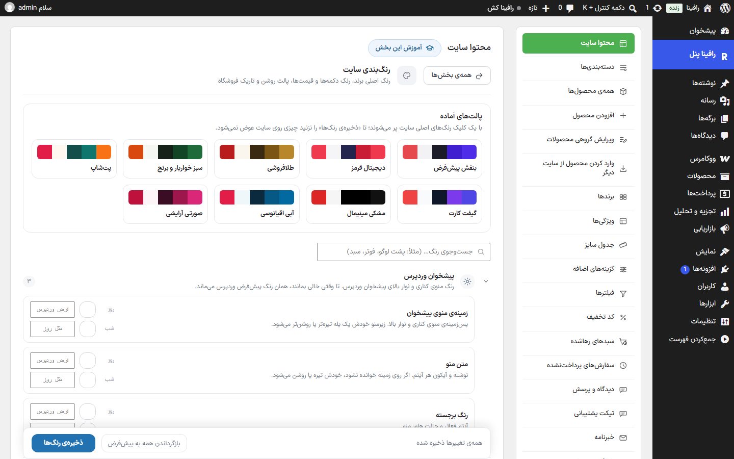
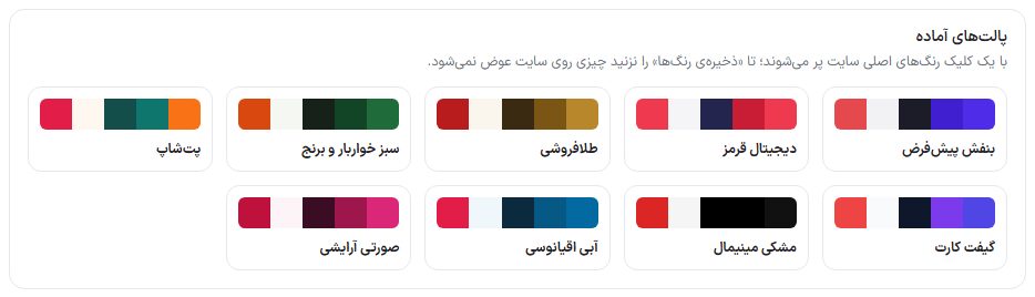
- Ready-made palettes: There are nine ready-made palettes at the top of the page ("Default purple", "Digital red", "Goldsmith", "Grocery and rice green", "Pet shop", "Gift card", "Minimal black", "Ocean blue", and "Makeup pink"). Clicking one, after the question "The current colors will be replaced. Continue?", fills the site's main colors (brand, top bar, buttons, and so on) in the form; only the day colors are filled and the night colors are untouched. Nothing changes on the site until you click "Save colors".
- Groups: Colors are arranged in 24 groups (148 colors in all). Click a group to open it; the "WordPress dashboard" group is open from the start. The gray number beside a group is its color count and the blue circle is the number of colors you have changed from the default.
- Search: In the "Search colors… (e.g. behind logo, footer, cart)" box, type part of a color's name or description to show only matching colors. If nothing is found, "No color with this name was found." appears.
- Day and night: Each color has two rows. "Day" is the color for the site's light mode and "Night" is the color for dark mode. If the Night field is left empty (placeholder "Same as day"), the day color is used in night mode too.
- Choosing a color: Click the colored square to open the color picker, or type a color code (such as
#4f2ce8) in the box beside it. - Resetting a color: Next to a color that has been changed from its default, a "Changed" badge and a "Reset this color to default" button appear.
- Saving: The bar at the bottom of the page shows the status ("All changes saved", "One color changed and not saved", or "… colors changed and not saved"). If you leave the page with unsaved changes, the browser warns you. The "Save colors" button saves everything, and afterwards "Colors saved." appears.
- Reset all to default: After a confirmation prompt, all colors return to the theme's original colors.
Changing the store's main color
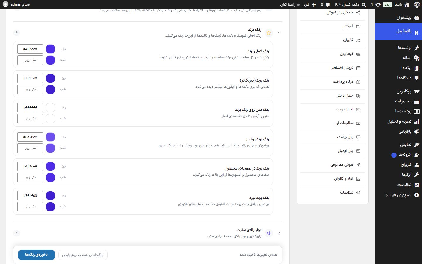
- Open the "Brand color" group.
- Set "Main brand color" and "Brand color (darker)" to your store's color. If you change only the main color and leave the darker one untouched, the theme derives the darker color from the main one automatically.
- If your site has night mode, fill in the "Night" row for the same two colors too, or leave it empty to keep it the same as day.
- Click "Save colors" and refresh a page of your site.
All groups and colors
Groups in page order: WordPress dashboard, Backgrounds and text, Brand color, Top Bar, Header and menu, Categories, Amazing offers, Sliders and stories, Top brands, Product Page, Product card and price, Buttons, Cart and payment, User Panel, Login and sign-up, Footer, Messages and statuses, Smart assistant, Guides and info pages, Special pages and app, Header rate bar, Gold price breakdown (product page), Email, Course page. In the default column, "Night: same as day" means the Night field is empty and the day color is used.
WordPress dashboard
The color of the side menu and top bar of the WordPress dashboard. While left empty, WordPress's default color is kept.
| Option | What it does | Default |
|---|---|---|
| Dashboard menu background | Background of the side menu and top bar. The submenu automatically becomes one step darker or lighter. | WordPress default |
| Menu text | Text and icon of each item. If it is not readable on the background, it automatically turns dark or light. | WordPress default |
| Highlight color | The active item and the menu hover state. | WordPress default |
Backgrounds and text
The background of the whole site, cards, texts, and borders. Any section that has no color of its own uses these.
| Option | What it does | Default |
|---|---|---|
| Site background | Background color of all pages | Day #f2f2f5Night #080b11 |
| Secondary background | Bars and sections that should stand out slightly from the background | Day #f7f7faNight #0d121b |
| Card and box background | Product card, boxes, popups | Day #ffffffNight #121826 |
| Variant picker window background | The variant picker window on the product card and the search box inside filters. The product card itself takes its color from "Card and box background". | Day #ffffffNight #121826 |
| Text color | Main text color: product name, headings, and body text | Day #1c1c28Night #eef1f7 |
| Muted text | Secondary descriptions | Day #55556aNight #9aa4b8 |
| Very muted text | The smallest texts: date, order number, text under fields | Day #8a8a99Night #8892a4 |
| Border color | Outline of cards, fields, and dividers | Day #ececf2Night #252b38 |
| Stronger border color | Bolder lines: around the active field and main dividers | Day #dcdce6Night #333a49 |
| Shadow color | Shadow of cards, popups, and the header | Day #142819Night #000000 |
Brand color
The store's main color; buttons, links, and accents take their color from here.
| Option | What it does | Default |
|---|---|---|
| Main brand color | The color that acts as the "site color" across the whole site: links, active icons, bars | Day #4f2ce8Night #3fbb4d |
| Brand color (darker) | The one seen most on buttons and icons | Day #3f1fd0Night #49ca52 |
| Text color on brand color | Text and icon inside primary buttons | Day #ffffffNight: same as day |
| Light brand color | The lightest step of the brand palette; used in night mode for text on a dark background | Day #6d50eeNight: same as day |
| Brand color on product page | The product page and stories take their colors from this palette | Day #4f2ce8Night: same as day |
| Dark brand color | The darkest step of the brand palette; the hover state of buttons and accent texts | Day #3f1fd0Night: same as day |
Top Bar
The thinnest bar at the top of the page, above the header.
| Option | What it does | Default |
|---|---|---|
| Bar first color | The thin bar above the header (announcement bar). If you want a gradient, fill in the second color too. | Day #19672aNight: same as day |
| Bar second color | The bar becomes a gradient between the first and second colors | Day #0f766eNight: same as day |
| Bar third color (optional) | If filled, the bar gradient becomes three-color; leave empty to keep it two-color | Day: empty Night: empty |
| Bar text color | Text and icons inside that thin top bar | Day #ffffffNight: same as day |
Header and menu
The top bar of the page, icons, cart counter, and mega menu.
| Option | What it does | Default |
|---|---|---|
| Categories button background | The dark button beside the search box — only in the "search-focused" layout. | Day #16211aNight: same as day |
| Two-tier header top bar background | The thin announcement and phone number bar — only in the "two-tier" layout. | Day #16211aNight: same as day |
| Header background | The header is slightly translucent so the content shows through underneath | Day #f6faf6Night #080b11 |
| Header text color | Store name, main menu links, and the "Log in/Sign up" button in the header | Day #152018Night #eef1f7 |
| Header icon color | Search, cart, user account | Day #152018Night #eef1f7 |
| Link hover color | The color header links and icons take when the mouse is over them | Day #19672aNight #49ca52 |
| Cart counter background | The small count circle on the cart icon in the header | Day #19672aNight #49ca52 |
| Cart number color | The number inside that small circle | Day #06210bNight: same as day |
| Mega menu background | The large panel that opens when you hover over "Categories" in the header | Day #ffffffNight #121826 |
Categories
The category row on the home page — outer box and the background behind logos.
| Option | What it does | Default |
|---|---|---|
| Categories box background | The white behind the whole category row (in classic and tile modes) | Day #ffffffNight #111827 |
| Background behind category logo (top) | The colored box behind each category's icon — the same light green as the classic mode | Day #f4f6f4Night #141a26 |
| Background behind category logo (bottom) | The box fades from the top color to this color; set both the same to make it flat | Day #eef4eeNight #0d121b |
| Selected category border | Outline of the category the user has clicked | Day #19672aNight #49ca52 |
Amazing offers
The offers title card and the sales bar.
| Option | What it does | Default |
|---|---|---|
| Offers card first color | The color of the panel beside "Amazing offer" — the one the timer sits on | Day #19672aNight: same as day |
| Offers card second color | If gradient mode is selected, the panel goes from the first color to this one | Day #0d3d19Night: same as day |
Sliders and stories
Product sliders, slider dots, and the story ring.
| Option | What it does | Default |
|---|---|---|
| Active slider dot color | The active dot under the home page banner slider | Day #19672aNight #49ca52 |
| Story ring color | The ring around stories that have not been viewed yet | Day #19672aNight: same as day |
| Viewed story ring | The ring around stories the user has already opened | Day #d5dcd7Night #333a49 |
| Story name color (optional) | The text under each story circle. Leave empty to keep the usual color. | Day: empty Night: empty |
Top brands
The brand logo strip on the home page.
| Option | What it does | Default |
|---|---|---|
| "Top brands" title color | The title above the brand logo row on the home page | Day #152018Night #f3f5f4 |
| Top brands box background | Empty means no box; set a color to place the logos inside a box | Day #ffffffNight #111827 |
| Background behind each logo | The small box behind each brand logo | Day #ffffffNight #0f172a |
Product Page
Gallery, buy box, tabs, specifications table, reviews, and Q&A.
| Option | What it does | Default |
|---|---|---|
| Top frame background | The large box that contains the gallery and the buy box | Day #f7f8f7Night #161b18 |
| Top frame border | The outline of that same large frame at the top of the product page | Day #e3e6e4Night #2a312c |
| Inner boxes background | Gallery, middle column, and buy box | Day #ffffffNight #1b211d |
| Inner boxes border | Outline of the gallery, middle column, and buy box | Day #e3e6e4Night #2a312c |
| Product name color | The large product title at the top of the page | Day #1c1c28Night #f2f5f3 |
| Breadcrumb color | Home › Category › Product name, at the top of the page | Day #8a8a99Night #9aa3ad |
| Inactive tab color | The "Specifications", "Reviews", and "Q&A" tabs when not selected | Day #6b7280Night #9aa3ad |
| Active tab color | Text and underline of the selected tab | Day #4f2ce8Night #49ca52 |
| Specification row title | Right column of the specifications table — attribute name | Day #8a8a99Night #9aa3ad |
| Specification row value | Left column of the specifications table — attribute value | Day #1c1c28Night #e6ebe8 |
| Specification divider line | Outline of each row of the specifications table | Day #eef1efNight #252c27 |
| Specification rows background | The cells of the specifications table in the "Modern 2" model | Day #ffffffNight #1b211d |
| Breadcrumb bar background | The full-width "Home › Category › Product name" bar in the "Modern 2" model | Day #f3f3f3Night #161b18 |
| Controls border | Outline of size boxes, quantity counter, and secondary buttons | Day #e0e0e0Night #2a312c |
| Buy box background | The box on the left side of the page that holds the price and the add-to-cart button | Day #ffffffNight #1b211d |
| Key features color | The few features listed at the top of the page | Day #374151Night #c3ccc6 |
| Top icons color | The configuration bar icon, the badges under the rating, and the shipping line. All take one color so the bar looks uniform. | Day #3c3c4eNight #c3ccc6 |
| Warranty and seller color | The warranty line and seller name at the top of the buy box | Day #4f2ce8Night #49ca52 |
| Review card background | The box of each user review and the rating summary box | Day #ffffffNight #1b211d |
| Rating star color | Rating stars on the product page. Leave empty to match the stars on cards. | Day #f5a623Night #ffc247 |
| Q&A background | The Q&A section box at the bottom of the product page | Day #f7f8f7Night #161b18 |
Product card and price
Everywhere a product card appears: shop, sliders, and offers.
| Option | What it does | Default |
|---|---|---|
| Price color | The final price on the product card in all sections | Day #1c1c28Night #49ca52 |
| Struck-through price color | The price before the discount, with a line through it | Day #8a8a99Night #7c8798 |
| Discount color | Discount percentage and sale badge across the site | Day #e5484dNight: same as day |
| Sales bar color | The "how many sold" bar | Day #ff7043Night: same as day |
| Card badge background | The corner badge on the product card (such as "New" or "Special offer") | Day #19672aNight #49ca52 |
| Badge text color | The text inside that corner badge on the card | Day #ffffffNight: same as day |
| Rating star color | Filled rating stars on the product card | Day #f5a623Night: same as day |
| Empty star color | The empty stars beside them | Day #d5dcd7Night #333a49 |
| Out-of-stock badge background | The "Out of stock" badge on the card of a sold-out product | Day #fdeaeaNight #2a1414 |
| Out-of-stock text color | The text inside that out-of-stock badge | Day #b91c1cNight: same as day |
| Under-3-hours shipping badge | Icon and text color of this badge on the card and the product page | Day #e6123dNight #ff4d6d |
| Same-day shipping badge | Icon and text color of this badge on the card and the product page | Day #1a73e8Night #5b9cff |
| Regular shipping badge | Icon and text color of this badge on the card and the product page | Day #4b5563Night #a3adbd |
Buttons
The primary button and the plain button on all pages.
| Option | What it does | Default |
|---|---|---|
| Primary button background | Add to cart, continue shopping, submit | Day #1f8034Night #49ca52 |
| Primary button text color | Text and icon inside the primary button | Day #ffffffNight: same as day |
| Plain button background | The light buttons beside the primary button | Day #eef2efNight #1b2231 |
| Plain button on hover | The same plain button when the mouse is over it | Day #e3e9e5Night #232b3c |
Cart and payment
Cart steps and the payment page.
| Option | What it does | Default |
|---|---|---|
| Payment page color | The steps at the top of the checkout page (cart ← details ← payment) | Day #1f8034Night #49ca52 |
| Printed invoice color | The invoice the admin opens for printing — print only, not the site page | Day #1f8034Night: same as day |
| Sticky free-shipping bar: first color (optional) | The background of the bar at the bottom of pages that says "Until free shipping…" (Sticky free-shipping bar). Empty means the same color as the site's cards. | Day: empty Night: empty |
| Sticky free-shipping bar: second color (optional) | If filled, the background becomes a gradient between the first and second colors; the smooth gradient is turned on from the cart tab. | Day: empty Night: empty |
| Sticky free-shipping bar: text color (optional) | Text, icon, and cart total on that bar | Day: empty Night: empty |
| Shipping label color | The printed shipping label for packaging the order | Day #14202bNight: same as day |
User Panel
User account, wallet, and orders.
| Option | What it does | Default |
|---|---|---|
| User panel main color | Accent color of the whole user panel: side menu, buttons, and order statuses | Day #1f8034Night #49ca52 |
Login and sign-up
The login page and the intro column beside it.
| Option | What it does | Default |
|---|---|---|
| Login button color | The "Get login code" button on the login page | Day #1f8034Night: same as day |
| Email login button color | When the login method is "email only", this becomes the main button color; in "both" mode, the color of the second button. | Day #2f80edNight: same as day |
| Login intro column first color | The colored column beside the login form. Visible only in the two-column layout and if you have not set an image. | Day #1f3a5fNight: same as day |
| Login intro column second color | The same column fades from the first color to this one (gradient mode only) | Day #2f80edNight: same as day |
| Login form background first color | Behind the form itself. In the full-page layout and on mobile, this is the background of the whole page. | Day #f6faf6Night: same as day |
| Login form background second color | Fades from the first color to this one (gradient mode only) | Day #eef4eeNight: same as day |
Footer
The bottom of the site and the copyright bar.
| Option | What it does | Default |
|---|---|---|
| Footer background | The whole bottom section of the site | Day #eef4eeNight #0d121b |
| Footer text color | Store name, intro, column titles, and footer links | Day #152018Night #eef1f7 |
| Copyright bar background | The last bar of the footer that contains "All rights reserved" | Day #e7eee8Night #080b11 |
| Copyright bar text color | The text of that last bar | Day #4c5a51Night #9aa4b8 |
| Newsletter box background | The email box in the newsletter column of the "Modern" design | Day #ffffffNight #12161d |
| Newsletter box text color | The text the user types inside the box | Day #1e1e1eNight #e7ecf5 |
| Newsletter box border | The box edge; on a light footer, this line makes the box visible | Day #dcdcdcNight #2a3140 |
| Back-to-top button color (optional) | The round button at the bottom of the footer in the "Strip" and "Digital" designs. Leave empty to take the site's main color. | Day: empty Night: empty |
| Arrow color of that button (optional) | Leave empty to match the site background as it does today. | Day: empty Night: empty |
| Social network badge color (optional) | The Instagram, Telegram, and other badges in the footer, in all five designs. Leave empty to take the design's usual color. | Day: empty Night: empty |
Messages and statuses
Success, error, and pending messages — on all pages.
| Option | What it does | Default |
|---|---|---|
| Success color | Success messages: "Added to cart", "Order placed" | Day #22c55eNight: same as day |
| Success message background | The background of those same success messages | Day #e8f5ecNight #10231a |
| Error and delete color | Error message, delete button, and warnings | Day #b91c1cNight: same as day |
| Error message background | The background of those same error messages | Day #fdeaeaNight #2a1414 |
| Pending color | Unpaid and under-review orders | Day #b45309Night: same as day |
| Pending background | The background of the "Awaiting payment" status | Day #fdf1e3Night #2a1f10 |
Smart assistant
The round support button and the chat window. Leave empty to follow the brand color.
| Option | What it does | Default |
|---|---|---|
| Chat button and header color | The round support button, the top bar of the window, and the send button | Day #1f8034Night #3fbb4d |
| Text color on button | Icon and text on the color above | Day #ffffffNight #07120a |
| User message color | The bubble of messages the user sent | Day #1f8034Night #3fbb4d |
Guides and info pages
Step-by-step guides, FAQs, and info pages.
| Option | What it does | Default |
|---|---|---|
| Step number background | The circles 1, 2, and 3 in the guides | Day #19672aNight #49ca52 |
| Step number color | The number inside those step circles | Day #ffffffNight: same as day |
| Step image background | The box behind each step's image on guide pages | Day #f3f4f6Night #0d121b |
| Guide tile background | Tiles of the info pages: Contact us, About us, Terms | Day #ffffffNight #121826 |
Special pages and app
The 404 page, coming soon, and web app colors.
| Option | What it does | Default |
|---|---|---|
| 404 page first color | The page that opens for non-existent addresses — the colored blob and the number 404 | Day #2fa04aNight: same as day |
| 404 page second color | The second color of that page; the gradient of the number and button goes from the first color to this one | Day #19672aNight: same as day |
| Coming soon page first color | The background of the "Coming soon" page goes from this color to the second color | Day #0f2027Night: same as day |
| Coming soon page second color | The second color of the "Coming soon" page gradient | Day #2c5364Night: same as day |
| App top bar color | The phone's top bar when the site is opened as an app | Day #f6faf6Night #080b11 |
| App launch screen color | The color seen when the app opens, before the site appears | Day #ffffffNight #080b11 |
| Web app install page background | The page that suggests "Add to home screen" on mobile | Day #ffffffNight: same as day |
| Install page text color | The texts of that install suggestion page | Day #1f2933Night: same as day |
| Install page button color | The "Install" button on that page | Day #2f80edNight: same as day |
Header rate bar
A bar that shows one rate (gold, coin, or currency) in the middle of the header. You choose its rate in "Currency settings"; until one is chosen, it is not shown.
| Option | What it does | Default |
|---|---|---|
| Bar background | The gold price bar shown in the second row of the header | Day #fdf6e3Night #241f10 |
| Border color | The outline of that same gold price bar | Day #e3c76aNight #6b5a24 |
| Price number color | The gold rate number itself in that bar | Day #152018Night #eef1f7 |
| Label and unit color | The text "18K gold" and "Toman" | Day #4c5a51Night #9aa4b8 |
| Icon color | The icon beside the gold rate in the header | Day #b8912aNight #d4af37 |
Gold price breakdown (product page)
A box under the product price that shows how much is for the gold itself and how much is making charge and profit. It is turned on from "Site content ← Product page".
| Option | What it does | Default |
|---|---|---|
| Box background | The "Price breakdown" box on the gold product page | Day #fffbebNight #1c1a10 |
| Border color | The outline of that same price breakdown box | Day #fcd77fNight #4a3f18 |
| Row title color | The text "Gold price" and "Making charge and profit" | Day #4b5261Night #cbd0d8 |
| Numbers color | The numbers inside the price breakdown box | Day #101828Night #ffffff |
| Final line color | The sentence "Based on each gram…" | Day #98a0adNight #8892a4 |
These colors appear only in emails that are sent, not on the site's pages. Until you touch them, they follow the site's color scheme.
| Option | What it does | Default |
|---|---|---|
| Email header color | The top bar of the email and the buttons inside it | Day #4f2ce8Night #3fbb4d |
| Text color on header | The store name and button text. If it is not readable on the header color, it automatically turns dark or light. | Day #ffffffNight #ffffff |
| Email background | The space around the box; what the email app shows behind the message | Day #f5f3feNight #080b11 |
| Email box background | The message itself; where the text and the order table sit | Day #ffffffNight #121826 |
| Email text color | The main text of the message. If it is not readable on the box background, it automatically turns dark or light. | Day #1c1c28Night #eef1f7 |
| Email border color | Divider lines between sections and around tables | Day #ececf2Night #252b38 |
Course page
The header and accent color of the courses page. This group only matters when the "Education" section is turned on.
| Option | What it does | Default |
|---|---|---|
| Course header start color | The start of the background gradient of the course page header. | Day #1e40afNight #1e3a8a |
| Course header end color | The end of the background gradient of the course page header. | Day #5b21b6Night #4c1d95 |
| Course header text color | The title and description on the header; must be readable on both colors above. | Day #ffffffNight #f1f5f9 |
| Course page accent color | Rating star, free-lesson badge, and play button. | Day #4f46e5Night #818cf8 |
FAQ and troubleshooting
I changed the main color but some buttons still have the old color.
Most buttons take their color from "Brand color (darker)" and the "Buttons" group, not from "Main brand color". If you saved the darker color separately before, change that one too. The header, footer, top bar, amazing offers, and login page also have their own colors on this same page.
I saved, but nothing changed on the site.
Refresh the site page. If your site is behind a plugin or cache service, clear the cache once.
The color of one page builder section differs from the rest of the site.
Each page builder section can have its own colors (section background color, card color, text color, and main color). If a color is set there, it overrides the site's color scheme. Shared element settings .
Email colors do not match the site.
The "Email" group affects only emails that are sent. Until you touch them, they follow the site's color scheme. If the text on the email header is not readable, it automatically turns dark or light.