Here you choose the product page model and decide which sections appear on it and what each text says. The settings are the same for all products; things that belong to one specific product are set on that product's edit page.
Where is it?Rafina Panel → Site content → Checkout path → Product Page
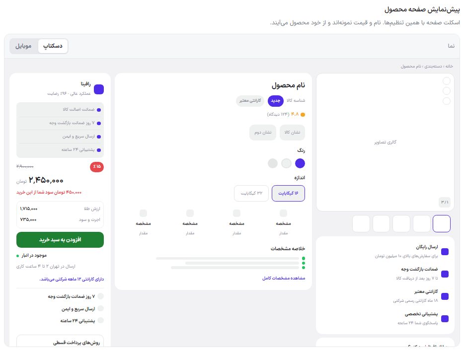
At the top of the tab is a live preview of the product page; see both views with the "Desktop" and "Mobile" toggles
The preview updates instantly with every change, even before saving. Its name and price are samples and come from the product itself on the site.
Setup
In the "Product page model" section choose the model that suits your item. When you change the model, the options lower on the page change too and only that model's options are seen.
In "Show sections", turn off whatever you don't want.
Write the texts and labels in your store's language. Any box left empty gets the theme's default text.
Click the "Save product page settings" button.
Product page model
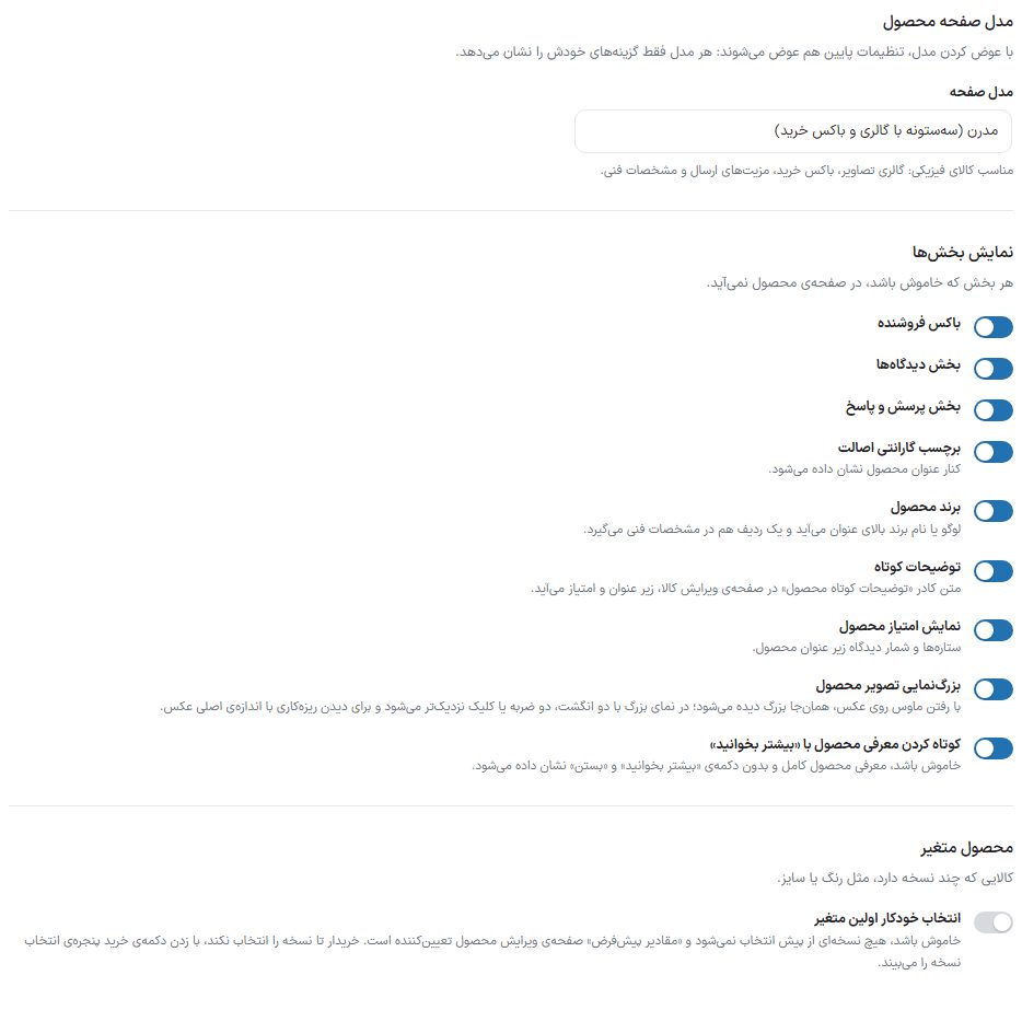
The "Page model" drawer, the "Show sections" toggles, and "Variable product"
Model
Suited to
Modern (three columns with gallery and buy box)
Physical items: image gallery, buy box, shipping benefits, and technical specifications. The theme's default model.
Modern 2 (side gallery with tab bar)
Luxury items and gold: gallery with a thumbnail rail, color and size selection, a benefits bar, and tabbed descriptions.
Classic (version 1.1 — three columns with quantity counter)
The version 1.1 product page: gallery, info, and buy box side by side, with quantity selection before adding.
Gift card (country and amount selection)
Digital items: country selection with flag, amount selection, trust badges, and FAQs.
Education (course page with player)
Courses and video: curriculum, in-page playback after purchase, instructor, and course details. A product connected to a course always gets this model; a regular product with this choice is shown in a simple form of this model.
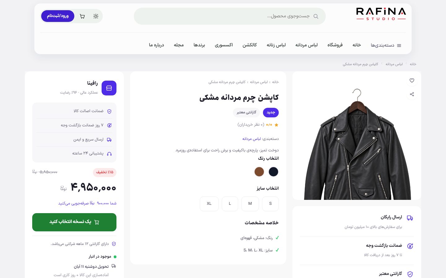
A product on the site with the "Modern" model; the other models draw the same data with a different layout
Which group is seen in which model
Settings group
Models that have it
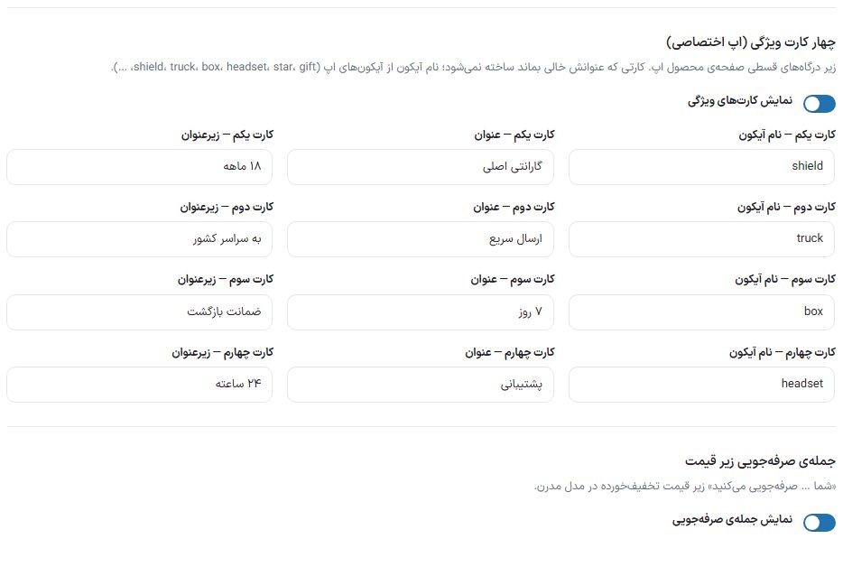
Show sections, variable product, compare, help box, section titles, buttons and labels, product categories and tags, sales count, shipping badge, four feature cards (dedicated app), the saving sentence under the price, product page colors, gold price breakdown
All models (with a few exceptions in the "Show sections" toggles, below)
Installment payment gateways
Modern, Modern 2, Classic, Gift card
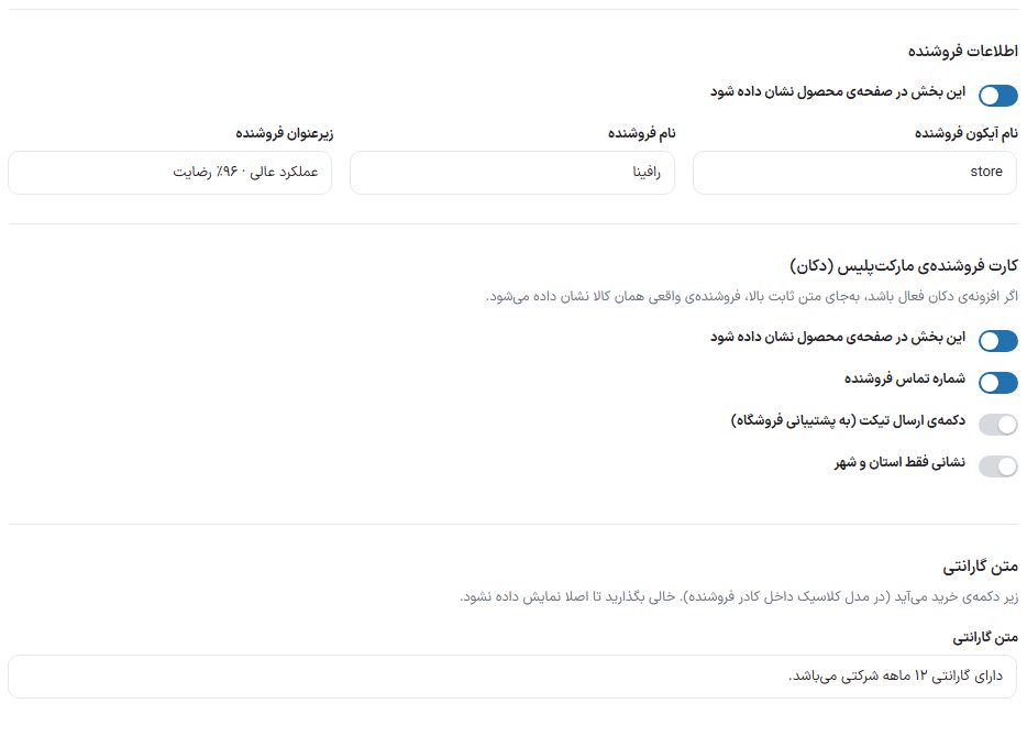
Seller info, marketplace seller card, warranty text
Modern, Classic
Quantity counter, variant selection placement
Classic
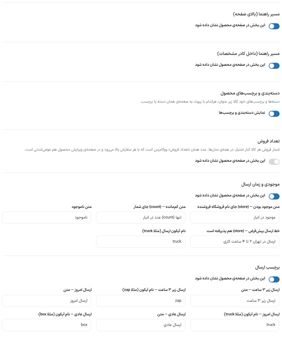
Breadcrumb (top of the page and inside the specifications box)
Modern, Modern 2, Classic, Education
Stock and shipping time
Modern, Modern 2
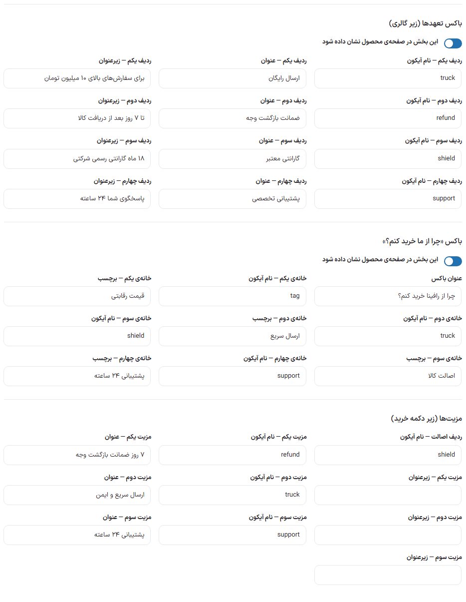
Commitments box and "Why buy from us?" box
Modern
Benefits (under the buy button)
Modern, Modern 2, Classic
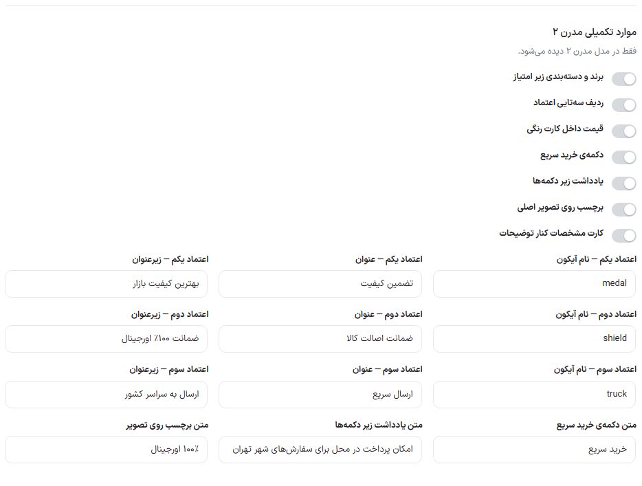
Modern 2 extras
Modern 2
Trust badges, FAQs, gift card
Gift card
Show sections
Any section that is off does not appear on the product page.
Option
What it does
Default
Seller box
The seller name box beside the buy box. Only in the Modern and Classic models.
On
Comments section
Buyer reviews and the review submission form.
On
Q&A section
Buyers' questions about the product and the store's answers. Not in the Gift card model.
On
Authenticity warranty badge
A small badge beside the product title. Not in the Gift card and Education models.
On
Product brand
The brand logo or name comes above the title and also gets a row in the technical specifications.
On
Short description
The text of the "Product short description" box on the item edit page, shown under the title and rating.
On
Show product rating
Stars and the review count under the product title.
On
Product image zoom
On a computer, hovering the mouse over the photo enlarges it right there. In the enlarged view, it zooms closer with a click, double tap, two fingers, or the mouse wheel and moves by dragging. The photo loads at its original size so fine details are visible.
On
Shorten the product intro with "Read more"
On: the long product intro is shown shortened and a "Read more" button opens it. Off: the full intro is shown without the "Read more" and "Close" buttons.
On
Variable product
An item with several versions, such as color or size.
Option
What it does
Default
Auto-select the first variation
On: the first option of each attribute is preselected. Off: no variation is preselected and the "Default values" on the product edit page decide; until the buyer chooses a variation, clicking the buy button shows the variant picker window.
Off
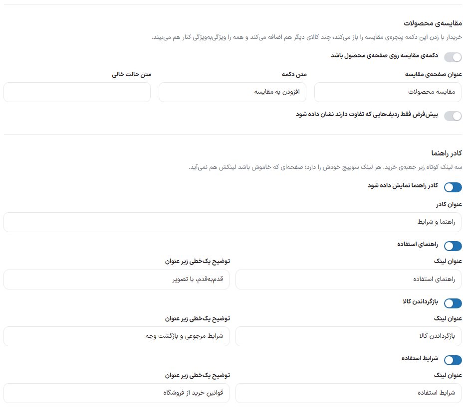
Product compare
The buyer opens the compare window with the compare button, adds a few other items, and sees them all side by side attribute by attribute.
The "Product compare" section and the "Help box"
Option
What it does
Default
Compare button on the product page
The master toggle for compare. When off, the compare button does not appear on the shop cards either.
On
Compare page title
The title at the top of the compare window.
Compare products
Button text
The compare button text.
Add to compare
Empty-state text
The sentence seen when no item is yet picked for comparison.
You haven't selected any items to compare yet.
By default, show only rows that differ
When on, the window shows from the start only the attributes that differ between items.
Off
Help box
Three short links under the buy box to the usage guide, returns, and terms of use pages. Each link has its own switch; a page that is off does not get its link either.
Option
What it does
Default
Show the help box
The master toggle for the whole box.
On
Box heading
The box heading.
Guide and terms
Usage guide, Returns, Terms of use
Each has one toggle and two boxes, "Link title" and "One-line description under the title". The pages' own content is written in the sections Usage guide, Returns and Site terms .
All three on
Installment payment gateways
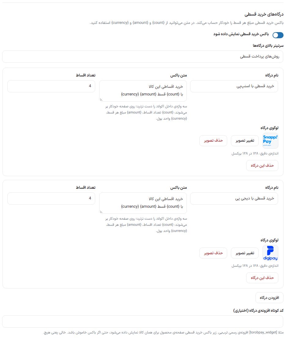
A box beside the price that tells the buyer how much each installment would be with any installment gateway (such as SnappPay or Torob Pay). The theme calculates the installment amount from the product price itself. Not in the Education model.
Each gateway has one row; "Add gateway" creates a new row
Option
What it does
Default
Show the installment purchase box
The master toggle for the box. Turning it on creates a default row if there is no gateway yet.
Off
Heading above the gateways
The small title above the gateway list.
Installment payment methods
Gateway name
The name written on the gateway card.
Installment purchase with SnappPay
Box text
The card text. Don't touch the three words inside braces; they are filled automatically on the page: {count} number of installments, {amount} amount of each installment, {currency} currency unit. The text can be two lines.
Buy this item in installments / in {count} installments of {amount} {currency}
Number of installments
A number from 1 to 36 on which the amount of each installment is calculated.
4
Gateway logo
The gateway badge beside the card. Exact size: 128 by 128 pixels. "Change image" and "Remove image" to replace or clear it.
—
Remove this gateway
Removes that row.
—
Add gateway
Adds a new row with default text and count.
—
Gateway plugin shortcode (optional)
If a gateway's official plugin has a shortcode for displaying its widget (for example [torobpay_widget] Torob Pay), write it here. It is shown for that item under the installment purchase box, even if the box is off. Empty means none.
Empty
Section titles and buttons
The "Section titles" and "Buttons and labels" groups
Option
What it does
Default
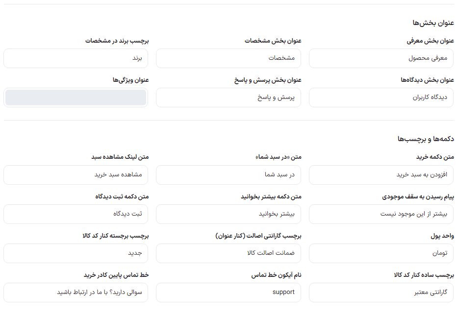
Intro section title
The title of the product description section.
Product introduction
Specifications section title
The title of the technical specifications table.
Specifications
Brand label in specifications
The name of the brand row in the specifications table.
Brand
Reviews section title
—
User reviews
Q&A section title
—
Q&A
Features title
The title of the short list of main features beside the gallery.
Specifications summary
Buy button text
—
Add to cart
"In your cart" text
The text seen after an item is added to the cart.
In your cart
View cart link text
—
View cart
Stock limit reached message
When the buyer wants more than the stock.
No more available
Read more button text
Under the long description.
Read more
Submit review button text
—
Submit comment
Currency unit
The word for the unit in the preview. The real unit of prices comes from Currency Settings .
Toman
Authenticity warranty badge (beside title)
The text of that badge beside the title.
Guaranteed authentic products
Highlight badge beside product code
A small colored badge beside the product code.
New
Plain badge beside product code
A colorless badge beside it.
Valid warranty
Contact line icon name
The English name of an icon from the theme's library, such as support.
support
Contact line under the buy box
A small sentence under the buy box.
Have a question? Get in touch with us
Icon nameEvery box that asks for an "Icon name" takes the English name of one of the icons in the theme's own library; examples: truck truck, shield shield, support support headset, refund money back, store store, tag price tag, zap lightning, box box, medal medal. An unknown name draws no icon.
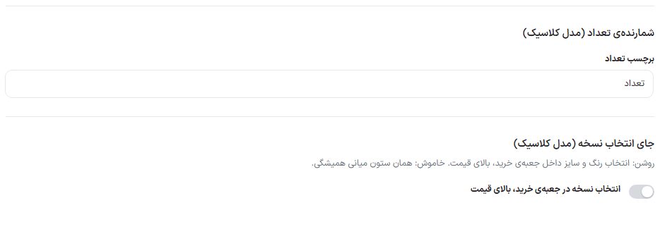
Quantity counter and variant selection placement (Classic model)
These two groups are seen only when the "Classic" model is selected
Option
What it does
Default
Quantity label
The text beside the counter the buyer uses to choose the quantity before adding to the cart.
number of
Variant selection placement (Classic model): variant selection in the buy box, above the price
On: color and size selection inside the buy box, above the price. Off: the usual middle column.
Off
Product categories and tags
The item's own categories and tags under the title, each linking to that category or tag's page. In all models.
Option
What it does
Default
Show categories and tags
Turns this line on and off.
On
Sales count
The sales count of each item beside the rating, in all product page models and the mobile app. The number is WooCommerce's own "total sales", which goes up with every order and can also be changed in the General tab of product editing. If rating is off, this line comes separately under the title.
Option
What it does
Default
Show this section on the product page
Turns this line on and off. The two boxes below are seen only with the toggle on.
Off
Text — {count} is where the sales count goes
{count} The sales count takes its place, with the digits of the site's own setting.
{count} successful sales
Show from how many sales upward
An item sold fewer than this gets no line, so a new item doesn't show "1 sale".
5
Seller info, marketplace card, and warranty text
These three groups are seen only in the Modern and Classic models.
Each group has its own on/off toggle
Option
What it does
Default
Seller info: show this section on the product page
The fixed seller box beside the buy box.
On
Seller icon name
—
store
Seller name
—
Site name
Seller subtitle
—
Your specialized store
Marketplace seller card (Dokan): show this section on the product page
If the Dokan plugin is active, instead of the fixed text above, the item's real seller (name, logo, rating, item count) is shown.
On
Seller phone number
The seller's number on the Dokan card.
On
Send ticket button (to store support)
A button that opens a new ticket form with the store name in the subject.
Off
Address as province and city only
Shows only province and city instead of the seller's full address.
Off
Warranty text
Comes under the buy button (in the Classic model, inside the seller box). Leave empty so it is not shown at all.
Comes with a 12-month company warranty.
Breadcrumb, stock, and shipping badge
The breadcrumb has two places; each has its own toggle
Option
What it does
Default
Breadcrumb (top of the page)
The "Home / Category / Product name" path at the top of the page.
On
Breadcrumb (inside the specifications box)
The same path inside the product info box. In the Modern 2 and Classic models there is only the top-of-page path.
On
Stock and shipping time: show this section on the product page
The stock and shipping line beside the price (Modern and Modern 2 models).
On
In-stock text — {store} is where the seller's store name goes
{store} On an item from a marketplace seller, the store name becomes that seller's, and on the store's own item, the site name; for example "In stock at {store} warehouse".
In stock at warehouse
Low-stock text — {count} is where the number goes
When stock reaches WooCommerce's "low stock" threshold. {count} is the remaining count.
Only {count} left in stock
Out-of-stock text
—
Out of stock
Default shipping line — {store} is also accepted
The shipping time sentence for an item that has no shipping line of its own. {store} Here too it becomes the seller's store name or the site name.
Shipped from the warehouse, one to two business days
Shipping icon name (for example truck)
—
truck
Shipping badge: show this section on the product page
The small "Shipping under 3 hours / Same-day shipping / Regular shipping" badge on the card and the product page. Which badge each item gets is chosen on that item's edit page.
Modern model only. Four rows of "Icon name, title, subtitle" under the image gallery, with an on/off toggle.
On; free shipping, money-back guarantee, valid warranty, specialist support
"Why buy from us?" box
Modern model only. The box title and four cells of "Icon name, label".
On; "Why buy from [site name]?" with competitive price, fast shipping, authentic items, 24-hour support
Benefits (under the buy button)
Modern, Modern 2, and Classic models. The "Authenticity row — icon name" and three benefits, each with an icon name, title, and subtitle. In Modern 2, these same ones are the four cells under the gallery.
7-day money-back guarantee, fast and safe shipping, 24-hour support
Modern 2 extras
This group is seen only in the Modern 2 model. All its toggles are off by default so the existing page doesn't change without a click.
Seven toggles and the text boxes for each
Option
What it does
Default
Brand and category under the rating
A line of brand and category under the stars.
Off
Three-item trust row
Three badges with icon, title, and subtitle; the text of each is in the "Trust 1/2/3" boxes.
Off
Price in a colored card
Price with discount percentage, previous price, and price update date in one card.
Off
Quick buy button
A button that adds the item to the cart and sends the buyer straight to checkout. Its text is set in “Quick buy button text”.
Off
Note under the buttons
A custom line under the buy buttons, for example about cash on delivery.
Off
Badge on the main image
A badge like “100% Original” in the corner of the image.
Off
Specs card beside the description
A summary card of specifications next to the description tab.
Off
Four feature cards (custom app) and the savings sentence
These two groups appear in all models.
App feature cards and savings sentence switch
Option
What it does
Default
Show feature cards
Four small cards under the installment gateways on the custom app’s product page. When off, none of them appear.
On
Card 1 to 4 — icon name, title, subtitle
A card with an empty title is not created. The icon name comes from the app’s own icons (shield, truck, box, headset, star, gift, and similar).
Genuine warranty / 18 months, Fast shipping / nationwide, 7-day / return guarantee, Support / 24 hours
Show savings sentence
The “You save …” sentence under the discounted price in the Modern model.
On
Gift card model sections
Gift card model trust badges and FAQCountry and amount selection texts
Option
What it does
Default
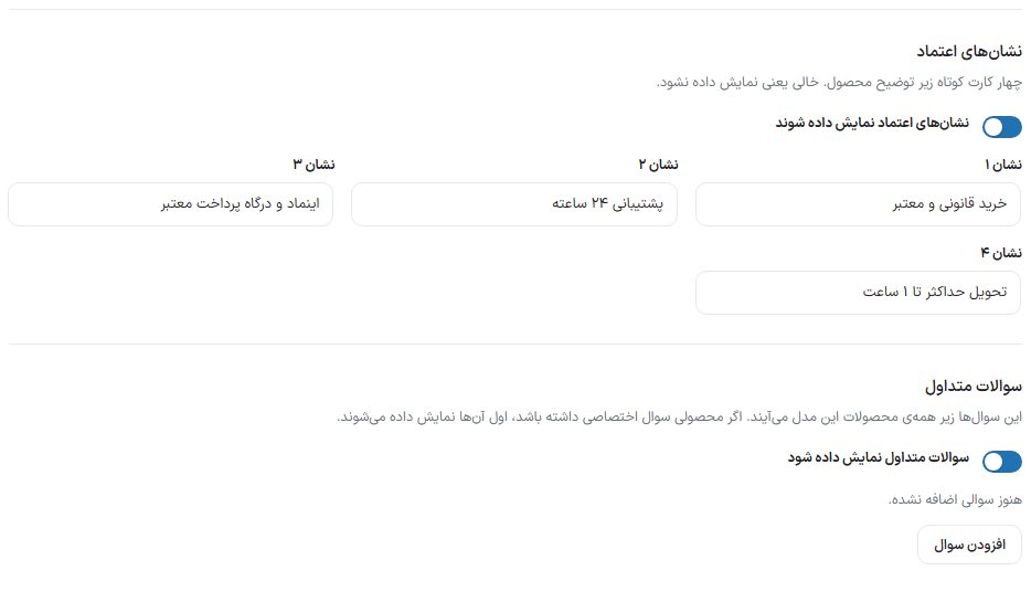
Show trust badges
Four short cards under the product description. An empty “badge” means it is not shown.
On; legitimate and authentic purchase, 24-hour support, eNamad and trusted payment gateway, delivery within 1 hour at most
Show FAQ
These questions appear under all products of this model. If a product has its own questions, those are shown first. Use “Add question” to add a question and answer row.
On, no questions
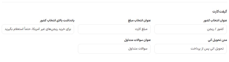
Country selection title
—
Country / region
Amount selection title
—
Card amount
Note above country selection
—
For non-US regions, be sure to check availability first!
Instant delivery text
—
Instant delivery after payment
FAQ title
—
FAQ
Product page colors and gold price breakdown
Colors come from “Site colors”
Option
What it does
Default
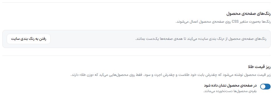
Go to site colors
Product page colors come from Site color scheme so all pages stay consistent.
—
Gold price breakdown: show on the product page
Below the price, it shows how much is for the gold itself and how much is labor and profit. It appears only on products that have a “gold weight”; other products are left untouched.
Off
Settings that live on the product itself
These are not in this tab. They are set on each product’s edit page (Dashboard ← Products ← Edit) and are listed in Add and edit product : per-item shipping label, size guide, warranty text and seller of that item, specs and top-of-page badges, expiry date, call to buy, and per-meter sale settings.
FAQ and troubleshooting
The option I’m looking for isn’t in this tab
Each model shows only its own options. First set the “Page model” drawer to the model you want on the site.
How do I remove the “12-month company warranty” text?
In the “Warranty text” group, clear the field and save. If it still appears on a specific item, that item has its own text in the “Warranty and seller of this product” box on its edit page; clear that too.
I turned on the installment purchase box but it isn’t on the page
The “Educational” model doesn’t have this box. In the other models, at least one named gateway is required.