
Header
The main menu, the logo spot, and what is seen at the top of every page. It has six ready-made designs, and the preview beside the page changes with each choice.
Where is it? Rafina Panel → Site content → Site frame → Header
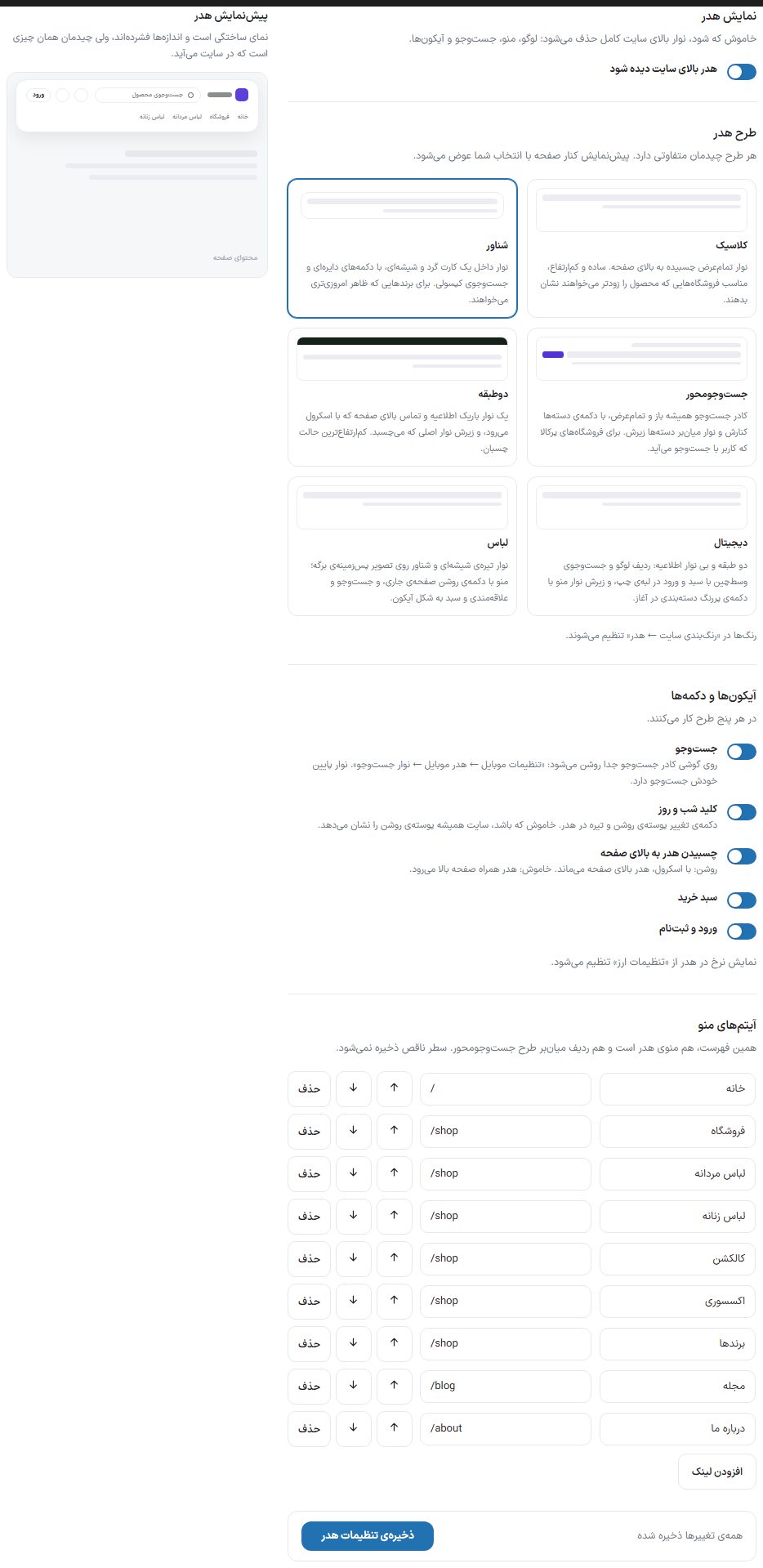

Header display
| Option | What it does |
|---|---|
| Show the header at the top of the site | When turned off, the site's top bar is removed completely: logo, menu, search, and icons. |
Header layout
| Option | What it does |
|---|---|
| Classic | A full-width bar stuck to the top of the page. Simple and short, suited to stores that want to show products sooner. |
| Floating | A bar inside a rounded, glassy card, with circular buttons and a capsule search. For brands that want a more modern look. |
| Search-focused | The search box is always open and full-width, with the categories button beside it and a category shortcut bar beneath it. For large-catalog stores where users arrive by searching. |
| Two-tier | A thin announcement and contact bar at the top that scrolls away, and the main bar beneath it that sticks. The shortest sticky layout. |
| Digital | Two tiers without an announcement bar: a centered logo and search row with cart and login at the left edge, and beneath it a menu bar with a bold categories button at the start. |
| Clothing | A dark, glassy, floating bar over the page's background image; menu with a light button for the current page, and search, favorites, and cart as icons. You place the background image in the page builder's "Page background" box. |
Options that come only with some designs
Choosing "Search-focused" opens the "Search-focused design" box, and choosing "Two-tier" or "Digital" opens the "Two-tier design" box under the design selection.
| Option | What it does |
|---|---|
| Categories button text (Search-focused design) | The text of the dark button beside the search box; the default is "All categories". The shortcut row beneath it is filled from these same menu items. |
| Announcement text (Two-tier and Digital design) | The top tier's text, such as "Free shipping for purchases over 500,000 Toman". |
| Contact number (Two-tier and Digital design) | The number that appears in the top tier. The top tier scrolls away and does not stick; if both fields are empty, that tier does not appear at all. |
Icons and buttons
These options work in all designs.
| Option | What it does |
|---|---|
| Search | The search box or button in the header. On a tablet-sized window (783 to 1100 pixels), the search box takes its own row under the header so it does not get lost. On a phone, except in the Search-focused design, the search box is turned on separately: "Mobile settings ← Mobile header ← Search bar"; the bottom bar has its own search. In the Search-focused design, the box is always open. |
| Night and day switch | The button that switches between light and dark themes. When off, the site always shows the light theme. |
| Header sticks to top of page | On: the header stays at the top while scrolling. Off: the header scrolls up with the page. |
| Cart | The cart icon with item count. |
| Login and sign-up | The login button, or the account menu for a logged-in user. |
Menu items
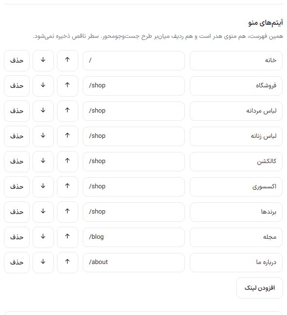
This same list is both the header menu and the shortcut row of the Search-focused design. Each row has "Link text" and "Link address", is moved with the "Up" and "Down" buttons, and removed with "Delete"; create a new row with "Add link". The list holds up to 12 rows. An incomplete row (no text or no address) is not saved.
Finally click "Save header settings". The header preview beside the page is a mock and compact view, but the layout is the one that appears on the site.