The columns at the bottom of the site with the store intro, links, contact methods, social networks, and copyright text. It has seven ready-made designs.
Where is it?Rafina Panel → Site content → Site frame → Footer
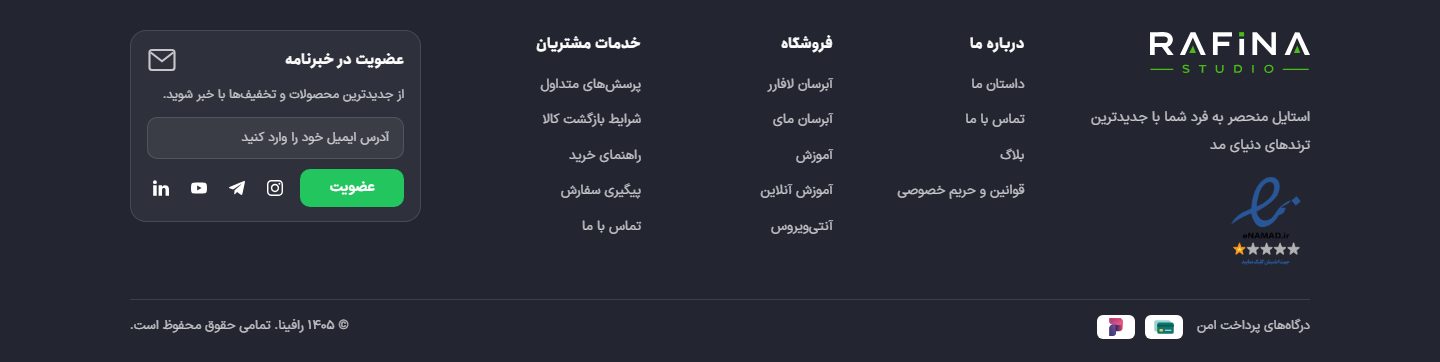
The site footer on desktop with the "Clothing" design: brand column with badges, three link columns, newsletter card, and bottom bar with payment gateway badges
Display and design
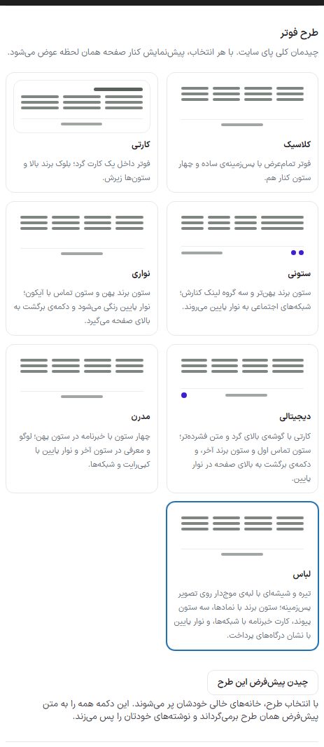
Choosing the footer design and the "Arrange this design's defaults" button
Option
What it does
Show the site footer
When turned off, the whole site bottom with all its columns and its copyright bar is removed.
Classic
A full-width footer with a plain background and four columns side by side.
Card
The footer inside a rounded card; brand block on top and columns beneath it.
Columnar
A wider brand column and three link groups beside it; social networks move to the bottom bar.
Strip
A wide brand column and a contact column with icons; the bottom bar becomes colored and gets a back-to-top button.
Digital
A card with a rounded top corner and more compact text; contact column first and brand column last, and the back-to-top button in the bottom bar.
Modern
Four columns with the newsletter in the wide column; logo and intro in the last column and a bottom bar with copyright and networks.
Clothing
Dark and glassy with a wavy edge over a background image; brand column with badges, three link columns, a newsletter card with networks, and a bottom bar with payment gateway badges.
Arrange this design's defaults
When you choose a design, empty fields fill themselves in. This button returns everything to that design's default text and discards your own writing.
NotePhone number, email, and address are not in the designs' defaults; fill these in yourself.
Brand column
Option
What it does
Show the site logo in the footer
The logo at the top of the brand column. A separate footer logo is chosen from "Settings ← Site identity"; empty means the same as the header logo.
Short store intro
One to two lines. Longer text pushes the side columns down.
Quick access column
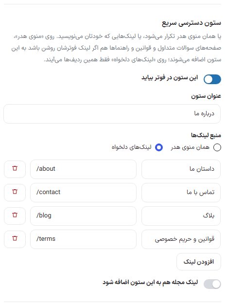
The quick access column with link source
Option
What it does
Show this column in the footer
Turns the column on and off.
Column title
The title at the top of the column.
Link source
"Same as header menu": the header menu is repeated, and the FAQ, terms, and guide pages are added too if their footer link is on. "Custom links": only the rows you write yourself with "Add link" (title and address like /shop).
Add the magazine link to this column too
The blog link is added to the end of the column. When on, the "Magazine link text" box opens for that link's text.
Categories column
Option
What it does
Show this column in the footer
Turns the column on and off.
Column title
The title at the top of the column.
Link source
"Automatically from site categories" or "Custom links".
How many categories to show
Only in automatic mode, between 1 and 12.
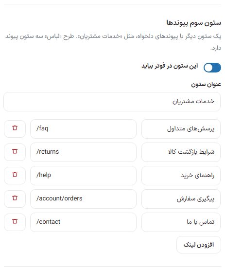
Third links column
The third links column with title and custom links
Another column with custom links, such as "Customer services". The "Clothing" design has three link columns and this column is the third. Its source is custom links only, because the menu and categories have their own columns.
Option
What it does
Show this column in the footer
Turns the column on and off.
Column title
The title at the top of the column.
Add link
Each row is a title and an address, like /faq.
Newsletter column (Modern design only)
This box is seen under the design selection only when the "Modern" design is selected.
Option
What it does
Show the newsletter column
Rendered only in the "Modern" design.
Column title and text under the title
The title and short description above the box.
Text inside the email box
The faint text inside the box.
Form address
Leave empty to record the email or mobile in the site's own newsletter list (Rafina Panel ← Newsletter). If you have another newsletter service, write that form's address.
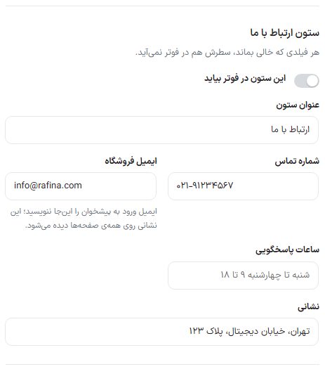
Contact us column
Contact us column
Any field left empty also has its row left out of the footer.
Option
What it does
Show this column in the footer
Turns the column on and off.
Column title
The title at the top of the column.
Phone number
The store's number. Separate multiple numbers with a comma ("," or "،") or a semicolon (";"); each number gets its own row with a phone icon and does not break mid-number on a phone.
Store email
The email address seen on all pages. Do not write your dashboard login email here.
Response hours
For example "Saturday to Wednesday 9 to 18".
Address
The store's postal address or location.
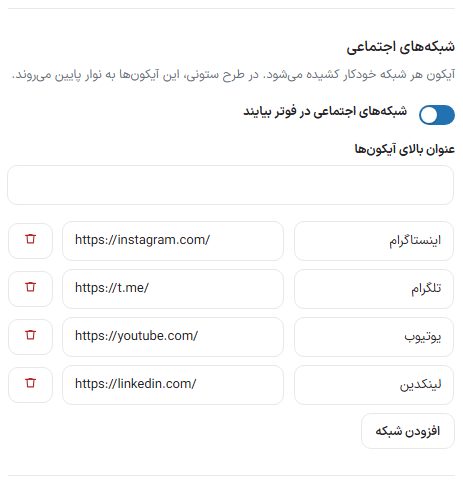
Social networks
Footer social networks
Option
What it does
Show social networks in the footer
Turns the icons on and off.
Title above the icons
A small heading above the row of icons.
Each network row
Choose the network from the dropdown (Instagram, Telegram, WhatsApp, X, YouTube, LinkedIn, Aparat, Rubika, Eitaa, Bale, Soroush, iGap) and write the page address. Create a new row with "Add network". Each network's icon is pulled in automatically.
NoteIn the columnar design, the network icons move to the bottom bar.
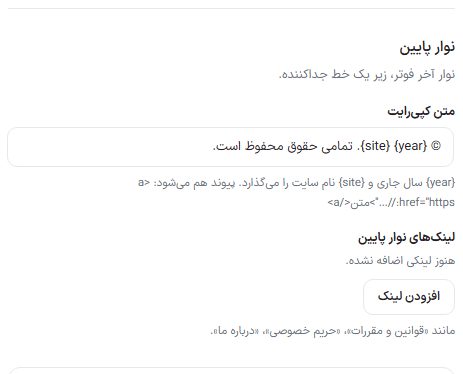
Bottom bar
Footer bottom bar: copyright text and bottom bar links
The last bar of the footer, under a divider line.
Option
What it does
Copyright text
{year} The current year and {site} the site name are placed. It can also be a link, for example <a href="https://…">text</a>.
Bottom bar links
Small links at the end of the footer such as "Terms and conditions", "Privacy", "About us"; with "Add link".
Finally click "Save footer settings". The footer preview beside the page has two buttons, "Desktop" and "Mobile", and reads from the same colors as "Site color scheme ← Footer".
NoteThe trust badge (eNamad) has its own place in the footer and is set from the "Trust badge" tab.