
Mobile Settings
Whatever you choose here only affects phones and the desktop view is untouched. It has two modes: "Web app", which compacts the site's own pages on phones, and "Dedicated app", which is a separate design for phones.
Where is it? Rafina Panel → Site content → Mobile Settings
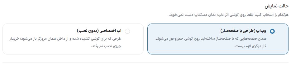
Display mode
| Option | What it does |
|---|---|
| Web app (designed with the page builder) | The pages you built with the page builder are compacted on phones. In this mode the "Page layout" box appears: the phone has no new layout of its own and follows the home page's page-builder page (the "Edit home page with page builder" button); if there is no such page, the theme's default page is shown. |
| Dedicated app (no install) | A design drawn for phones that opens inside the same browser; the buyer installs nothing. |
Web app mode options
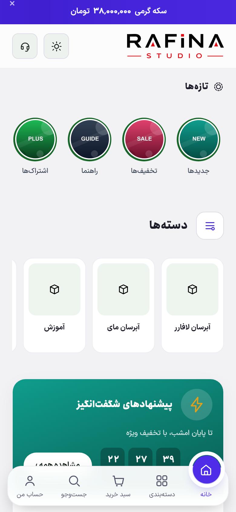
Mobile bottom bar
A fixed bar that stays at the bottom of the page on phones. It is not shown on desktop.
| Option | What it does | Default |
|---|---|---|
| Turn on the bottom bar | When off, no bar appears on phones. | — |
| Bottom bar on all pages → Also show on login and checkout pages | Login and checkout have their own sticky button, so the default bar does not appear there. Turning this option on keeps the bar on all pages. | Off |
| Bar layout | "Classic (full-width bar)" attached to the page edge, or "Floating with sliding bubble": a pill-shaped bar set away from the edge with a bubble under the active item. | — |
| Text under icons | When off, only the active item has text and the rest are icons only; the bar gets shorter. | — |
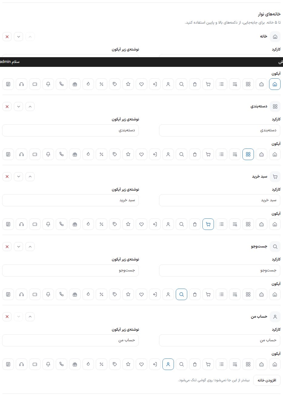
Bar items
Up to 5 items; use the up and down buttons to reorder. The last item cannot be deleted; to have no bar, turn it off.
| Option | What it does |
|---|---|
| Function | Home, Categories, Search, Cart, My account, Store, Blog, or Custom link. "Categories" opens a drawer with the store's categories and "Search" opens the search drawer. |
| Text under icon | The item name. |
| Address | Only for "Custom link". |
| Icon | From the theme's icon library. |
| Delete this item | Removes the item. |
| Add item | A new item; more than 5 do not fit. |
Site header and footer
| Option | What it does |
|---|---|
| Site header and footer on all pages / only on the home page | On phones, the site header and footer appear either on all pages or only on the home page; the bottom bar stays in place in both modes. |
Mobile header
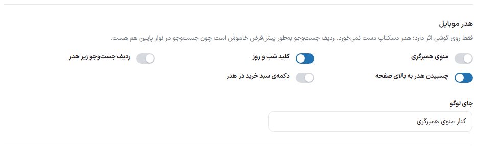
Only affects phones; the desktop header is untouched.
| Option | What it does | Default |
|---|---|---|
| Hamburger menu | The three-line button that opens the slide-out menu. | Off |
| Night and day switch | The theme switch button in the phone header. | — |
| Search row under the header | A search box under the header. Off by default because search is also in the bottom bar; the bottom bar's search drawer opens full height and its suggestions appear instantly. | Off |
| Header sticks to top of page | The phone header stays at the top on scroll. | — |
| Cart button in the header | The cart icon in the phone header (the bottom bar has a cart too). | Off |
| Logo position | "Beside the hamburger menu" or "In the middle of the header". | — |
Mobile app mode
| Option | What it does |
|---|---|
| App mode on | When "Site header and footer" is set to "Only on the home page", the other pages on phones get a top bar with the page title and a back button, like an app. With "All pages", the header and footer stay everywhere. It makes no difference on desktop. |
Web app install prompt
A card on phones that suggests installing the site (adding it to the phone's home screen).
| Option | What it does |
|---|---|
| Show install prompt | This switch is only for web app mode; the dedicated app has its own switch. |
| Prompt style | Full screen or a card at the bottom of the page. |
| Title and text | The prompt card's texts. |
| Seconds after the site opens | The delay before the card shows. |
| If dismissed, show again after how many days | The gap before showing again after it is closed. |
| Show every time | The card appears on every visit. |
| Install app button on the site | A small button on phones, above the bottom bar, that the buyer taps themselves to open the install dialog; on any page, without waiting for the automatic card. The buyer can hide it for up to seven days with its cross, and it stops appearing after installing. It does not depend on the automatic card being on and exists in both web app and dedicated app modes. |
App icon and name on the phone
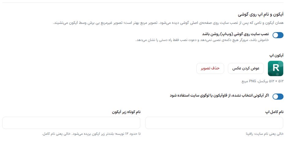
The same icon and name seen on the phone's home screen after installing the site. This box exists in both web app and dedicated app modes.
| Option | What it does |
|---|---|
| Site installation on phones (web app) is on | When off, the browser offers no install button and the install prompt shows only the manual way. |
| App icon | Image 512 × 512 pixels, square PNG. A non-square image is placed in the middle of the icon without cropping. Use "Change image" and "Remove image" to replace or remove it. |
| If no icon is chosen, use the favicon or site logo | Without an icon, the favicon or site logo takes its place. |
| Full app name | Empty means the site name. |
| Short name under the icon | Up to about 12 characters; longer ones are cut off under the icon. Empty means the full name. |
Dedicated app mode
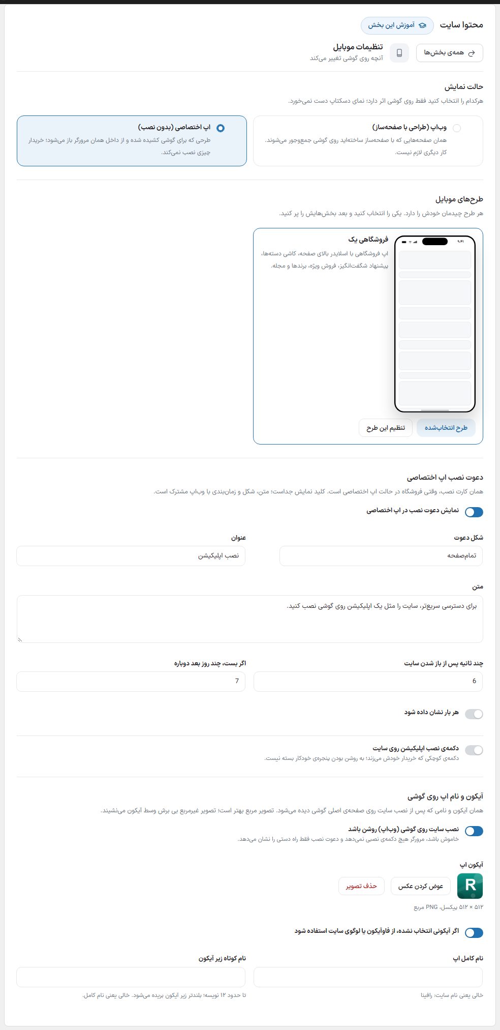
Choosing "Dedicated app" brings in the "Mobile designs" section. Each design has its own layout; choose one with "Select this design" and fill its sections with "Configure this design". A design whose pages are not built yet shows "This design is not ready yet" and cannot be chosen. In this mode the "Dedicated app install prompt" section also appears with the switch "Show install prompt in dedicated app"; its text, style, and timing are shared with the web app.
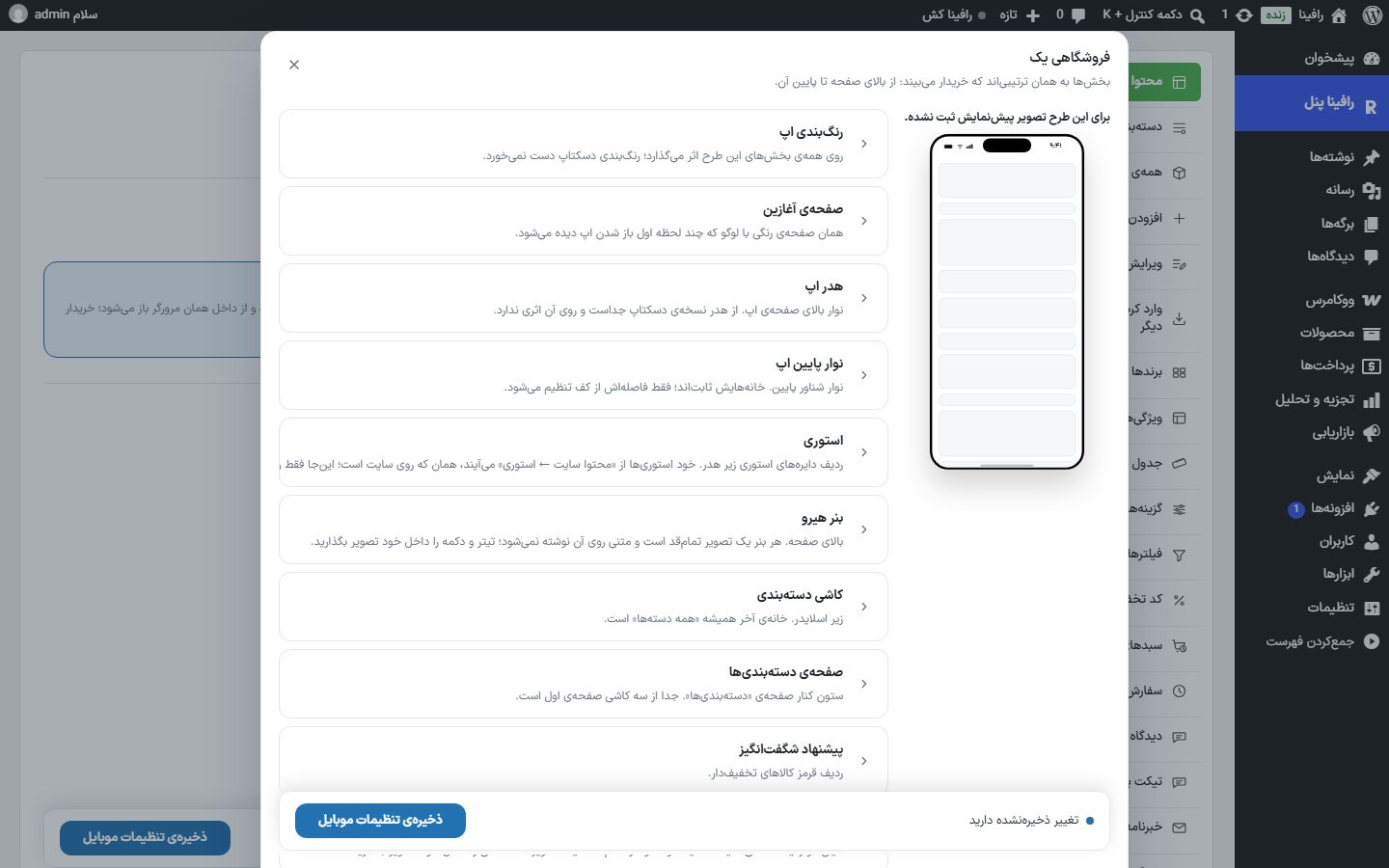
The configure design dialog shows sections in the same order the buyer sees them, from top of the page to the bottom. Tap a section to open it. The save bar is inside the dialog itself; after changing, click "Save mobile settings".
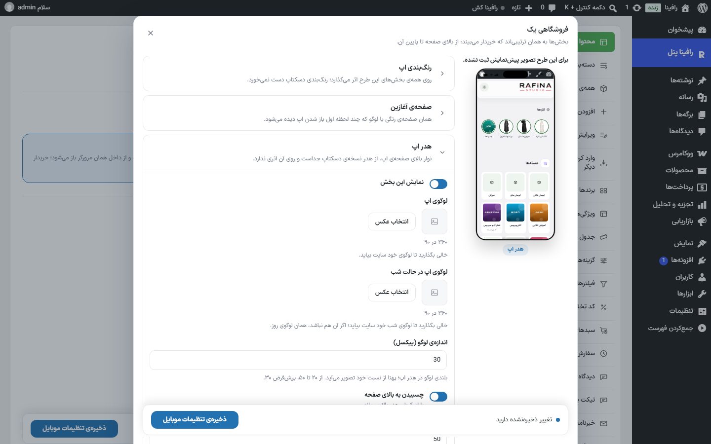
Sections of the "Store One" design
| Option | What it does |
|---|---|
| App color scheme | "Primary color" (buttons, discount badge, badges, and the amazing-offer row; default is the design's red) and "Primary color in pressed state" (the button color under the finger; empty means automatic, slightly darker). It affects all sections of the design and the desktop color scheme is untouched. |
| Splash screen | A colored screen with the logo seen the moment the app opens. "Show splash screen", "Display duration" (milliseconds, 500 to 5000, default 2200; the user can skip it with a tap), and "Splash screen logo" (size 540 by 160, single color because it is drawn white on the primary color; empty means the site logo). |
| App header | "Show this section", "App logo" and "App logo in night mode" (both 360 by 90; empty means the site logo), "Logo size (pixels)" (20 to 50, default 30), "Stick to top of page", "Distance from top of page" (0 to 80, default 50; 12 to 20 is enough inside a browser), and "Night and day switch". It is separate from the desktop header. |
| App bottom bar | "Bar style" ("Floating (main design)" or "Glass (blur)"; glass is the same bar with a frosted transparent background), "Distance from page bottom" (0 to 42, default 42), and "App header and footer" ("Only on the home page" or "App header and footer on all pages"). This bar's items are fixed. |
| Stories | "Show this section". A row of story circles under the header of the app's home page, with a full-screen viewer (tap the left half for next, right for previous, hold to pause, swipe down to close). The stories themselves come from "Site content → Stories", the same as on the site. |
| Hero banner | "Show this section", "Banners" (up to 8 banners, each with a 1448 by 760 image and an optional link, with "Add banner" and "Generate with AI"), "Autoplay", and "Pause per banner" (2 to 10 seconds, default 5). No text is written on the banner; put the headline and button inside the image itself. |
| Category tiles | "Show this section", "Displayed categories" (up to three; for each you can choose an icon or let the category's own image appear), "Last tile text" (default "All categories"), and "Tile background color" (day mode only). |
| Categories page | "Main categories of the side column" of the Categories page; they appear in that order and subcategories appear next to them automatically. Empty means all main categories. If you choose a subcategory, its parent category appears in the side column. |
| Amazing offer | "Show this section", "Section title", "Products from where" ("Discounted products" or "Manual selection"), "Manual product selection" (up to 12), "Number of products" (4 to 12), "Show countdown", and "Countdown end" (Jalali date and time; empty means from the end date of the products' own discounts). |
| Two side-by-side banners | "Show this section", "First banner image" and "Second banner image" (each 704 by 624), and a "Link" for each. Exactly two banners. |
| Special sale | "Show this section", "Section title", "Products from where" (manual selection, newest, best selling, random), "Manual product selection" (up to 20), "Limit to these categories", and "Number of products" (4 to 20). |
| Guarantees bar | "Show this section" and the title and subtitle of four items. An item with an empty title is not built. |
| Brands | "Show this section", "Section title", and "Number of brands" (4 to 12). |
| Magazine | "Show this section", "Section title", and "Number of posts" (2 to 8). |
| About us | The app's "About us" page: three headline lines, "Introduction text", "Store numbers" (each line "number | text | icon"), title, text, button, link, and "Story image" (724 by 300), "Values title" and "Values" (each line "name | subtitle | icon"), the social responsibility box with title, text, and button, and "Closing box title" with subtitle. A box with empty text is not built. |
| Footer | "Show this section", "Page footer logo" (240 by 60), "Short intro", title and two-column rows (each line "text | address"; empty means the default list), "Phone number, address, and working hours" with title and three fields (an empty field is filled from the site footer), the "Social networks" switch and addresses of twelve networks (Instagram, Telegram, WhatsApp, Eitaa, Rubika, Aparat, YouTube, LinkedIn, X, Bale, Soroush, iGap; a full address or just the username, and for WhatsApp the mobile number), "Show eNamad", "eNamad link", and "Page bottom text". |
FAQ and troubleshooting
In the app's categories page, a subcategory does not appear in the side column
The side column shows only main categories; a chosen subcategory appears in the second column under its parent category.
I changed settings in the dialog and closed it, and it didn't save
Closing the dialog does not save. Before closing, click "Save mobile settings" in the dialog's bottom bar.
The site header shows on all pages on phones and app mode doesn't work
Set "Site header and footer" to "Only on the home page"; "All pages" takes priority over app mode.